Technology lessons for educational technology integration in the classroom. Content for teachers and students.
Box Plot Charts with Google Drawings
In this lesson, we are creating a Box plot chart. Google Sheets does not have a tool to create a Box plot chart, so we will create our box plot using Google Drawings. We will begin with Google Sheets to collect and organize the information.
In this lesson, we are creating a Box plot chart. Google Sheets does not have a tool to create a Box plot chart, so we will create our box plot using Google Drawings. We will begin with Google Sheets to collect and organize the information.
The chart for this lesson is based on data collected from a paper airplane lesson. Students had a flight distance contest. The distances are measured and rounded to the nearest foot. The worksheet with the data is available in the link below. There is also a link to the finished product.
Box plot final document preview
Box plot chart working document
Box plot Drawing working document
Box plots
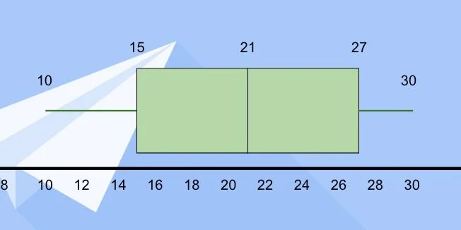
Box plots are used in statistics to visualize data. They show the lowest and highest data points. They show us the median value for all the collected data. It also shows us the median for the values that are below and above the median. These points are called quartiles.
The data is spread into four groups. Each quartile contains 25-percent of the total data. Representing the data with a box plot helps answer several questions about the data. We will explore questions and answers at the end of the lesson.
The Google Sheet contains the data from an airplane contest; 30 students participated; the measurements are in feet. These measurements are an average of three trial runs for each team. Each measurement is rounded to the nearest foot.
We need to pull some information from the data to create the box plot. First, we need the low and high values in the range. We also need the first and third quartile values. I provided a small table to organize the information.
Enter the number 10 under the title for Low and 30 under the title for High.
Let's begin with the second median for all the data. There are 30 measurements. Count 15 measurements down. At the 15th measurement, we have 21-feet. We also have 21-feet on the 16th measurement. Both values represent the median. We average the values and get a median of 21-feet. Enter 21 for the second quartile. I'll refer to this as the second quartile to avoid confusion.
*If the values had been 15 and 21 we would add them together and divide by two. This would have given a median of 18.*
The first quartile is the median value for the measurements between the lowest value and the overall median. There are fifteen measurements from the lowest number to the median. Count eight measurements from the beginning. The median value is 15. This measurement falls right in the middle so we don’t need to average.
Enter 15 for the first quartile.
The third quartile is the median value between the second quartile and the highest measurement. Count eight measurements from the second quartile. The median value is 27.
Enter 27 for the third quartile. We have the values needed to create the box plot.
The Drawing document from my template includes a solid line across the center of the canvas.
The drawing template also includes the values from the table and an image.
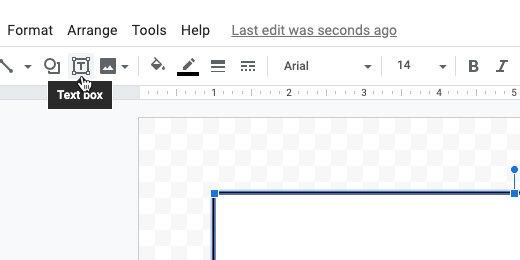
Click the text box button.
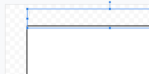
Click once above the black line.
Stretch the left side of the box to the edge of the canvas.
Repeat the process for the right side of the text box.
The text box is for the number range. Double-click inside the text box; type the number 0; press the Tab key and type the number 2. We use the tab key to space the numbers across the text box.
Repeat the process to enter even numbers from 0 to 30.
Click the justification button; center the text.
Move the text box below the black line. Use the alignment guides to center the box along the black line. Make sure the top of the text box is lined up along the black line.
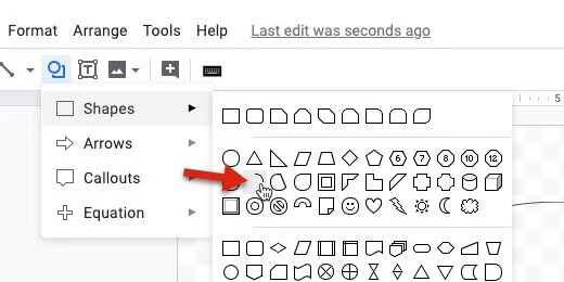
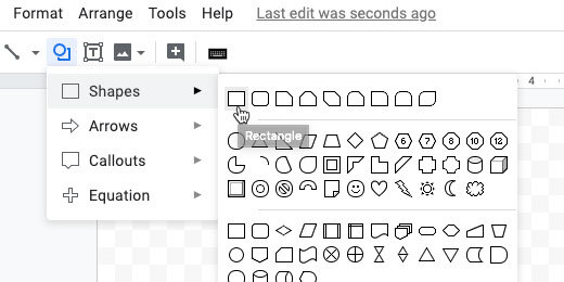
Click the shape selector and choose the rectangle tool.
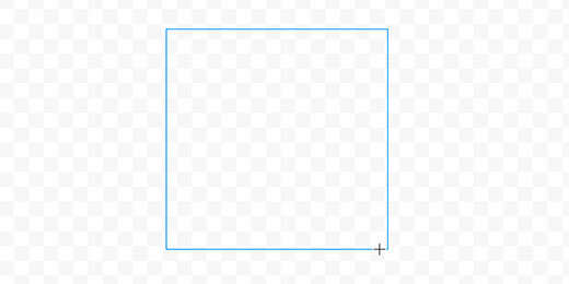
Click once above the number line.
Move the box over the number line. Place the left edge of the box halfway between 14 and 16. This is the location of the first quartile.
Stretch the right side of the box halfway between 20 and 22. This is the location of the second quartile.
Go back to the shapes selector. Choose the rectangle shape again. Place the shape above the canvas like the previous shape. Move the square to the right of the rectangle. Align the left edge of the square with the right edge of the first rectangle.
Stretch the right side of the shape so it lines up with the value for the third quartile—27.
Go to the line selector; select the line tool.
Position the line tool to the left side of the first rectangle. Purple dots appear along the edges of the rectangle. These are connectors for lines.
Click on the left dot; move the left side of the line above the number 10. Hold the Shift key to maintain a straight line.
Repeat the process for the right side of the second shape. Extend the line to the number 30. These lines are called the Whiskers. This chart is sometimes referred to as the Box and Whisker plot.
Click the text box tool. Place a text box on the canvas. Enter the number 15. Resize the text box; place it over the left edge of the first rectangle.
Place a text box with the number 21 between the boxes where they meet.
Repeat the process for the third quartile.
Use text boxes to mark the lowest and highest values at the end of the whiskers.
Click on the table—make sure the border appears around the table—press the delete key.
Insert a text box for the chart title. Set the font size to 38 points. Center the text box at the top of the canvas.
Move the image onto the canvas. Align it to the top-right edge.
Stretch the image so it covers the canvas.
The image is wider than the canvas. We need to crop the image. Click the crop tool.
Drag the crop edge toward the black line. Stop when the alignment guides appear to mark the edge of the canvas. Press the Escape key to release the crop tool.
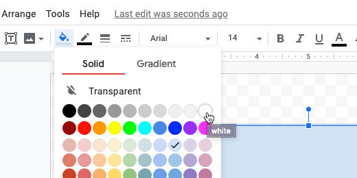
Adjust the color of the boxes to help them stand out against the image background. I changed mine to light green.
One more thing before we are done. Select the left Whisker.
Use the line endpoint selector; select the round endpoint.
Repeat the process for the right Whisker.
Box plot interpretation
This box plot represents a normal distribution; like the normal distribution curve. The low and high values are distributed evenly from the center.
Other box plots include those where the median is closer to one end of the quartiles. When the second quartile is close to the first quartile it is called a box plot with a positive skew. Most of the values are on the right side.
Box plots with the median close to the third quartile have a negative skew. Most of the values are to the left of the second quartile.
Here are some basic questions we can ask about the box plot.
1. What percent of the planes landed beyond 21 feet?
2. All of the planes landed within 30 feet. (T/F)
3. 50 percent of the planes landed less than 21 feet from the start. (T/F)
4. What is the Inter Quartile Range?
5. Any plane landing beyond 30 feet is an outlier. (T/F)
Custom 3D Bar charts with Google Drawings
Custom 3D charts with Google Drawings. Creating charts manually provides opportunities to teach and learn. It opens opportunities for students to experience another way to do the same thing. Developing a chart with Drawings provides opportunities for artistic expression. It gives students access to the behind the scenes stuff that’s usually hidden with modern applications.
The development of charts is an easy process with tools like Excel, Numbers, and Google Sheets. Excel and Numbers have excellent tools to develop colorful charts. Google Sheets has good tools to develop basic nice looking charts.
I think we can create some nice charts with Google Drawings and make them look nice. We need to put a lot of work into making something look nice but I believe the effort is worth it. Plenty of teachable moments.
Okay, why go through all the trouble?
I’m glad you asked.
Creating charts manually provides opportunities to teach and learn. It opens opportunities for students to experience another way to do the same thing. Developing a chart with Drawings provides opportunities for artistic expression. It gives students access to the behind the scenes stuff that’s usually hidden with modern applications.
This lesson arises from lessons I did with students.
The process took a couple of class periods; it was part of a much larger lesson. An unforeseen benefit arose from the process of creating charts manually. My students were better able to answer questions related to charts on those standardized tests. They were able to easily dissect the data presented in those charts. I credit this to their intimate experience in collecting data and creating charts manually.
Use the link below to see a preview of the finished product.
Paper airplane contest chart preview
Use the link below to get the template for our project. The template includes a table with the data. It also includes the font and a graphic used in the lesson.
Google Drawings working document
The project
The date for this project comes from a paper airplane contest. This is part of an overall lesson. In the lesson, we learn about the origins of flight and the principles of flight. One of the actives includes the construction of paper airplanes.
Students construct a paper plane. The design is based on several we found on the Internet. Students choose the design they want to use in the contest. All students agree to use the same design so the data is representative of the design. The first chart does not include variables like paper, paper size, and weight.
Students are separated into teams of two. Each team selects a name for their team. The name must come from one of the terms we learned about aviation. Some of the terms are shown on the table in the drawing template. Requiring these names prevents fights over strange unrelated names. The names make a nice connection to the academic vocabulary.
Each team gets three tries. The measurements are done with a member of the team and a member of an opposing team to make make sure there is no cheating. The three distance measurements are averaged by each team.
The averages are placed in a table. The distances are broken down into percentages. Each percentage is based on the longest average distance; the longest distance being 100-percent. The table forms the basis for the bar chart.
The template has two tables. One has all the teams and trials. The other contains the averages and percentages.
On the right side of the drawing is an image. This is an image of a typical paper airplane against a rose background. I will use this image for the chart background later.
Click once inside the average and percentage table. A border appears around the table. Move the cursor to one of the border sides. Look for the arrow to change to four opposing arrows. Move the table from the drawing canvas.
Place the table to the right of the drawing canvas. Place it under the paper airplane image.
Moved the other table to the other side of the canvas.
We are going to resize the canvas. This creates additional room for the bars we need in the bar chart. Click File and select Page Setup.
Select Widescreen 16:10 from the page selector; click the apply button.
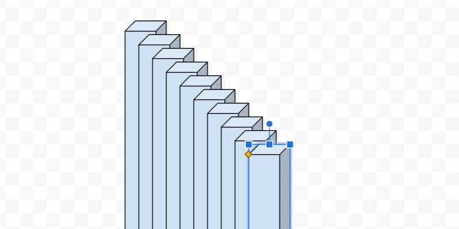
Click the shapes button. Select the cube tool from the Shapes list.
Draw a thin rectangle on the canvas. This is technically a rectangular prism.
We have ten values; we need to make sure there is enough room for the bars to fit on the canvas. We also need to accommodate other elements in the chart. These elements include labels and titles.
There is a ruler that runs along the top of the canvas. The canvas is 10-inches wide.
We will leave 1-inch on either side for titles. This leaves 8-inches for the bars. We could divide the eight inches into equal spaces for the bar charts. This, however, would cause the bars to line up against each other. To have some breathing room between each bar the bars will be set to a width of .5 inches.
—Work the steps out with students.
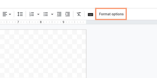
Make sure the shape is still selected and click the Format options button.
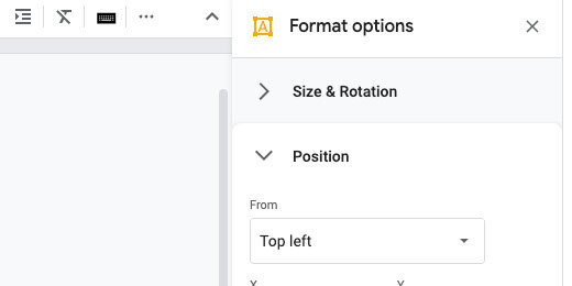
Open the Size & Rotation section.
Change the width to 0.5 inches.
The height of the canvas is a little over 6-inches. Leaving an inch on top and bottom for labels leaves 4-inches. Change the height to 4-inches.
This bar represents the largest value; the longest average distance recorded. We need ten bars in total.
Click Edit and select Duplicate. A useful shortcut is the Ctrl+D or Cmd+D keys. This helps duplicate the bar quickly; we need eight more.
Leave the duplicate bar where it is and duplicate it.
Duplicate eight more. You will have nine duplicates of the original with a total of ten. You will have ten bars cascading down when it’s all done.
Draw a selection around the tops of all the bars.
Click Arrange in the menu and go to the align option. Select the align to top option.
The bars align with the top of the first bar.
Press the ESC key or click away from the selected bars. Click once on the first bar on the left.
Drag the bar to the left; hold the shift key to make sure the bar remains aligned with the others. Alignment guides follow the bar. Use the alignment guide and the ruler. Align the left guide to the number one on the ruler.
Select the last bar on the right. Drag it to the right; remember to hold the shift key. Align the right guide to the number nine on the ruler.
Draw a selection around all the bars.
Click Arrange in the menu; go to the Distribute option. Select the option to align the shapes horizontally.
The inner bars are evenly distributed between the first and last bar.
Keep all the shapes selected. Go back to the Arrange menu; select the Group option.
Click on the second bar. It should be selected on its own apart from the others. You can tell it is selected separately because the rotation handle appears above the shape.
This bar needs to represent 92.7 percent. This is the percentage of the average distance flown by the second-longest flight.
Open the Format options panel—if it isn’t open. Open the Size & Rotation section. Change the height scale to 93 percent. The scale option does not permit decimal percentage values. Round the percentages to the nearest whole number.
The bar size is adjusted from the bottom up. We will fix this once all the bars are sized.
Click on the next bar.
The next percentage value is 74.4. Round the percentage to 74 and enter it in the height percentage value.
Repeat the process with all the bars.
Press the ESC key to deselect any of the selected bars. Click once on any of the bars to selected the grouped bars.
We can’t arrange the bars while they are grouped.
Use the Arrange menu to ungroup the bars.
The bars remain selected. Use the Align option in the Arrange menu to align the bars to the bottom.
Return to the Arrange menu and group the bars.
The bars represent the percent values from largest to smallest.
Click the color fill tool. Go to the gradient section; choose light cornflower blue 2.
The gradient is applied to all the bars.
The default gradient is a good starting point. Let’s create our own. Return to the color palette and the gradient section. Click the custom option.
The gradient has a light blue on top and a darker shade at the bottom.
Gradients are made with color stops. The left color stop is light blue and the right is a darker blue. The light color stop is selected.
Click the color palette selector. Select light cornflower blue 1.
Click the right color stop.
Use the color palette to choose dark cornflower blue 2.
The gradient is a little darker. I chose blue; feel free to choose a gradient color pattern of your own. Click the OK button.
Click the border-color selector. Choose dark cornflower blue 3.
Values
We are going to use a text box to place the values for each bar. Click the text box tool.
Click once above the bar chart. Change the font size to 11 points. Type the value for the average distance of the longest flight.
Resize the text box and place it above the first bar.
Duplicate the text box; place it above the second bar. Change the value to 200.3. Repeat the process for each bar.
Click on the first text box; hold the shift key and click on the next. Repeat this process to select all the text boxes.
Click Arrange in the menu and select Group.
Axis lines
Charts have an axis that represents the X and Y values. The values for our chart are the team and distance. We need lines to identify these axis values and labels.
Click the Line tool selector; choose the polyline tool.
The polyline tool creates connected lines each time we click somewhere on the canvas. The tool is easy to use but tricky if you have never used it before. You have to remember to stop clicking otherwise you keep making lines.
Click once somewhere on the canvas. Hold the shift key and move the tool down to create a vertical line. Holding the shift key assures we create a straight vertical line. Click once to place the second point of the line.
Keep holding the shift key and move the tool to the right; make a horizontal line. Double-click to finish drawing the shape.
Press the ESC key on your keyboard after double-clicking. This deselects the tool so you don’t accidentally make another line.
We have our coordinate lines.
Move the shape to the lower left side of the bar chart.
Stretch the top part of the shape; place it just above the first number label.
Stretch the right side to the right of the last bar.
Leave space below the bars.
Chart title
Click Insert and select Word Art.
Type Paper Airplane Contest in the input box; press the Return key.
Move the title to the top of the canvas.
Change the font to Fugaz One and resize the word art box. Use the ruler to size the text box and match mine. The left edge of my word art box is at the 1.5-inch mark. The right edge is at the 8.5-inch mark.
Change the text fill color. Use dark cornflower blue 1.
Use white for the word art outline color.
Set the outline width to 3-pixels.
We need to move things around for the labels. The value labels are grouped separately from the bars. To select all the labels we need to pay close attention to the mouse pointer. The pointer will change to four opposing arrows when it is above the grouped labels.
Click once and that will select the grouped labels.
Move the value labels up and to the right. Use the alignment guide to push the grouped box against the bottom of the word art. Use the vertical center alignment guide to center the labels on the canvas. Press the ESC key to deselect the grouped labels.
Click once on one of the bars to select the grouped bars.
Using the mouse to move the grouped bars works fine for most situations. Moving the grouped bars hides the bars and makes it difficult to align them with the labels.
Instead of using the mouse, we are going to use the arrow keys. Press the up arrow key once or twice. Press the right arrow key once or twice. Use the combination of up, down, left, and right keys to position the bars under the values.
Click the axis lines shape; use the arrow keys to position it close to the bars.
Titles
We’ll add titles to the X and Y-axis. Click the text box tool and click anywhere on an empty area of the canvas. Type “Distance in inches”.
Resize the text box and center justify the text.
Drag the rotation handle on the text box to the left.
Hold the Shift key to force the text box to align vertically. Look for the angle measurement to read 270-degrees.
Move the text box to the left of the Y-axis line. Use the center alignment guide to position the title.
Click on the text box tool again; click on an empty area of the canvas. Type the first team name into the box. The team names are in the table we placed on the right side of the canvas. The table is editable. Copy and paste the text from the table for the labels.
Resize the text box. Don't make the width too small. It will need to accommodate the longer titles of team names. Align the text to the right. Change the font size to 11 points.
Rotate the text box to 300.0 degrees.
Move the text box and place it below the first bar.
The name just fits in the space at the bottom. We need more space for long team names. Click once on one of the bars.
Drag the bottom resize handle up. Use your best guess to determine how much additional space we need for the titles.
Click the X and Y-axis line. Move the bottom resize handle up and stop just before you meet the bottom of the bars.
Move the text box up to the x-axis line. Use the alignment guide to push the text box up against the x-axis.
Duplicate the text box. Move it to the next bar. Enter the name of the next team.
Repeat the process for the rest of the team names.
Make sure the first and last titles are aligned directly under their corresponding bar. Draw a selection around all the labels.
Go to the Arrange option on the menu. Use the distribute option to distribute the titles horizontally.
Return to the Arrange menu; use the align option to align the tops.
Return to the Arrange menu one more time and group the titles.
Use the up arrow key to nudge the text closer to the x-axis.
Resizing the bars will offset the value labels. Select the grouped labels. Look for the cursor to change to four opposing arrows before clicking.
Use the bottom resize handle to move the titles up.
The background
Move the background image onto the canvas. Resize the image so it fills the canvas.
The background offers a sharp contrast to the blue bars. This color is fine but I would like to see what other color options do to the design. Keep the image selected and click the Format options button. Open the Recolor section.
Use the recolor selector to choose a color overlay. Let’s see what purple looks like.
Wow! that is bright.
I think I’ll go for a light blue to match the bars.
Text shadow
Click on the main title. Use the format options panel. Add a drop shadow to the text art.
This is our finished custom bar chart.
Cylindrical bars
We aren't limited to 3-D rectangles. We can use cylinders. Select the bars group. Right-click to get the contextual menu. Use the Change shape option to access the shapes tools.
Select the cylinder shape.
We now have a bar chart that uses cylinder shapes.
Not all the shapes work well for bar charts. Here is one with arrows.
Space race infographic with Google Drawings
Infographics are a good way for students to summarize information. It allows them to represent what they have learned in alternate ways. Infographics are highly visual and fact-intensive.
Infographics are useful in many segments of media; people grasp information faster when it is visual.
Introduction
Infographics are a good way for students to summarize information. It allows them to represent what they have learned in alternate ways. Infographics are highly visual and fact-intensive.
Infographics are useful in many segments of media; people grasp information faster when it is visual.
“It (infographic) keeps people’s interest by lending storytelling and visual element to what can be sterile research.” – Caitlin McCabe.
Good infographics require students to collect relevant information and develop some compelling text. Students present information efficiently and concisely.
Research
Research has shown that visual clues help increase the memorability of information. —W.H. Levie and R. Lentz, “Effects of Text Illustrations: A Review of Research,” Educational Communications and Technology Journal 30 (4) (1982): 195-232
Facts and figures lend authority to the text.
We learn things better visually. 90% of the information transmitted to the brain is visual, and that is processed 60,000 times faster in the brain than text.
Studies confirm the power of visuals in learning
Much of the information above came from several resources. These resources are listed on the Visual Teaching Alliance web page. The link is available below.
http://visualteachingalliance.com/
The Lesson
The infographic for this lesson is based on an overall lesson. The lesson covers the history of the space race. This was the space race that ended with the first moon landing. It began during the Cold War and Sputnik. It ended with Neil Armstrong landing on the Moon.
Use the link below to see the final product.
Space Race infographic preview
Use the link below to get the starter template. The template includes the fonts used in the lesson.
Google Drawing starter template for space race project
You don’t need to use the template. The template contains the fonts used in the lesson. The fonts are embedded in the drawing. This, in turn, adds the fonts to your font repository. This saves you and students the trouble of having to go out and find the fonts used in the lesson.
Google Drawing setup
Infographics are not limited by physical size. Most infographics are usually wider than a typical paper document. They are also much longer. Infographics are meant to be part of social media outlets like Facebook, Twitter, and especially Pinterest.
The documents are larger because they need to accommodate images and text. They also need to be visually appealing. They are much like the posters we place in our classrooms. The link below to https://easel.ly provides a nice overview of the basic dimensions for infographics on various social media. The sizes represented on the page are the standard basic measurements. I use them as the minimum requirements.
https://www.easel.ly/blog/cheat-sheet-infographic-size-dimensions/
The Template
Use the link to get a copy of the template. Click File in the menu; select page setup.
Click the page setup selector and choose Custom.
Choose Pixels for the unit measurement.
The dimensions for this infographic are 900 by 1200 pixels. Enter these values in the fields. Click the Apply button.
Graphics and text
There are lots of options for infographic backgrounds. They range from a basic color to images. Our background will have an image.
Click the Insert image selector; Search the web.
Search for space background; use the search panel on the right.
Select one of the space backgrounds —choose one you like.
Click the Insert button at the bottom of the panel.
Use the Zoom tool to zoom out to 50%.
Grab the lower right resize handle. Stretch the image so it fills the Drawing canvas. Blue alignment guides appear to inform you when the image matches the height of the canvas.
Click the Crop image tool.
Crop handles appear at the edges of the image.
Bring the right side crop handle in —toward the center of the image. A crop guide follows the resize handle. There is a Ruler at the top of the canvas. Match the guide to the edge of the ruler.
The right part of the image appears faded. This is the part of the image that will be cropped out.
Click once outside the image to exit crop mode. You can also press the ESC key on your keyboard.
Click Insert and select Word art.
Type “The Space Race” in the Word art box. Press Enter to render the word art.
Click the Zoom tool and select Fit.
Place the title toward the top of the drawing —center it.
Change the font. Use something futuristic, techno, or sci-fi. The template includes four fonts I found for you. The fonts are listed below. Use one of these or one of your own.
Expletus Sans
Nova Square
Baumans
Orbitron
Your font choice might cause the title to extend beyond the canvas. My choice of Orbitron caused the title to extend beyond the canvas. Use the resize handles to fit the title in the canvas.
Some fonts include other members of the font family. My choice of Orbitron includes type-face options from normal to Black. I chose Bold type-face.
Click the color fill button —choose white.
Word art includes a border option for the letters. Set the border color to transparent.
Keep the text selected and click the Format options button.
Place a checkmark on the Drop shadow option.
Click the disclosure chevron to reveal the drop shadow options. Move all the drop shadow sliders to the left.
Click the color selector and choose Dark gray 1.
Move the distance slider to the right. Place the slider below the letter “a” in distance. A number pops up as you move the slider. Stop when the number is 6.
This gives our title some depth.
Click the Text box tool.
Click once below the title. Click the font color tool and select white.
Select the Orbitron font or the font you chose earlier, and increase the font size to 32 points.
Type the subtitle—A brief history—into the text box.
Click once on one of the text box borders.
Click the text alignment selector and chose the center-align option.
Move the text box up and toward the center of the main title. Use the vertical and horizontal alignment guides to position the subtitle.
Click the image option selector and search the web.
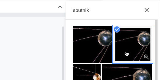
Search for Sputnik.
There are several images. Choose one of the first two that appears. Insert the image.
We used the crop tool earlier. The crop tool doubles as a mask tool. Click the triangle next to the crop symbol.
Choose the circle tool from the shapes option.
The shape is masked by an oval.
Click the format options button. Open the Size and Rotation options.
Set the width and height to 1.5 inches.
Position the image below the subtitle.
The image becomes distorted after resizing the mask. We need to update the image. Go to the button bar; click the Replace image selector.
Search the web for the Sputnik image. This search box is different from the one we used earlier. The search for Sputnik isn’t saved in this panel. Type Sputnik again.
Select the image and click the Replace button.
The image is off-center. Double click the image.
The image has two bounding boxes. The black box is for the circle mask. The blue is to resize the image. Don’t resize the image; drag it to the left.
Get as much of the Sputnik sphere into the mask as you can. Press the ESC key to exit mask mode.
Make sure the image is still selected.
Select white from the border color palette.
Click the border thickness tool; select 8-pixels.
That took a few steps. To save time, we will use this image as a template for the others.
Select the image; go to the menu and click File. Select the Duplicate option.
Place the duplicate image below the first.
Leave the second image selected. Replace the image with one from the Web. Use the Replace image option.
Search for Yuri Gagarin.
Select an image and click Replace.
Double click the image. Move the image so Yuri Gagarin’s face is in the center of the circle.
Duplicate the image two more times. Insert images of John Glenn and Neil Armstrong into each.
Reposition the images so Neil Armstrong is on top. Place John Glenn next; Yuri Gagarin and Sputnik are next. Move the images to the left side of the canvas.
Click once on the first image. Hold the Shift key and click on each of the other images.
Click Arrange and go to the Align option. There are several align options. The left-align option aligns the images with the leftmost image. The same is true for the right align option. The images align with the rightmost image. The center align option aligns all the images below the first image based on the center of the first image. Use the left-align option.
Click Arrange again and go to the Distribute option. Choose the vertical distribution option.
This spaces the images vertically. It uses the first and last images as anchors. The rest of the images are spaced evenly between these two images. Deselect the images.
Select the rounded rectangle tool from the Shapes menu.
Draw the rounded rectangle shape to the right of Neil Armstrong.
The shape has a yellow diamond in the upper left corner. Drag that diamond shape to the right —all the way. This rounds the corners so they match the circle in our image. The shape is now a pill shape.
We need to size the rounded rectangle so the height matches the height of the Neil Armstrong image. The image of Neil Armstrong is 1.5 inches. The border around the image is 8 pixels. Each pixel is equivalent to a fraction of an inch. That’s about .08 inches for the border. The border is all the way around. So there are .16 inches of the white border on opposite sides of the image.
The height of the rounded rectangle needs to be 1.66 inches—1.5 plus .16 inches.
Open the Format options panel. Set the height of the rounded rectangle to 1.66 inches.
Move the rounded rectangle over the image of Neil Armstrong. Use the alignment guides to center and align the shape.
The shape is covering the image. Shapes and images are placed on invisible layers. The layers can be repositioned.
Click Arrange; select Send backward from the Order menu.
The rounded rectangle is behind the image. Stretch the shape to the right. Align it with the letter —e— in the title Race.
Use the color fill option; set the color fill to dark cornflower blue 1.
Return to the color fill option and choose Custom.
Move the transparency slider to the left.
Color and colors with transparency values are represented by Hex values. The value for my adjustment is shown at the top of the custom color selector. Enter this value if you want the same transparency adjustment used in my example —3c78d8cf. Adjust the transparency and click the OK button.
Transparency applied to objects is referred to as the Alpha value.
Change the border color to white.
Change the border thickness —set it to 4 pixels.
Duplicate the shape and move it down. Align it with the shape above using the center alignment guide.
The shape will appear above the image of John Glenn. Use the Arrange menu option to send the shape backward.
The shape will still be over the image after sending it backward. There are lots of shapes and images in layers. Return to the Order option and send the image backward again.
Our shape isn’t on top anymore so options to bring the shape forward or to the front are available.
You’re going to need to do this one more time for this shape. I find it useful to use the shortcut keys to arrange images. On Chromebooks and Windows computers —use the Control key plus the down arrow. Control plus the up arrow moves images forward in the layers. Mac computers use the Command key and the up or down arrow.
Duplicate the shape two more times. Place the shapes behind the two remaining images.
Click the Text box icon.
Draw a text box over the pill shape. Place the text box next to the left side of the image —stop before it reaches the rounded edge of the pill shape. Cover as much of the shape as you can.
Use white for the font color.
Use any font and font size you prefer. I used the Nunito font with 16 points.
Duplicate the text box and place it over the other shapes. Fill out the boxes with relevant information.
Replace the background
After working on the infographic you might find it necessary to make some changes. The background I chose was too distracting so I replaced it with another. To replace, click on the background image and use the Replace image option.
Soften the background
I like backgrounds but some backgrounds can be distracting. I soften backgrounds with a transparent layer. Go to the shapes tool; select the rectangle tool.
Place a small rectangle shape outside the drawing canvas.
Move the shape onto the canvas. Stretch the shape so it fills the infographic.
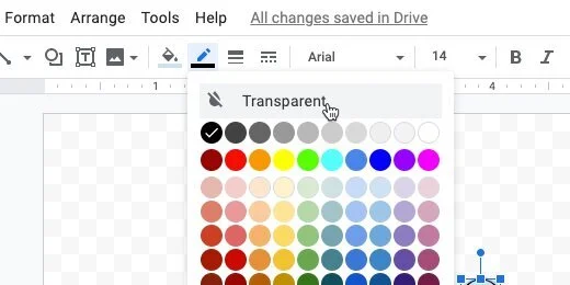
Click the border color and choose the transparent option.
Select dark blue 3 from the fill color palette.
Return to the color fill palette and select the Custom option.
Move the transparency slider to the center; click the Ok button.
Send the image to the back using the Order option.
The shape drops behind the background image. We need to bring the shape up one layer. Use the Order option to bring the shape forward once.
This mutes the background image slightly and helps the text stand out.
Share your infographic with the world.
Publishing Google Charts with Google Drawings
Welcome to the third lesson in a four-part lesson for publishing Google Charts. This lesson focuses on the publication of Google Charts with Google Drawings.
Google Drawings has features that make publishing charts easy. Google Drawings allows us to be creative. Charts are often part of infographics. We are using a basic infographic to publish the chart in this lesson.
Introduction
Welcome to the third lesson in a four-part lesson for publishing Google Charts. This lesson focuses on the publication of Google Charts with Google Drawings.
In a previous lesson, we learned how to publish charts on their own. We published a Google Sheet to simulate a dashboard. We used a Google Doc to publish the chart and include detailed information.
Google Drawings has features that make publishing charts easy. Google Drawings allows us to be creative. Charts are often part of infographics. We are using a basic infographic to publish the chart in this lesson.
Use the link below to see a preview of the final product.
Use the links below to get a copy of the Chart and Drawing working documents.
The Chart
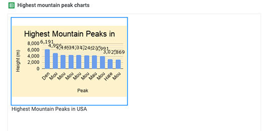
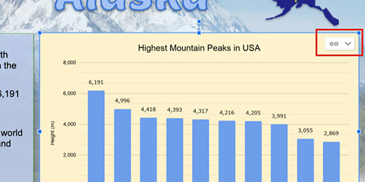
Take a look at the chart on the Google Sheet. The chart displays the top ten highest mountain peaks in the United States. The data for the chart comes from a Wikipedia article. The link to the articles is available in the Sheet. The data is in the Peaks sheet.
The Table uses a Query to filter for prominent peaks in the United States. The Google Sheet with the chart doesn’t need to be open. You can close it after reviewing the information.
The Drawing
The template has a background image of the Denali mountain. It has a title and text box with basic information about Denali. There is a place for the chart next to the text box.
Go to the menu and click Insert. Go to the Chart option and select From Sheets.
Look for the spreadsheet titled Highest Mountain Peaks. The preview shows the table and chart in the first sheet. Select the spreadsheet.
The import box displays the only chart in our spreadsheet.
The chart is linked to the spreadsheet; this is important. Select the chart and click Import.
Resize the chart and place it next to the information box. The chart shows a link to the spreadsheet. We will come back to this later.
Click the Share button.
Click the option that reads Change to anyone with the link.
Click the Copy link button.
Open a new tab and paste the link into the address bar. The link ends with the word edit and some other information.
Replace edit and anything that comes after, with the word preview. Press the Return key to render the page.
Our drawing is nicely published for the world to view.
The data in the published drawing is live. Leave the tab open and return to the Drawing tab. Click the Done button to close the link box.
Click once on the chart. Click the Link button and select Open source.
The information in the table for the chart is from a Query. Click on the Heading titled Peak. Look at the query in the Formula bar.
Go into the Formula bar and change the Limit parameter from 10 to 5. The Limit parameter limits the number of results returned in the query. Press the Return key to update the query.
The table and chart update
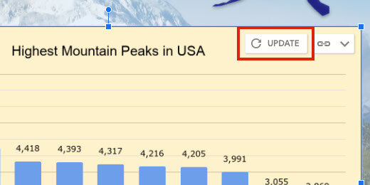
Return to the Drawings tab. An update button appears next to the Link menu. Click the Update button.
Go to the published drawing tab. Refresh the page to show the changes.
Google Drawings is very useful for creating elaborate documents. An infographic is one document format that works well with charts and drawings.
The publish option
There is a publishing option for Drawings. This is similar to publish options in Sheets, Docs, and Slides. There is one important difference. The publish option does not provide a web version of the drawing. Let's take a look.
Click File and select Publish to the web.
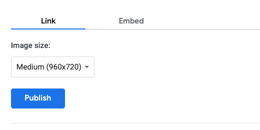
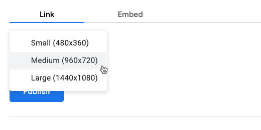
Publishing Google Drawings comes with an option to select the resolution of the published image. The medium resolution is recommended.
The other resolution options are small and large. Stick with medium and click the Publish button.
Confirm you want Google to publish the drawing.
A link is generated for the published document. Copy the link; create a new tab and paste the link.
Press the Return key. You most likely won’t see the chart displayed on the page. The drawing is converted to a PNG image and downloaded to your computer.
This option doesn’t serve us here for what we want to do. It is useful for other purposes. It is a good way to distribute and share images. It is also a good way to embed images in other Google products.
Halloween Infographic with Google Drawings
In this lesson, we are using Google Drawings to create a fun Halloween Infographic. You will learn how to import images into Drawings. You will learn how to layer images with transparency. You will learn how to create a working document for students with the necessary resources like images and fonts. Use the infographic for basic information on Halloween or use it for writing exercises. Writing exercises include poems, stories, and personal memories.
Introduction
Infographics are used in a wide range of topics. Infographics are a fun way for students to collect and present information. An infographic is filled with images and charts that provide an overview of a topic. Most infographics contain a minimum amount of text.
Infographics are designed to provide visual information. Visual information is processed faster than text. This is one reason infographics are so popular in media.
Creating them takes more work. This is one of the reasons I like this type of exercise.
Students need to be aware of their audience. They need to think about thinks like legibility and readability. They research the topic. They decide how they are going to present the information. Is it going to be formal, informal, or personal? They need to decide on the format. They outline the information and create mockups. Students need to highlight the main points of a topic. They need to learn how to convey the main idea with a few sentences.
The product
I like to create a working document for students. The working document contains some resources. These resources facilitate the speedy completion of the product. For example, students often spend too much time searching through fonts. The working document includes the fonts to be used in the project.
The first infographic projects are guided. On these projects, I include the graphics to be used. I do this to speed up the process and avoid distractions. Searching for images is fun but students wander off.
Use the link below to see a preview of the final product.
Use the link below to get a copy of the working document.
Get a copy of the working document
Drawing document
The working document has a few resources. On the left side of the canvas is the list of imported fonts. Google has a large repository of fonts available for Google documents. They are also available for use on your computer. The repository is found at https://fonts.google.com. The repository is also available within the Google Apps.
When you receive a Google document from any application —Google Docs, Sheets, Slides, or Drawings— it includes all the fonts used in the creation of that document.
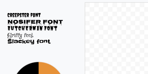
The fonts for this lesson are in a text box where each line is formatted with a separate font. This attaches the fonts to the document and makes them available.
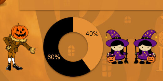
Below the font resources is a donut chart. The chart is one of the components I want students to include. The chart represents statistics on the number of people that wear a costume on Halloween. This information is available on ducksters.com —Halloween facts for kids.
https://www.ducksters.com/holidays/halloween.php
On the right side of the canvas are the graphics used in the product. They include a pumpkin scarecrow, scary pumpkin, and cute trick-or-treaters.
The background
I like to begin with a background. The background sets the tone of the project. It also sets the choice of colors. Click the Insert Image option in the button bar; select the Search web option.
Search for Halloween.
I chose the image with a haunted house and an orange moon in the background. Click on the image and click the Insert button. The button is at the bottom of the panel. You can also double click the image. That’s much easier.
Stretch the image so it fills the canvas. Don’t worry about deforming the image. Halloween images are scary and deformed.
Go to the shape selector tool. Select the rectangle shape tool.
Draw a rectangle anywhere over the image.
Use the background palette and set the color to dark orange 1.
Use the line color palette and choose the transparent option.
Go back to the color background tool; choose the custom option.
Move the transparency slider to the left. Not too much —about a fifth of the way.
The top of the custom toolbox has a Hex value for color and transparency. Enter this number if you want the same results I have. The Hex value is e69138c8. Click the OK button.
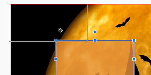
Move the box to the top left corner. Align the edges of the box to the edges of the canvas. Use the red alignment guides to help.
Stretch the box so it fills the image on the canvas.
The title
Go to the menu and click Insert. Choose the Word art option.
Type Halloween Facts in the Word art box. Press the Return key.
Keep the word art selected. Use the font menu to select one of the fonts provided with the document. Mine are all listed in the recent section. The fonts on your menu will be further down. I’m using the Creepster font.
Move the word art text box to the top center of the drawing canvas.
Use the background fill tool. Select a color for the title. I choose dark red 2.
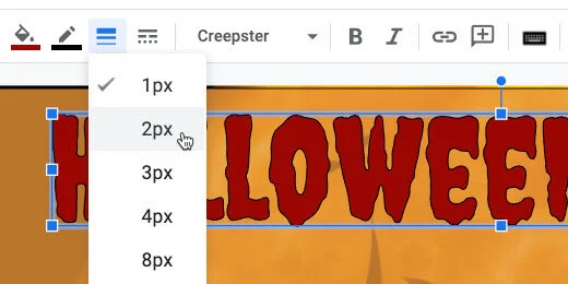
The text has a thin black border that helps the red stand out. Click the line thickness tool and choose the 2-pixel option.
Click the Format options button.
Place a checkmark on Drop shadow. Close the format options panel.
Bullet points
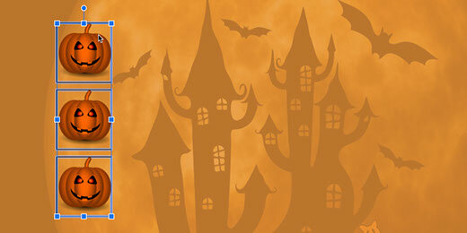
The pumpkin images will serve as bullet points. The pumpkin images are available on the document but I want to show you how to search for and insert them. Click the Insert image selector. Choose Search the web.
Search for Halloween pumpkin clipart. The clipart option is important.
Click the preview image icon for the first pumpkin.
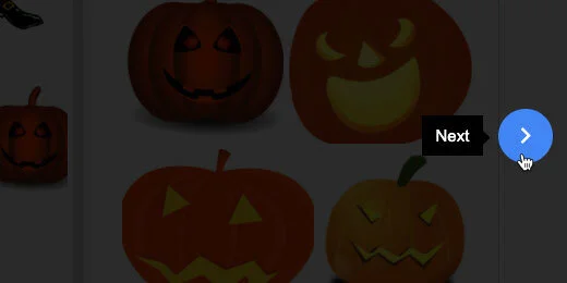
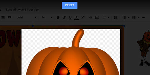
The clipart image appears in an overlay. The image is surrounded by tiny grey and white squares. These squares indicate that the background is transparent. That’s what we want. We don’t want to have to deal with some ugly background around the pumpkin.
Click the next button twice to get to the pumpkin image we need.
Click the Insert button.
Click the Format options button.
Open the Size & Rotation section. Place a checkmark on the Lock aspect ratio option.
Change the width to 1-inch. The height value changes to match the aspect ratio.
Place the pumpkin below the letter H for Halloween. Use the red alignment guides to position the image.
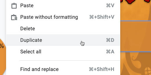
Go to the menu and click Edit. Select the Duplicate option.
Place the duplicate pumpkin below the first.
Repeat the process one more time and place the pumpkin below the second.
Hold the Shift key and click once on each pumpkin image. This selects all three images for the next step.
Use the border-color picker and set the border to transparent.
Go to the menu and click Arrange. Use the Align option and select Center. This aligns the images to the center.
Go back to the menu and select Arrange again. Go to the distribute option and select vertically.
Text boxes
Use the text box tool and place a text box next to the first pumpkin.
Click the Format options button. Go to the Size & Rotation section. Set the width to 6.3 and the height to 1 inch.
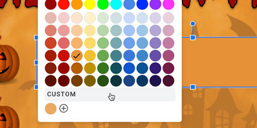
Click the background color tool; select the same orange we’ve been using.
Go back to the background color tool and choose Custom.
Move the transparency slider to the left. Move it so it’s just above the letter ‘o’ in OK. Click the OK button.
Place a checkmark on the drop shadow option. The option is in the Format options panel.
Go to the menu and click Edit; choose the duplicate option.
Use the vertical and horizontal options to align the duplicate with the previous text box.
Duplicate this text box and move it next to the last pumpkin image.
Remaining images
Get the donut chart and move it below the last text box.
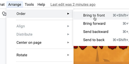
When you let go of the chart it will look like it disappeared; it didn’t. Images are placed on invisible layers. The donut chart is in one of the first layers so it is below the background image. We need to bring the image to the top layer.
Click Arrange and move to the Order option; select bring to front.
Bring the images I placed on the right side of the canvas and place them on either side of the donut chart. Use the Order tool to bring the images to the front. Resize the scarecrow image so it fits.
Select each image and add a drop shadow.
The infographic design is complete. Fill in the text boxes with three facts about Halloween.
Lesson ideas
Infographics are versatile. Instead of facts, we can use it for other Halloween topics. Here are some examples.
Halloween short stories. Students write three short Halloween stories.
Halloween memories: Students write three Halloween memories. They can also write one long memory —each box represents a paragraph.
Halloween family: Students write a short story about a member of their family during Halloween.
Halloween poems are another option.
Make a cone shape with Google Drawings
Geometry isn't only about 2D shapes and angles. It includes 3D shapes. Representing 3D shapes on 2D surfaces like screens and paper is difficult. We can use orthographic projection to represent 3D objects in 2D space. There are different methods for representing 3D objects.
Introduction
Geometry isn't only about 2D shapes and angles. It includes 3D shapes. Representing 3D shapes on 2D surfaces like screens and paper is difficult. We can use orthographic projection to represent 3D objects in 2D space. There are different methods for representing 3D objects.
One method used in technical drawings is isometric projection. Another familiar perspective is a Cabinet graphical projection. Cubes are often represented using this projection. Artists often use perspective projections. This is common with buildings and landscapes. There is a family of graphical projections. The images below represent some of these projection groups.
Use the links below to get a copy of this final product or to see a preview.
See a preview of the final product
Cone
Google Drawings has plenty of shapes to help with geometry. It has a couple of 3D shapes. It does not have spheres or cones. In this lesson, we are creating a cone shape.
Create a Google Drawing document. Click File in the menu and go to the page setup option. Set the width and height to 10 inches. Rename the drawing cone.
Select the triangle tool from the shapes selector.
Drag out a basic triangle.
Click the Format options button in the button bar. Select the size & rotation section in the format options panel.
Set the width to 6-inches and the height to 7-inches.
Drag the shape to the center of the canvas. Use the alignment guides.
Change the fill color. Choose white.
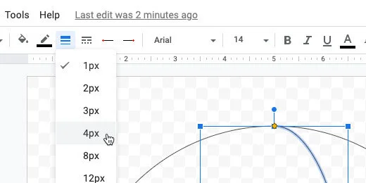
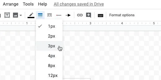
Change the line thickness to 3 pixels.
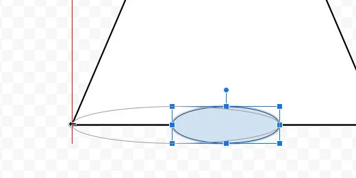
Select the oval tool. Create a small oval next to the triangle.
Move the oval to the bottom of the triangle. Use the alignment guides to center the oval.
Stretch the left side of the oval. Align it to the left angle of the triangle.
Stretch the right side of the oval. Align it to the right angle of the triangle.
Change the oval fill color to white.
Change the border color to a dark gray.
Change the line thickness to 3 pixels.
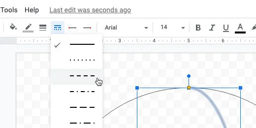
Set the line style to dashed.
Select the triangle. Click Arrange and go to the Order option. Select the option to bring it to the front.
Each shape is placed on a layer. The triangle was the first shape so it was placed on the first layer. Each new layer is placed above the first. The oval was placed on the second layer. The operation we just performed brought the triangle layer to the top. Part of the oval has disappeared below the triangle.
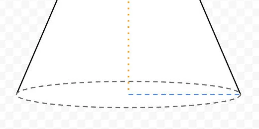
Select the line tool and create a small vertical line next to the triangle. Use the Shift key to create a straight vertical line.
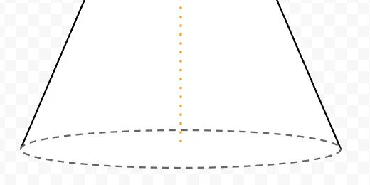
Set the line thickness to 4 pixels. Choose dotted for the line style. Select orange for the line color. Move the line to the top of the triangle. Use the alignment guides to center the top of the line to the top of the triangle.
Drag the line’s bottom to the bottom of the triangle. Use the purple anchor point to attach the line to the triangle.
Click on the triangle. Go to Arrange and then to the Order option. Select Send to back.
Create a horizontal line. Place it next to the triangle. Change the line thickness to 3 pixels. Change the line color to blue. Change the line style to dashed. Move the line to the bottom of the cone. Align the left side to the orange line. Align the line itself to the center of the oval. Use the alignment guides.
Connect the right side of the line to the edge of the oval on the right.
The blue line represents the radius of the base.
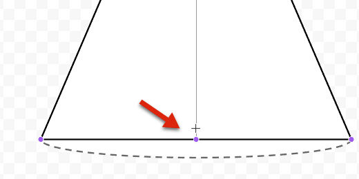
Select the arc tool from the tools selector.
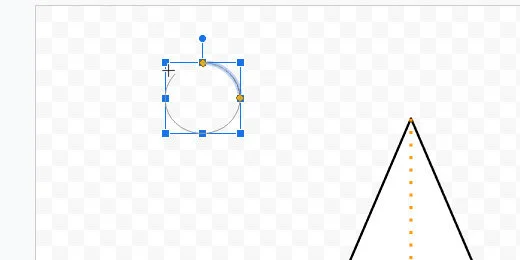
Draw a small arc next to the triangle. Use the Shift key to keep the arc symmetrical.
Drag one of the arc anchor points to form a circle. Don’t complete the circle. Leave a small gap.
Drag the arc to the bottom of the cone. Align it to the center of the oval.
Stretch the left side of the arc to the left edge of the oval.
Stretch the other end of the arc to the right side of the oval.
We need to align the arc to the oval. The arc will be directly over the oval. Hold the Option key and drag the bottom resize hand toward the oval border. The option key keeps it centered while it is resized.
Drag the left arc anchor point to the left. Place the yellow anchor as close as you can to the edge of the oval and the angle of the triangle.
Repeat the process for the other arc anchor point.
Change the arch line thickness to 3 pixels. Set the line style to solid. This completes the illustration.
Make a sphere with Google Drawings
Geometry isn't only about 2D shapes and angles. It includes 3D shapes. Representing 3D shapes on 2D surfaces like screens and paper is difficult. We can use orthographic projection to represent 3D objects in 2D space. There are different methods for representing 3D objects.
Introduction
Geometry isn't only about 2D shapes and angles. It includes 3D shapes. Representing 3D shapes on 2D surfaces like screens and paper is difficult. We can use orthographic projection to represent 3D objects in 2D space. There are different methods for representing 3D objects.
One method used in technical drawings is isometric projection. Another familiar perspective is a Cabinet graphical projection. Cubes are often represented using this projection. Artists often use perspective projections. This is common with buildings and landscapes. There is a family of graphical projections. The images below represent some of these projection groups.
Use the links below to get a copy of this final product or to see a preview.
See a preview of the final product
Sphere
Google Drawings has some 3D shapes. These shapes include the cylinder and cube. It does not have a sphere or a cone. We will create a sphere.
Create a folder to store the geometric shapes. I have my 3D shapes folder within a geometry folder. That folder is within an assignment folder. Go into that folder to create the sphere.
Go to your Google Drive and open the folder where the Sphere will be saved. Create a new drawing document. Set the document name to Sphere. Click File and go to the page setup option.
Select the custom option from the page setup selector. Set the width and height to 10-inches. Click the apply button.
Click the shapes selector. Choose the oval tool.
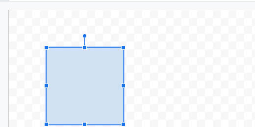
Drag out a circle shape. Press the Shift key on your keyboard to constrain the shape to a circle. The circle doesn’t have to be large.
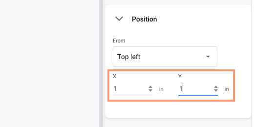
Go to the button bar and click Format options. Click the Position section. Set the X and Y position values to 1-inch.
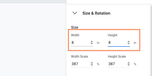
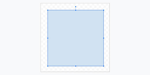
Select the size & position section. Set the width and height values to 8-inches.
Use the shape color fill tool and choose the Transparent option.
Select the arc tool from the shapes selector.
Draw a small arc shape outside the circle area. Press the Shift key to create a symmetrical arc.
Use one of the yellow anchor points to trace a circle. Don’t complete the circle. Leave a small gap.
Move the arc shape to the top center of the circle. Use the alignment guides to help align the shape.
Drag the bottom resize handle down.
Release the shape when it touches the opposite end of the circle.
One of the yellow anchor dots should be somewhere within the circle. Click and drag the yellow dot down to the bottom of the circle.
The yellow dot should be touching the bottom of the circle.
The other yellow dot should be touching the top of the circle.
Open the size & rotation option. Set the width of the arc to 3-inches. Make sure the height is set to 8-inches.
Changing the size moves the arc slightly off-center. Drag the arc toward the center of the circle. Use the alignment guides.
Change the arc line color to a light gray.
Change the line thickness to 4 pixels.
Set the line style to dashed.
Click Edit and select Duplicate.
Click Arrange and go to the Rotate option. Select Flip horizontally.
Drag the duplicate shape and center it within the circle.
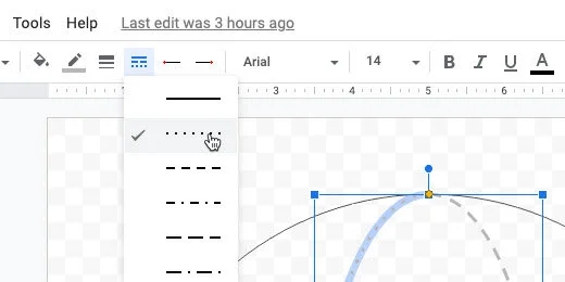
Change the line style. Use the dotted line style.
The next step is optional. Try it out so see if is something you want for your sphere.
Select the circle.
Click the color fill selector. Switch to the gradient section.
Choose a gradient from the fourth row.
You don’t have to give the sphere a gradient color. I think it adds some depth. The next step creates the diameter and radius lines.
Select the line tool. Draw a horizontal line outside the circle. Hold the Shift key to keep the line horizontal.
Change the line thickness to 3 pixels. Change the line style to dashed. Press the ESC key to deselect the line.
Move the line to the center of the circle. Use the alignment guides.
Drag the right anchor to the edge of the circle. Connect it to the anchor that appears at the edge. Repeat the process for the other end of the line.
We are going to duplicate this line. Click Edit and select Duplicate. Drag the right endpoint up. Connect it to one of the connectors on the circle above the diameter line.
Drag the other end of the line. Connect it to the center connector on the diameter line.
Click the Textbook button. Click outside the sphere. Type the capital letter D in the box. Resize the textbook. Place the letter where the radius line meets the diameter line.
Create another text box. Type a lower case letter r. Resize the box and position it next to the radius line.
Measuring angles with a protractor in Google Drawings
In this lesson, we are creating graphics for geometry angle assignments. The images are used by students to measure angles. Students use the image of a protractor to help them measure these angles.
Introduction
In this lesson, we are creating graphics for geometry angle assignments. The images are used by students to measure angles. Students use the image of a protractor to help them measure these angles.
The angles we are using here are based on a previous lesson. Use the link below to review that lesson.
I am providing the finished product links below. Use them if you don’t want to create the angles from scratch. Each link creates a copy of the angle in your Google Drive.
The angles are available on my Teacher Pay Teacher storefront. They are free. The link to the storefront is available below this paragraph. I encourage you to follow along in the lesson. The point of the lesson is to learn new skills.
Create basic angles with Google Drawings
The protractor
Students need a protractor to measure the angles. There is a free image resource available from Wikimedia Commons. This image is in the public domain. The link to the image on Wikimedia is available below. I also have a copy of the protractor available in a Google Drawing.
Don't download the image from the Wikimedia page. We will use the link to directly insert the image into a drawing.
https://upload.wikimedia.org/wikipedia/commons/5/5b/Gradeboog1.png
Vocabulary
Geometry and angles have their own set of vocabulary. Here are the terms used in this lesson.
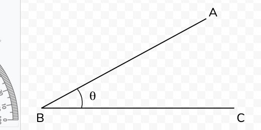
Vertex is the point where line segments meet at an angle.
An arm is a term used for the lines of an angle.
An angle is where the arms meet in a vertex.
An initial side is an arm that lies flat on the x-axis.
The Terminal side is the arm that is opposite the initial side.
Theta is the symbol used for angles.
Acute angles
Open the acute angle drawing. Use the link above to get a copy. Make a copy of the Drawing. Click File and select Make a copy.
Set the name of the copy to 15-degree angle. Click the OK button.
The image in the drawing is grouped. I recommend grouping the objects to prevent students from accidentally moving objects out of place. We need to ungroup the objects to create the angle.
Click once on one of the lines. Click Arrange and select Ungroup.
Press the ESC key on your keyboard or click once outside the angle to deselect the objects. Click on the Terminal arm.
We are going to change the angle of the line. To change the angle we need to rotate it to 90-degrees. Click and drag the terminal line endpoint to the left. We want the line to be straight up and down. Hold the Shift key will moving the endpoint. This forces the line into a perfectly vertical position.
The line needs to be at a 90-degree angle.
Hold the Shift key and drag the line endpoint to the right. The line will snap as you move it to the right. The line snaps at 15-degree increments.
Keep moving the endpoint down. Stop when the line snaps to a point before it reaches the initial arm.
This is our 15-degree angle. We need to clean up the letters and symbols. Select the arc symbol. Move the top arc endpoint toward the terminal arm. Use the plus symbol to align the endpoint.
Reposition the letters and the Theta symbol.
Draw a selection around all the objects. Click Arrange and select Group.
Move the angle toward the center of the canvas. Use the alignment guides to center the angle.
The protractor
We need to supply the protractor for students to use. Go to the beginning of this lesson and copy the link to the image.
Click Insert and go to the Image option. Select the option to insert an image by URL.
Paste the link into the URL box. The image of the protract appears in the preview box. Click the Insert button.
Measuring the angle
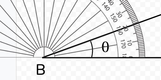
This is what students will do. Drag the protractor so the 90-degree mark is at the vertex. The image disappears as we drag it. Place the image close to the vertex. Use the up, down, left, and right arrow keys to position the image.
The terminal line lies on the 15-degree mark.
Adjusting the protractor
The protractor and the line are the same color. It might be difficult for some students to determine the reading.
Select the protractor image. Click the Format options button. Select the Recolor section.
Click the recolor selector. Choose a color.
The color provides added contrast.
There is another option to increase contrast. Open the Adjustments section. Move the transparency slider to the right. Move it somewhere close to the midway position.
The terminal line of the angle is easier to see.
Place the protractor to one side of the drawing. Students will drag it onto the drawing.
Distribute a copy of the angle to students using Google Classroom.
More angles
There are many more angle options. Make a copy of this drawing. Set the name of the copy to 30-degree angle.
Select the angle and ungroup the objects. Click the terminal line endpoint. Hold the Shift key. Move the endpoint up and to the left. It will snap to the next 15-degree point.
Adjust the letter for the endpoint. Move the endpoint for the arc to meet up with the terminal line. Adjust the Theta symbol. Select all the objects and group them. This prevents students from accidentally moving the objects separately.
Different angles
We have been making angles with increments of 15-degrees. Let’s make an angle for 20-degrees.
Make a copy of the drawing. Set the name to 20-degree angle. Select the angle and ungroup the shapes. Select the terminal line. Open the Format options panel. Select the Size & rotation option.
The shape can only be rotated clockwise. Shapes are always set to zero degrees when created. Rotating a shape counterclockwise is not possible using the rotation setting.
The terminal line is 30-degrees from the initial line. Rotate the angle 10-degrees to return to 20-degrees.
The shape rotates about the center. This causes the endpoint to move from its connection with the initial line.
Drag the rotated line down until the endpoint aligns with the initial line.
Adjust the arc and move the Theta symbol.
Move the protractor image in and measure the angle.
Move the protractor back to where it was.
Draw a selection around the objects. Group the objects. Center the angle on the canvas.
More angle options
I like to begin with the right angle for most angles. Make a copy of the angle we created. Name the new drawing 60-degrees. Ungroup the angle. Select the terminal line. Drag the top endpoint to the left. Use the shift key to form a vertical line.
Open the Format options panel. Open the Size & Rotation section. To create a 60-degree angle we need to subtract the difference from 90-degrees. That gives us 30-degrees. Enter 30-degrees in the degrees field.
Move the terminal angle and align it with the initial line endpoint.
Adjust the arc and reposition all the text boxes.
Obtuse angles
We create obtuse angles using the same process. We need an obtuse angle to get started. Use the link below to get a copy of a basic obtuse angle drawing.
Get a copy of the obtuse angle.
Make a copy of the angle. Name the copy 140-degree angle. Ungroup the objects. Select the terminal line.
Move the top endpoint so the line is horizontal. Remember to use the Shift key.
Click the Format options button. Open the Size & Rotate section. We need to subtract 140-degrees from 180. This leaves 40-degrees. Enter 40-degrees in the angle field. Move the line and align it with the horizontal line endpoint.
Rearrange the text boxes. Group all the objects and center the angle on the drawing canvas.
The process isn't too difficult. I hope you find these instructions useful.
Angles with Google Drawings
In this lesson, you will learn how to create a variety of angles with Google Drawings. Use the angles to teach and assess student knowledge of various angles. We will create a right, acute, and obtuse angles. Samples of the angles are available for your Google Drive account.
Introduction
In this lesson, you will learn how to create a variety of angles with Google Drawings. Use the angles to teach and assess student knowledge of various angles. We will create a right, acute, and obtuse angles.
The angles are available for you to copy and use without going through the lesson. I do encourage you to go through the lesson to learn a few skills. The links are available below.
right angle
acute angle
obtuse angle
Vocabulary
Geometry and angles have their own set of vocabulary. Here are the terms used in this lesson.
Vertex is the point where line segments meet at an angle.
An arm is a term used for the lines of an angle.
An angle is where the arms meet in a vertex.
An initial side is an arm that lies flat on the x-axis.
The Terminal side is the arm that is opposite the initial side.
Theta is the symbol used to identify angles.
Preparing the Drawing
Open Google Drive. Make sure to create a folder to store the drawings. Mine is stored inside an assignment folder. This folder has a math folder. Inside that folder, I have a geometry folder. In that folder, I have a folder for the angle drawings. I also have folders for my 2D and 3D shapes.
Click the New button to create the Drawing document.
Set the name of the drawing to a 90-degree angle.
Click File and select Page Setup. Click the page selector and choose Custom. Set the page size to 10 by 10 inches. Click the Apply button.
Select the Line segment tool from the line selector.
Draw a horizontal line on the canvas. Press and hold the Shift key to create a perfect horizontal line.
Click the Line weight selector. Choose the 4 pixels.
Press the ESC key to exit the line segment tool. Make sure the line is still selected. Click Edit and select the Duplicate option.
Click the Format options button.
Open the Size and Rotation section in the format options panel. Click the Rotate 90-degree button.
Drag the vertical line to the left edge of the horizontal line. Use the red alignment guides to position the top of the vertical line with the left side of the horizontal line. The lines need to be at right angles to each other.
Drag the horizontal line to the bottom. Align it to the right.
Draw a selection around both lines. Click Arrange and select Group.
Go to the Size & Rotation section. Change the height and width to 8 inches.
Open the Position section. Set the position for X and Y to 1-inch.
Click the Text-box tool.
Click once in a space above the angle. Type the letter A. Change the font size to 36 points. Resize the text box. Place it above the vertical line.
Click Edit and select Duplicate. Move the duplicate letter to the bottom. Change the letter to B.
Duplicate the text box. Place it to the right of the horizontal line. Change the letter to C. The letters are used to reference the angle in questions.
We will use this angle to create other angles.
Acute angle
Click File and select Make a copy.
Change the name of the drawing to an Acute angle. Click the OK button. Select the vertical line. Click the Format options button. Open the Size & Rotation section. Click in the angle field. Change the angle to 45-degrees.
Drag the rotated line to the horizontal line. Align the ends of each line. Use the alignment guides.
Move the letter A. Place it above the angled line. Drag a selection around all the objects. Click Arrange and select Group.
Click the line and drag the shape toward the center. Use the alignment guides to center the angle vertically and horizontally.
This will serve as our template for future acute angles. Before creating more angles we need to take care of a couple more items.
Click the shapes selector. Choose the arc tool.
Draw an arc on the canvas. Hold the Shift key to create a symmetrical arc. Don’t make the arc too big.
Move the arc down to the angle.
Open the Formatting options panel. Rotate the arc 15-degrees.
Move the arc so the endpoints touch the arms of the angle. Change the arc line thickness to 3 pixels.
Theta symbol
We need a symbol for the angle. This symbol is Theta. Open another tab and go to https://math.typeit.org. Click on the Theta symbol. It looks like the number zero with a horizontal line through it. The symbol is placed in the text area.
Select the symbol in the text area and copy it. Return to the drawing tab. Paste the symbol. A text box is created to hold the Theta symbol.
Set the font size to 36 points. Resize the text box to surround the Theta symbol. Move the text box. Place it within the angle.
Obtuse angles
Make a copy of the acute angle. Set the name of the copy to an obtuse angle. Select the angle. Click Arrange and select Ungroup. Deselect the shape. Select the diagonal line.
Open the Format options panel. Click the Flip horizontal button.
Move the inverted diagonal line to the left. Align the endpoint with the horizontal line.
Drag the arc closer to the vertex. Drag the top arc endpoint to connect with the terminal side.
We are going to select the arms and the arc. Hold the Shift key and click on each arm.
Click Arrange and select Group. Go to the Resize & Rotation panel. Set the width to 8-inches. Set the height to 4-inches. Move the obtuse angle to the center of the canvas. Reposition the letters and the Theta symbol.
Basic geometric shapes with Google Drawings
In this lesson, we will be learning how to create basic geometric shapes. Use the shapes in assignments and assessments. The shapes are created using Google Drawings. The tools in Drawings makes the process of creating the shapes simple.
Introduction
In this lesson, we will be learning how to create basic geometric shapes. Use the shapes in assignments and assessments. The shapes are created using Google Drawings. The tools in Drawings makes the process of creating the shapes simple.
The final products in this lesson are available and free on my Teacher Pay Teacher store. I have created some free assignments and assessments for you. They are on my Teacher Pay Teacher storefront. Use the links below to access those resources. I encourage you to go through the lesson and create the shapes yourself. The process adds to your skillset.
Google Drawing shapes on Teacher Pay Teacher
Google Drawings
Create a folder in your Google Drive to store the geometric shapes. Here I have my geometry folder inside my assignments folder.
Within the geometry folder, I have a 2D shapes and a 3D shapes folder. Create a folder for your 2D shapes.
Create a new Google Drawing.
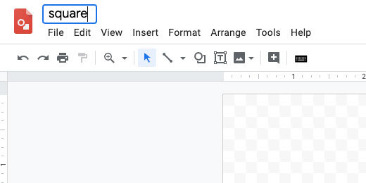
Set the name of the drawing to Square. We will begin with something simple.
Drawing setup
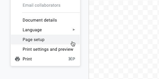
The default canvas has a size ratio set at four by three. I like to have a square-shaped canvas. This gives me a consistent framework for the shapes in the final product. Click File and select Page Setup.
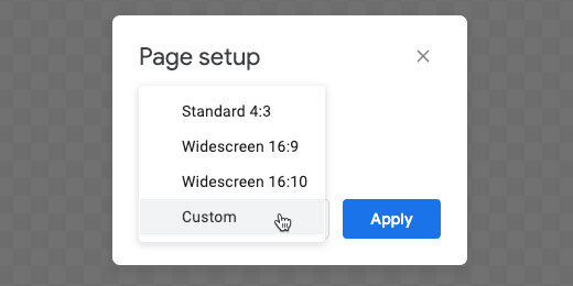
Click the page setup selector and choose custom.
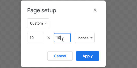
Set the width and height values to 10 inches. Apply the changes.
The square
Click the shapes selector button. Select the rectangle tool.
The rectangle creates a free form rectangular shape. The shape we want here is a square. We need to constrain the shape to a square. There is a keystroke that helps us. Press and hold the shift key while dragging out the shape.
The shape does not need to fill the canvas. We will take care of that in the next step. Click the Format options button.
Open the Position option.
Set the x and y values to 1-inch.
The values place the top left corner one inch away from both the top and left edges of the drawing canvas.
Open the Size & Rotation settings. Set the width and height to 8-inches.
The shape is centered on the canvas with a 1-inch space all the way around.
Click the shape fill tool. Select white.
Click the border width tool. Set the width to 4-pixels.
Click the text box tool.
Click once in the area between the box and the edge of the canvas.
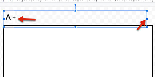
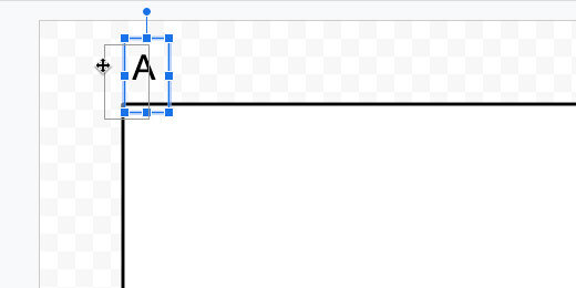
Change the font size to 30 points. Type a capital letter A in the text box. Click the resize handle on the right and drag it toward the left. Stop before you get to the letter.
Click and drag one of the text box sides to position the letter near the corner of the square.
Click Edit and select Duplicate. Click and drag the duplicate letter to the right side of the square. Use the red alignment guide to keep the text boxes aligned. Double click in the text box. Change the letter from A to B.
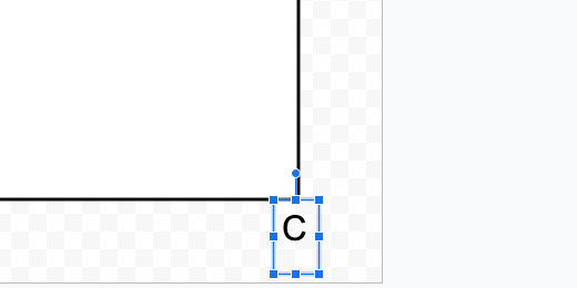
Click once on once of the text box sides. Duplicate this text box. Move the text box to the bottom right of the box. Change the letter from B to C.
Duplicate this text box. Move the duplicate to the lower-left corner of the square. Change the letter from C to D.
Our square is done. The letters are used in the assignment to refer to the sides.
The rectangle
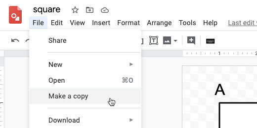
To save time we will use the square as a starter. Click File and select Make a copy.
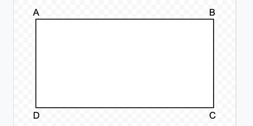
Change the name to Rectangle. Click the Ok button. Click once on the shape. Open the Format options. Open the size & rotation option. Change the height to 4-inches. Open the position option. Change the Y value to 3-inches. Make sure the rectangle is centered vertically.
Move each of the text boxes close to each corner. Use the alignment guides to help position them.
That completes our rectangle.
Right triangle
Return to Google Drive. Click File and select new Drawing. Change the page size to 10 inches by 10 inches. Name the new drawing Right Triangle. Click the shapes tool and select the right triangle tool.
Drag out a small right triangle on the canvas.
The options for the right triangle are almost identical to those for the square. Set the position for the triangle. Set X and Y to one inch. Set the width and height to 8-inches. Use the text box to create letters for each angle. Set the background color to white. Set the border thickness to 4 pixels.
Right triangles face in different directions. Let’s create those different right-triangle options. Make a copy of this drawing. Name the new drawing Right Triangle B. Select the triangle. Click Format options. Open size & rotation. Click the rotate by 90-degrees button once.
Reposition the letter B. We have our second right-triangle option.
Create two more right-triangle options. Rotate each by the same 90-degrees. Name the right-triangles with the letters C and D.
Regular triangles
There are many other triangle forms. There are isosceles, equilateral, acute, obtuse, and scalene.
Create a new drawing. Set the page size to 10 by 10 inches. Name the drawing isosceles triangle. Click the shapes tool button. Select the triangle tool.
Draw a triangle shape on the canvas. This triangle shape is used to create a variety of triangles. Use the format options panel to set the hight larger than the width. This makes an isosceles triangle. Add text boxes with the letters A, B, and C for each angle.
In assignments, students need to solve for the area. To calculate the area, they need to know the height. We need a line to mark the height of the triangle.
Click the shapes selector and choose the line tool.
Click and drag a short line on the canvas. The line needs to be vertical. Hold the Shift key while drawing the line.
Click the line color tool and choose a dark grey. Set the line thickness to 3 pixels. Set the line style to dashed. Press the ESC key on your keyboard to release the line.
Drag the line toward the center of the triangle. A center alignment guide appears to help align the shapes. Release the line.
Drag the ends to stretch the line. The triangle has connection points. This helps connect the line to the center of the lines or the corners on the triangle.
Stretch the bottom of the line. Attach it to the line connector.
This completes the isosceles triangle.
Equilateral triangle
Make a copy of the isosceles triangle. Set the name of the drawing to Equilateral Triangle. Change the width and height. Use 8-inches for each. Reposition the text boxes as needed.
Scalene triangle
Make a copy of the equilateral triangle. Rename the file to Scalene Triangle. All the sides of a scalene triangle are different. There is an orange anchor at the top of the triangle. Click and drag the anchor to the left or right.
Shrink and stretch the bounding box until you have a triangle with different angles and sides. Move the letters to match the new angle positions.
After deforming the shape, it is no longer centered. It also doesn't fill the canvas. Drag a selection around the shape and the letters.
Drag the shape and letters selection toward the center of the canvas. Use the vertical and horizontal alignment guides.
Repeat this process to create different scalene triangles.
Circle
The circle will be our last shape. By now you should understand the process.
Create a new drawing. Set the canvas page settings. Choose the oval tool from the shapes selector.
Drag out a circle shape on the canvas. Use the Shift key to constrain the shape to a circle.
Use the format options panel to set the height and width of the circle. Set each to eight inches. Change the fill color. Choose white. Set the border thickness. Choose 4 pixels.
Get the line tool. Create a dashed line. Connect the dashed line to opposite ends of the circle. This marks the diameter of the circle.
Duplicate the diameter line. Connect one end to the center of the diameter line. Connect the other end to a separate point on the circle. This is the radius.
Create labels A, B, C and D. Place them where the lines touch each other or the circle’s circumference.
Assignments with shapes
There are plenty of shapes available in Google Drawings to create a wide variety of geometric shapes. Use the shapes and Google Docs to create assignments and assessments. Here is an example of an assignment.
The students determine the perimeter or area of rectangles and squares. I used a table in Google Docs to organize the shapes and questions. Using letters for points on the shape allows me to identify them as line segments. This then allows me to provide measurement information. I have free samples on my Teacher Pay Teacher storefront.
Matching with Google Drawings
In this instruction, you will learn to create a matching exercise using Google Drawings. Match by connecting lines to vocabulary, ideas, and concepts. Create the assignment and reuse it for different assignments. Distribute the assignment using Google Classroom. Use the assignment for review and assessment.
Fun matching assingments for students
Remember those matching exercises where you drew a line from one item to another? That is what this lesson is about. We are creating a matching exercise for students to match a list of items with another.
Use the links below to get a copy or preview of the final product.
Get a copy: https://bit.ly/2AZ1W7Y
Get a preview: https://bit.ly/2AXuqPL
This lesson begins with Google Sheets to organize our items. We then use Google Drawings to create the exercise itself. I have the link to the exercise in Google Sheets if you would like to follow along. The link is below.
Get a copy of the exercise to follow along.
Use the sheet from the link above or create a new blank Google Sheet. Title the Sheet Matching Activities lists. The list in the example has 10 words. Columns one and two contain the prefix and root word.
Using Google Sheets to organize the content is much easier than trying to do it in Drawings. There is another benefit of using Sheets.
We need to mix the prefixes and root words for the exercise. Select the prefixes.
Click Data and select Sort Range.
Click the Sort button.
Select the root words. Click Data and select Sort Range. Click the Sort button.
We have a nice mix for the exercise.
Open a new tab. Go to your Google Drive and create a Google Drawing. Title the Drawing Prefix Review Assignment. Return to the spreadsheet. Select the prefixes in column A. Copy and paste them into the drawing. Select the option to paste unlinked. Click the paste button.
Move the mouse arrow to the top of the table. Move the arrow to one side of the three dots. Look for the arrow to change to four arrows. Click and drag the table to the right.
Return to the spreadsheet. Copy the root words in column B. Paste them into the drawing. Remember to unlink the pasted contents.
Move the table with the root words to the right.
Click on the table with the prefixes. Make sure the outline of the table is visible.
I am going to be precise about the placement of my tables and content. This is to help you set up a document like mine. Click the Format options button.
Open the Position section.
Set the X and Y positions to 1.5 inches.
Open the size and rotation section. Set the width to 1.5 inches. Set the height to 5 inches.
Select the table with the root words.
Open the Position section. Set the X position to 6.5 inches. Set the Y position to 1.5 inches.
Open the size & rotation section. Set the width to 1.5 inches. Set the height to 5 inches.
Return to the table with prefixes. Select the cells in the table.
Set the font to Ariel. Change the font size to 24. Set the text to Right Justification.
Select the root words. Set the font to Ariel. Change the font size to 24.
Click the shape selector. Choose the oval tool.
Create a small circle on the canvas.
Change the width and height to .35 inches.
Click the border color tool. Select the transparent option.
Move the circle next to the first prefix. Use the smart guide to align the circle to the bottom cell border.
Click the line selector tool. Choose the arrow.
Move your mouse arrow to the circle. The arrow changes to a plus symbol. Move the symbol over the circle. Dots appear around the circle. These are anchor points.
Click the anchor point on the right side. Drag an arrow to the right.
Press the Esc key to release the tool.
Click the line thickness selector. Choose a thickness of 3 pixels.
Click on the canvas to deselect the arrow.
Click and drag a selection around both shapes.
Click Edit and select Duplicate.
Move the duplicate shape down. Use the alignment guides to align the objects.
Keep the shape selected. Use the shortcut keys Control+D on windows or Chromebook to duplicate the shape. Use Command+D on Mac. Move the duplicate shape below the previous shape. Use the distance guides to help space the shapes evenly. Repeat this process for the remainder.
Draw a selection around all the shapes. Click Edit and select duplicate.
Move the duplicate to the right of the original. Deselect the duplicate.
Draw a selection so only the arrows are selected. Press the delete key to remove the arrows.
Draw a selection around the circles. Move the selection to the right. Move them close to the root words. Use the alignment guide above. This keeps the circles aligned with the ones on the left.
Keep the circles selected. Click the border color tool. Choose a color.
Select the fill tool and choose white.
Choose the circle for the first prefix.
Click the fill color. Choose light red berry 2.
Select the arrow.
Click the arrow color tool. Choose light red berry 2.
Go to each of the circles and arrows and choose a different color. Make sure the colors contrast.
Right-click on an empty area of the canvas. Go to the background option. Choose a neutral grey.
Select all the cells in the prefix table.
Click format and go to the Borders & lines option. Choose the Transparent option.
Repeat the process with the root words table.
Don't do this next step yet. I need to show you how to go through and reset the assignment in a moment. This is how it works. Students click on an arrow.
They click and drag the arrow point to the corresponding root word. The arrow attaches itself to one of the anchor points.
They select the next arrow and repeat the process.
The different colors identify the connections.
Add a title to the top of the assignment. Click Insert and select the Text box.
Draw a rectangular text box.
Provide a title.
Make a copy for students.
Put the word student somewhere in the new name.
Go back to the tab with the original document. This is your copy. You will use this for demonstration, in-class participation, or review. This is what I do with my documents when teaching.
Teacher master document
I use Google's Version history. Click File and go down to Version history. Select the Name Current version option.
Name the version Original and click Save.
Use the arrows to make the matching connections.
Click File and go down to version history. Select see Version history.
Find the version name Original and select it.
Click the Restore this version button.
Answer key
It’s nice to have a version for the answer key. Connect the correct answers. Create a version and name it Answer Key. Go back to version history and retrieve the original version. Retrieve the answer key by selecting it from version history.
Bonus
Turn on the option to show only named versions.


