Custom 3D Bar charts with Google Drawings
The development of charts is an easy process with tools like Excel, Numbers, and Google Sheets. Excel and Numbers have excellent tools to develop colorful charts. Google Sheets has good tools to develop basic nice looking charts.
I think we can create some nice charts with Google Drawings and make them look nice. We need to put a lot of work into making something look nice but I believe the effort is worth it. Plenty of teachable moments.
Okay, why go through all the trouble?
I’m glad you asked.
Creating charts manually provides opportunities to teach and learn. It opens opportunities for students to experience another way to do the same thing. Developing a chart with Drawings provides opportunities for artistic expression. It gives students access to the behind the scenes stuff that’s usually hidden with modern applications.
This lesson arises from lessons I did with students.
The process took a couple of class periods; it was part of a much larger lesson. An unforeseen benefit arose from the process of creating charts manually. My students were better able to answer questions related to charts on those standardized tests. They were able to easily dissect the data presented in those charts. I credit this to their intimate experience in collecting data and creating charts manually.
Use the link below to see a preview of the finished product.
Paper airplane contest chart preview
Use the link below to get the template for our project. The template includes a table with the data. It also includes the font and a graphic used in the lesson.
Google Drawings working document
The project
The date for this project comes from a paper airplane contest. This is part of an overall lesson. In the lesson, we learn about the origins of flight and the principles of flight. One of the actives includes the construction of paper airplanes.
Students construct a paper plane. The design is based on several we found on the Internet. Students choose the design they want to use in the contest. All students agree to use the same design so the data is representative of the design. The first chart does not include variables like paper, paper size, and weight.
Students are separated into teams of two. Each team selects a name for their team. The name must come from one of the terms we learned about aviation. Some of the terms are shown on the table in the drawing template. Requiring these names prevents fights over strange unrelated names. The names make a nice connection to the academic vocabulary.
Each team gets three tries. The measurements are done with a member of the team and a member of an opposing team to make make sure there is no cheating. The three distance measurements are averaged by each team.
The averages are placed in a table. The distances are broken down into percentages. Each percentage is based on the longest average distance; the longest distance being 100-percent. The table forms the basis for the bar chart.
The template has two tables. One has all the teams and trials. The other contains the averages and percentages.

On the right side of the drawing is an image. This is an image of a typical paper airplane against a rose background. I will use this image for the chart background later.

Click once inside the average and percentage table. A border appears around the table. Move the cursor to one of the border sides. Look for the arrow to change to four opposing arrows. Move the table from the drawing canvas.

Place the table to the right of the drawing canvas. Place it under the paper airplane image.

Moved the other table to the other side of the canvas.

We are going to resize the canvas. This creates additional room for the bars we need in the bar chart. Click File and select Page Setup.

Select Widescreen 16:10 from the page selector; click the apply button.

Click the shapes button. Select the cube tool from the Shapes list.

Draw a thin rectangle on the canvas. This is technically a rectangular prism.

We have ten values; we need to make sure there is enough room for the bars to fit on the canvas. We also need to accommodate other elements in the chart. These elements include labels and titles.
There is a ruler that runs along the top of the canvas. The canvas is 10-inches wide.

We will leave 1-inch on either side for titles. This leaves 8-inches for the bars. We could divide the eight inches into equal spaces for the bar charts. This, however, would cause the bars to line up against each other. To have some breathing room between each bar the bars will be set to a width of .5 inches.
—Work the steps out with students.
Make sure the shape is still selected and click the Format options button.

Open the Size & Rotation section.

Change the width to 0.5 inches.

The height of the canvas is a little over 6-inches. Leaving an inch on top and bottom for labels leaves 4-inches. Change the height to 4-inches.

This bar represents the largest value; the longest average distance recorded. We need ten bars in total.
Click Edit and select Duplicate. A useful shortcut is the Ctrl+D or Cmd+D keys. This helps duplicate the bar quickly; we need eight more.

Leave the duplicate bar where it is and duplicate it.

Duplicate eight more. You will have nine duplicates of the original with a total of ten. You will have ten bars cascading down when it’s all done.
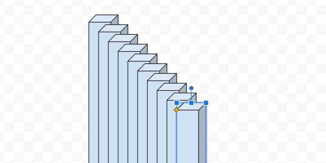
Draw a selection around the tops of all the bars.

Click Arrange in the menu and go to the align option. Select the align to top option.

The bars align with the top of the first bar.

Press the ESC key or click away from the selected bars. Click once on the first bar on the left.

Drag the bar to the left; hold the shift key to make sure the bar remains aligned with the others. Alignment guides follow the bar. Use the alignment guide and the ruler. Align the left guide to the number one on the ruler.

Select the last bar on the right. Drag it to the right; remember to hold the shift key. Align the right guide to the number nine on the ruler.

Draw a selection around all the bars.

Click Arrange in the menu; go to the Distribute option. Select the option to align the shapes horizontally.

The inner bars are evenly distributed between the first and last bar.

Keep all the shapes selected. Go back to the Arrange menu; select the Group option.

Click on the second bar. It should be selected on its own apart from the others. You can tell it is selected separately because the rotation handle appears above the shape.

This bar needs to represent 92.7 percent. This is the percentage of the average distance flown by the second-longest flight.

Open the Format options panel—if it isn’t open. Open the Size & Rotation section. Change the height scale to 93 percent. The scale option does not permit decimal percentage values. Round the percentages to the nearest whole number.

The bar size is adjusted from the bottom up. We will fix this once all the bars are sized.

Click on the next bar.

The next percentage value is 74.4. Round the percentage to 74 and enter it in the height percentage value.

Repeat the process with all the bars.

Press the ESC key to deselect any of the selected bars. Click once on any of the bars to selected the grouped bars.

We can’t arrange the bars while they are grouped.

Use the Arrange menu to ungroup the bars.

The bars remain selected. Use the Align option in the Arrange menu to align the bars to the bottom.

Return to the Arrange menu and group the bars.

The bars represent the percent values from largest to smallest.

Click the color fill tool. Go to the gradient section; choose light cornflower blue 2.

The gradient is applied to all the bars.

The default gradient is a good starting point. Let’s create our own. Return to the color palette and the gradient section. Click the custom option.

The gradient has a light blue on top and a darker shade at the bottom.

Gradients are made with color stops. The left color stop is light blue and the right is a darker blue. The light color stop is selected.

Click the color palette selector. Select light cornflower blue 1.

Click the right color stop.

Use the color palette to choose dark cornflower blue 2.

The gradient is a little darker. I chose blue; feel free to choose a gradient color pattern of your own. Click the OK button.

Click the border-color selector. Choose dark cornflower blue 3.

Values
We are going to use a text box to place the values for each bar. Click the text box tool.

Click once above the bar chart. Change the font size to 11 points. Type the value for the average distance of the longest flight.

Resize the text box and place it above the first bar.

Duplicate the text box; place it above the second bar. Change the value to 200.3. Repeat the process for each bar.

Click on the first text box; hold the shift key and click on the next. Repeat this process to select all the text boxes.

Click Arrange in the menu and select Group.

Axis lines
Charts have an axis that represents the X and Y values. The values for our chart are the team and distance. We need lines to identify these axis values and labels.
Click the Line tool selector; choose the polyline tool.

The polyline tool creates connected lines each time we click somewhere on the canvas. The tool is easy to use but tricky if you have never used it before. You have to remember to stop clicking otherwise you keep making lines.
Click once somewhere on the canvas. Hold the shift key and move the tool down to create a vertical line. Holding the shift key assures we create a straight vertical line. Click once to place the second point of the line.

Keep holding the shift key and move the tool to the right; make a horizontal line. Double-click to finish drawing the shape.
Press the ESC key on your keyboard after double-clicking. This deselects the tool so you don’t accidentally make another line.

We have our coordinate lines.

Move the shape to the lower left side of the bar chart.

Stretch the top part of the shape; place it just above the first number label.

Stretch the right side to the right of the last bar.

Leave space below the bars.

Chart title
Click Insert and select Word Art.

Type Paper Airplane Contest in the input box; press the Return key.

Move the title to the top of the canvas.

Change the font to Fugaz One and resize the word art box. Use the ruler to size the text box and match mine. The left edge of my word art box is at the 1.5-inch mark. The right edge is at the 8.5-inch mark.

Change the text fill color. Use dark cornflower blue 1.

Use white for the word art outline color.

Set the outline width to 3-pixels.

We need to move things around for the labels. The value labels are grouped separately from the bars. To select all the labels we need to pay close attention to the mouse pointer. The pointer will change to four opposing arrows when it is above the grouped labels.

Click once and that will select the grouped labels.

Move the value labels up and to the right. Use the alignment guide to push the grouped box against the bottom of the word art. Use the vertical center alignment guide to center the labels on the canvas. Press the ESC key to deselect the grouped labels.

Click once on one of the bars to select the grouped bars.

Using the mouse to move the grouped bars works fine for most situations. Moving the grouped bars hides the bars and makes it difficult to align them with the labels.

Instead of using the mouse, we are going to use the arrow keys. Press the up arrow key once or twice. Press the right arrow key once or twice. Use the combination of up, down, left, and right keys to position the bars under the values.

Click the axis lines shape; use the arrow keys to position it close to the bars.

Titles
We’ll add titles to the X and Y-axis. Click the text box tool and click anywhere on an empty area of the canvas. Type “Distance in inches”.

Resize the text box and center justify the text.

Drag the rotation handle on the text box to the left.

Hold the Shift key to force the text box to align vertically. Look for the angle measurement to read 270-degrees.

Move the text box to the left of the Y-axis line. Use the center alignment guide to position the title.

Click on the text box tool again; click on an empty area of the canvas. Type the first team name into the box. The team names are in the table we placed on the right side of the canvas. The table is editable. Copy and paste the text from the table for the labels.

Resize the text box. Don't make the width too small. It will need to accommodate the longer titles of team names. Align the text to the right. Change the font size to 11 points.

Rotate the text box to 300.0 degrees.

Move the text box and place it below the first bar.

The name just fits in the space at the bottom. We need more space for long team names. Click once on one of the bars.

Drag the bottom resize handle up. Use your best guess to determine how much additional space we need for the titles.

Click the X and Y-axis line. Move the bottom resize handle up and stop just before you meet the bottom of the bars.

Move the text box up to the x-axis line. Use the alignment guide to push the text box up against the x-axis.

Duplicate the text box. Move it to the next bar. Enter the name of the next team.

Repeat the process for the rest of the team names.

Make sure the first and last titles are aligned directly under their corresponding bar. Draw a selection around all the labels.

Go to the Arrange option on the menu. Use the distribute option to distribute the titles horizontally.

Return to the Arrange menu; use the align option to align the tops.

Return to the Arrange menu one more time and group the titles.

Use the up arrow key to nudge the text closer to the x-axis.

Resizing the bars will offset the value labels. Select the grouped labels. Look for the cursor to change to four opposing arrows before clicking.

Use the bottom resize handle to move the titles up.

The background
Move the background image onto the canvas. Resize the image so it fills the canvas.

The background offers a sharp contrast to the blue bars. This color is fine but I would like to see what other color options do to the design. Keep the image selected and click the Format options button. Open the Recolor section.

Use the recolor selector to choose a color overlay. Let’s see what purple looks like.

Wow! that is bright.

I think I’ll go for a light blue to match the bars.

Text shadow
Click on the main title. Use the format options panel. Add a drop shadow to the text art.

This is our finished custom bar chart.

Cylindrical bars
We aren't limited to 3-D rectangles. We can use cylinders. Select the bars group. Right-click to get the contextual menu. Use the Change shape option to access the shapes tools.

Select the cylinder shape.

We now have a bar chart that uses cylinder shapes.

Not all the shapes work well for bar charts. Here is one with arrows.
