Box Plot Charts with Google Drawings

In this lesson, we are creating a Box plot chart. Google Sheets does not have a tool to create a Box plot chart, so we will create our box plot using Google Drawings. We will begin with Google Sheets to collect and organize the information.
The chart for this lesson is based on data collected from a paper airplane lesson. Students had a flight distance contest. The distances are measured and rounded to the nearest foot. The worksheet with the data is available in the link below. There is also a link to the finished product.
Box plot final document preview
Box plot chart working document
Box plot Drawing working document
Box plots
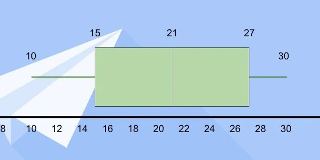
Box plots are used in statistics to visualize data. They show the lowest and highest data points. They show us the median value for all the collected data. It also shows us the median for the values that are below and above the median. These points are called quartiles.
The data is spread into four groups. Each quartile contains 25-percent of the total data. Representing the data with a box plot helps answer several questions about the data. We will explore questions and answers at the end of the lesson.
The Google Sheet contains the data from an airplane contest; 30 students participated; the measurements are in feet. These measurements are an average of three trial runs for each team. Each measurement is rounded to the nearest foot.

We need to pull some information from the data to create the box plot. First, we need the low and high values in the range. We also need the first and third quartile values. I provided a small table to organize the information.
Enter the number 10 under the title for Low and 30 under the title for High.

Let's begin with the second median for all the data. There are 30 measurements. Count 15 measurements down. At the 15th measurement, we have 21-feet. We also have 21-feet on the 16th measurement. Both values represent the median. We average the values and get a median of 21-feet. Enter 21 for the second quartile. I'll refer to this as the second quartile to avoid confusion.
*If the values had been 15 and 21 we would add them together and divide by two. This would have given a median of 18.*

The first quartile is the median value for the measurements between the lowest value and the overall median. There are fifteen measurements from the lowest number to the median. Count eight measurements from the beginning. The median value is 15. This measurement falls right in the middle so we don’t need to average.

Enter 15 for the first quartile.

The third quartile is the median value between the second quartile and the highest measurement. Count eight measurements from the second quartile. The median value is 27.

Enter 27 for the third quartile. We have the values needed to create the box plot.

The Drawing document from my template includes a solid line across the center of the canvas.

The drawing template also includes the values from the table and an image.

Click the text box button.

Click once above the black line.
Stretch the left side of the box to the edge of the canvas.

Repeat the process for the right side of the text box.

The text box is for the number range. Double-click inside the text box; type the number 0; press the Tab key and type the number 2. We use the tab key to space the numbers across the text box.

Repeat the process to enter even numbers from 0 to 30.

Click the justification button; center the text.

Move the text box below the black line. Use the alignment guides to center the box along the black line. Make sure the top of the text box is lined up along the black line.

Click the shape selector and choose the rectangle tool.

Click once above the number line.

Move the box over the number line. Place the left edge of the box halfway between 14 and 16. This is the location of the first quartile.

Stretch the right side of the box halfway between 20 and 22. This is the location of the second quartile.

Go back to the shapes selector. Choose the rectangle shape again. Place the shape above the canvas like the previous shape. Move the square to the right of the rectangle. Align the left edge of the square with the right edge of the first rectangle.

Stretch the right side of the shape so it lines up with the value for the third quartile—27.

Go to the line selector; select the line tool.

Position the line tool to the left side of the first rectangle. Purple dots appear along the edges of the rectangle. These are connectors for lines.

Click on the left dot; move the left side of the line above the number 10. Hold the Shift key to maintain a straight line.

Repeat the process for the right side of the second shape. Extend the line to the number 30. These lines are called the Whiskers. This chart is sometimes referred to as the Box and Whisker plot.

Click the text box tool. Place a text box on the canvas. Enter the number 15. Resize the text box; place it over the left edge of the first rectangle.

Place a text box with the number 21 between the boxes where they meet.

Repeat the process for the third quartile.

Use text boxes to mark the lowest and highest values at the end of the whiskers.

Click on the table—make sure the border appears around the table—press the delete key.

Insert a text box for the chart title. Set the font size to 38 points. Center the text box at the top of the canvas.

Move the image onto the canvas. Align it to the top-right edge.

Stretch the image so it covers the canvas.

The image is wider than the canvas. We need to crop the image. Click the crop tool.
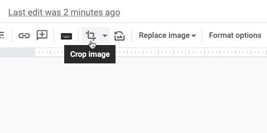
Drag the crop edge toward the black line. Stop when the alignment guides appear to mark the edge of the canvas. Press the Escape key to release the crop tool.

Adjust the color of the boxes to help them stand out against the image background. I changed mine to light green.
One more thing before we are done. Select the left Whisker.

Use the line endpoint selector; select the round endpoint.

Repeat the process for the right Whisker.

Box plot interpretation
This box plot represents a normal distribution; like the normal distribution curve. The low and high values are distributed evenly from the center.
Other box plots include those where the median is closer to one end of the quartiles. When the second quartile is close to the first quartile it is called a box plot with a positive skew. Most of the values are on the right side.

Box plots with the median close to the third quartile have a negative skew. Most of the values are to the left of the second quartile.

Here are some basic questions we can ask about the box plot.
1. What percent of the planes landed beyond 21 feet?
2. All of the planes landed within 30 feet. (T/F)
3. 50 percent of the planes landed less than 21 feet from the start. (T/F)
4. What is the Inter Quartile Range?
5. Any plane landing beyond 30 feet is an outlier. (T/F)