Weather Station Project: Lesson 9

Line charts
Line charts are used to represent trends in data over time. That describes the information we are collecting. The sensor takes temperature and humidity information at set intervals. That interval is currently every thirty seconds.
We need to select two columns of data. The first will be the time. The second will be the temperature in celsius. We will create charts for Fahrenheit and humidity later.
We don't need to represent all the readings in our chart. For this chart, we will take the first 24 readings. Click on the time heading and drag the mouse down the column to row 25.
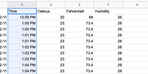
Move the mouse over to the adjacent column and select the corresponding celsius data.

Click Insert on the menu. Go down the list of options and select Chart.

Google will attempt to select a chart type for us. In my example, it chose a bar chart.

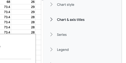
A panel opens to the right of the spreadsheet. This panel is used to edit and configure chart settings. Click the Chart type selector. Choose the first line chart option.

The chart isn’t much to look at now. This will change when we modify the sensor reading interval. The temperature readings are on the left.

The chart shows a blue line at the bottom. This represents the time intervals. Go to the panel. Click Use column C as labels.

The time intervals appear on the x-axis.

Click the Customize tab in the Chart editor panel.

Click the chevron next to Chart & axis titles.

Title the chart, Daily Temperature Data.
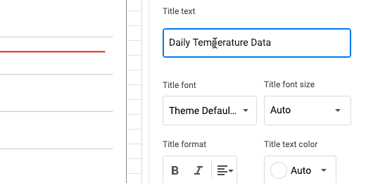
The title appears at the top left on the chart.

Click the text alignment selector and choose center-align.

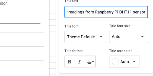
Click the title selector and choose Chart subtitle.

The subtitle is Sensor Readings from Raspberry Pi DHT11 sensor. Change the text alignment to center.
Go to the title selector and choose the Horizontal axis title.

Set the title to Time. Align the text to the left.

Select the Vertical axis title option.

Set the title to celsius.

Click the chevron again to collapse the section.
The tile labels don’t show every time reading. It would be convenient to have all the readings. Open the horizontal axis section.

Click the option to treat the labels as text. The labels are fitted within the horizontal axis.

The data in the chart is from the first day when we began accepting readings. New readings are appended to the end. Today’s sensor readings are at the bottom of the sheet. We need to filter and sort the sensor data.
Today’s Temperature
To display the temperature for the current day we need to filter the data. We do this within the query function.
We are going to create a new sheet for this chart. Click the Plus button to create a new sheet.

Double click the sheet name and change the name to Today’s Temp.

Inside of Cell A1, we will query the data. We only need the time and temperature information.
Type =query(‘sensor data’!B1:E,”select *”,1)

The name of the sensor data sheet is in single quotes. This is necessary because there is a space in the sheet name. The data range begins on cell B1. This is where we have the date information. The data in column E contains the temperature information in Fahrenheit. Using the column notation without a number after E selects every cell in columns B,C,D and E. Replace -1 with 1.

To get the readings from today, we need to modify the query. Click on cell A1. We are going to use the Formula Bar to edit the query. Place the cursor after the asterisk.

Add this parameter to the query after the asterisk.
Where B = date ‘“&text(today(),”yyyy-mm-dd”)&”’
This parameter instructs the query to use today’s date as the filter. The filter looks in column B. If there is data for today’s date, then it is listed.
It may look like there are three single quotes after date. It is a single quote followed by a double quote. The order is reversed after the ampersand.

There is a lot of new stuff going on here so I’ll go through the parameters. We are instructing the query to select everything in the columns where the contents of column B match today’s date.
The single quote and quotation marks are like parentheses. The single quotes surround quotation marks and the parameters. The date for today is represented as text in the form of year, month, and date.

Today’s Temperature Chart
We spent some time customizing the chart earlier. We will use this same chart for our new sheet. Go back to the sensor data sheet. Click once on the chart. Click the three dots in the upper right corner. This is called the action menu. Select the option to copy the chart.

Go back to Today's Temp sheet. Click Edit and select paste.

Click the chart action menu and select the Edit chart option.

Click in the Data range field. Erase the data range.

Replace the range with B2:C25.

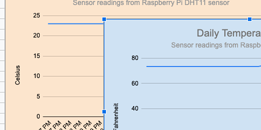
This chart represents the temperature in celsius. We will use another chart to represent the Fahrenheit temperature information.

Make a copy of the current chart. Click the actions menu and select Copy chart. Click edit in the Google Sheets menu and select paste.

Click the actions menu on the duplicate chart and select Edit Chart.

Erase the data range. The data for this chart spans two separate columns. Those columns are not next to each other. We need to select the columns separately. Type B2:B25,D2:D25. Note that the selections are separated by a comma.

Go to the Customize section of the Chart editor. Open Chart & axis titles. Select the Vertical axis title. Change the title from Celsius to Fahrenheit.
The titles are looking a little bland. This makes it difficult to distinguish. Change the chart color to help identify the charts. Go to the Chart style. Click the background color selector. Choose a light color for the background. A light color will help keep the text on the chart legible.

Repeat the process with the chart with the celsius information.
Humidity Chart
The chart to report the humidity information is similar to the temperature chart. Click the Plus button to create a new sheet. Rename the chart to Today’s Humidity.
Let's take a look at the sensor datasheet. The humidity data is in column F. We will query the data from columns B, C, and F.

Go back to the Humidity sheet and enter this query.
=query(‘sensor data’!B1:F,”select B,C,F”,1)

The select parameter is used to choose the columns of data to display.
We are going to filter the data so only the current day’s humidity information is displayed. We will use the same parameter used for Today’s temperature reading.
Use the Formula bar and place the cursor right after the letter F. Add this parameter.
Where B = date ‘“&text(today(),”yyyy-mm-dd”)&”’

Today’s Humidity Chart
Go to Today's Temp sheet. Choose one of the charts. Click the actions menu and select Copy chart. Return to Today's Humidity sheet and paste the chart. Click the chart action menu and select Edit chart. Erase the current data range. Replace it with B1:C.
Go to the Customize tab in the chart editor. Open the Chart & axis titles. Select the Vertical axis title. Change the title to Percentage.
Select the Chart title. Change the title to Today’s Humidity.
Open the Chart style section. Change the background color.
