Normal Distribution Curve with Google Sheets

Introduction
A normal distribution curve is one of the more common tools used to analyze information. It is used to represent real values that appear at random. Most of the values tend to fall within the standard deviation.
Use the link below to get a copy of the completed project.
I want to go over some of the fundamentals before creating a normal distribution. These fundamentals are important in the creation of the normal distribution curve.
The curve is created from data represented as numbers. The data represents a population. It can also be a sampling of the population. The population can be anything. It doesn’t necessarily mean population like a count of people. A population is things like the number of scores on an assessment or the number of accidents on state highways. The data are usually large.
The data don’t have to include every occurrence. A representative same is often used. Representative samples are often used on surveys. This is done because not everyone can be interviewed for a survey. The best method is to get a sample of people to take a survey. This sample represents the population from one or more categories. Deciding on the sample data is difficult. We don’t have to do that here.
All collected data have some common characteristics. All data has a Mean, Median, and Mode. The Mean is the average of the numbers or data collected. The average falls in the middle of the numbers. The average is calculated by adding the numbers and dividing the total by the number count. Here is a simple example. We have five numbers. They are 1,2,3,4 and 5. The numbers total 15 when we add them. We divide 15 by the number count which is 5. The average or Mean is 3. We see that the number 3 is in the middle of 1,2,3,4 and 5.
Here is another example. A class of five students took a test. Their scores are 60,65,75,80,90 and 95. The total, when the scores are added is 465. Dividing 465 by 6, the number count gives an average of 77.5. The average doesn't have to be one of the values. The average of 77.5 does fall in the middle of the grades. Somewhere between 75 and 80.
The Median is the value that is exactly in the middle. This is different from the average. We don’t have to do any math to determine the Median. We do have to place the numbers in order from least to greatest.
Here is an example. We have exam scores of 60,70,75,80,85,85 and 90. The Median value is 80. Here is another way to figure it out. There are 7 scores. Add 1 to the number and divide by 2, 7+1 dividend by 2 is 4. The median number is the fourth number in the list.
The Mode is the number that appears most often. We have to place the numbers in order. Here is an example. We have weekly temperatures of 77,79,79,79,80,80 and 85. The Mode is 79 because it is the number that appears most in the list of values.
The range is another important concept. The range identifies the largest value and the smallest value. The Range is the difference between these numbers. The Range in the temperature example is 85 to 77, 77-85=8. The range in these values is 8.
The last concept is the Standard Deviation. The standard deviation is the distance of each value from the Mean. There are a few math steps required to determine the standard deviation. The math isn’t complex.
The first step is to subtract the mean from each value. The answer to each is squared. Add up all the squared values and divide by the count. Finally, we take the square root.
This provides the standard deviation. That is several steps. We don’t have to do all the math. Google sheets will determine the Standard Deviation with a function.
Gathering and formatting the data
The data for our distribution chart come from NOAA. I have used this data before. I like it because it is free and there is a lot of it. I also use it because students like to learn about earthquakes and volcanoes.
Use this lesson as part of a larger project. The link to the data is available below. It is the same data from previous lessons.
NOAA Earthquake database:
https://www.ngdc.noaa.gov/nndc/struts/form?t=101650&s=1&d=1
Google Spreadsheet data:
Query the data
The data we want is in the last column. This column represents the earthquake magnitudes. We will import this column of information into a separate sheet. The data we want is in column H.
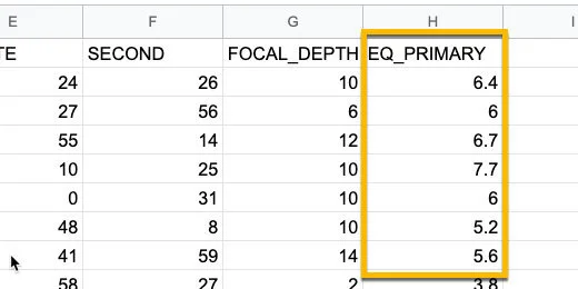
NOAA magnitude data
Click the Plus button next to the sheet name. Rename the new sheet Distribution curve.
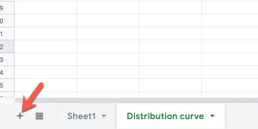
Add a new sheet
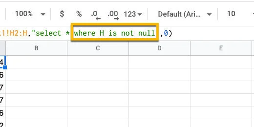
Click on cell A1. Type =query(Sheet1!H2:H,”select *”,0).
This is a query function. It is used to import data from another sheet. This query imports data from Sheet1. The data we chose to import starts in cell H2. It goes all the way down to the end.
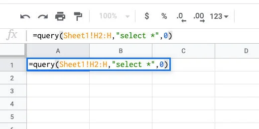
Query the data
Filter away empty values
I want to remove cells with empty values before creating the Named Range. Make sure cell A1 is selected. Click once after the asterisk. Use the formula bar.
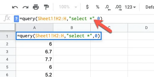
Append to the query
Add WHERE H is not null after the asterisk. This imports information in cells that are not empty. The not null part is referring to the not empty cells.
Filter away empty data
Sorting the data
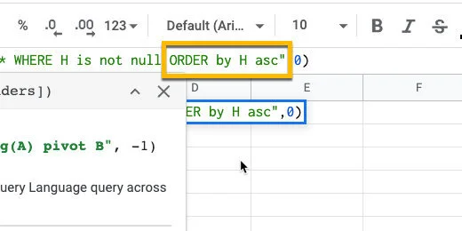
Sorting the data is helpful when looking at the frequency distribution. Type ORDER by H asc after the word null. The content is arranged in ascending order.
Sort the data in alphabetical order
The sorted data shows there are multiple occurrences of magnitudes. This will appear again when we use the Frequency function.
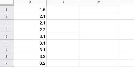
Repetition of magnitudes
Named Range
We are going to use this data several times. To make things easier, we are going to save the data in a Named Range. A Named Range allows us to call the same data with a word.
Click once on cell A1. We are going to select all the data to put into a data range. The easiest way to do this is to use a keyboard shortcut. Press and hold the Shift and Control keys. Keep holding these and press the down arrow once and let go.
Selected cells for Named Range
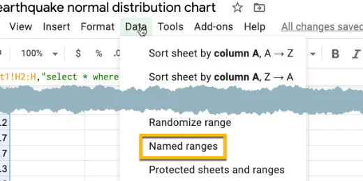
Click Data in the menu and select Named Ranges.
Named Range option
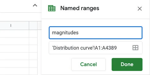
A Named Ranges panel opens on the right. Name the range ‘magnitudes’. Click the done button.
Named Range name set to magnitudes
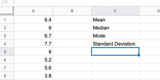
Scroll back to the top of the sheet. Skip column B. In column C enter the labels for Mean, Median, Mode, and Standard Deviation.
Titles for statistical data
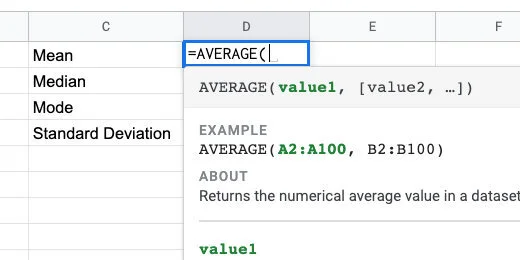
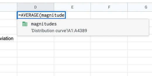
Click in cell D1. Type =AVERAGE followed by an open parenthesis. Google Sheets does not have a function called MEAN. The average is the same as the Mean.
We supply the data range within the parenthesis. The data range is the beginning cell and the ending cell for the data. This is where we use the Named Range.
The AVERAGE function
Type magnitudes followed by closing parenthesis. The Named Range appears as a suggestion as we type the name.
Magnitudes Named Range for AVERAGE parameter
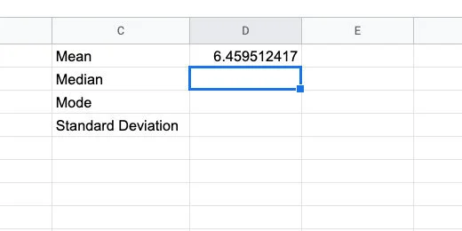
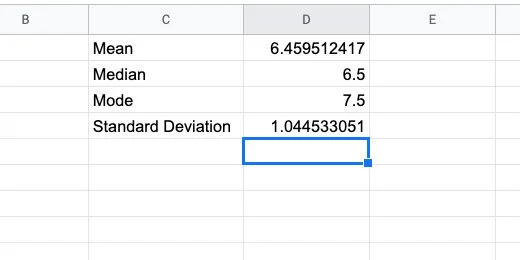
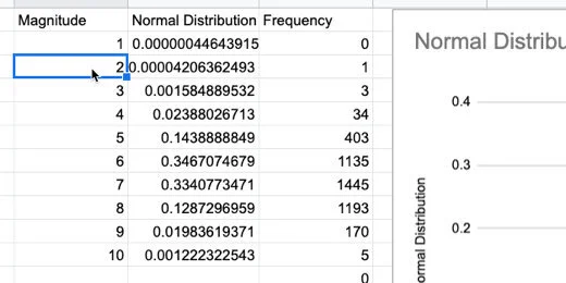
Press the Return key to run the function. The average magnitude for all the recorded earthquakes in our data list is 6.459512417.
Calculated average
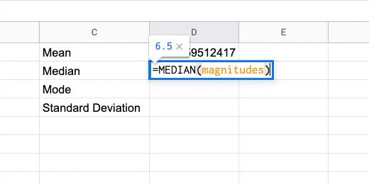
In cell D2, type =MEDIAN followed by an open parenthesis.

Median function
Type the Named Range followed by closing parenthesis.
Median function with named range parameter
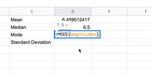
Type =Mode(magnitudes) in cell D3.
Mode function
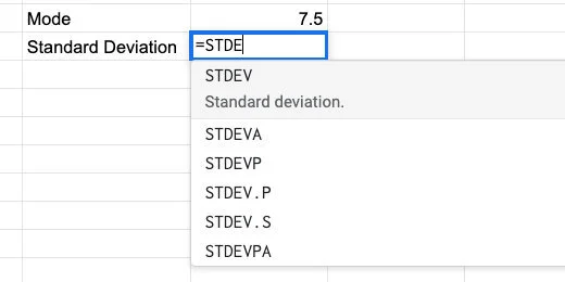
Type =STDE in cell D4. There are several options for the Standard Deviation function. We want the standard deviation for our entire population. The function ends with the letter P.
Standard Deviation function
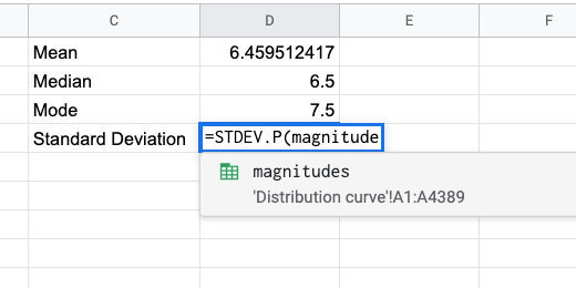
There are two functions that end with the letter P. Use the STDEV.P function and supply the magnitudes Named Range in the parenthesis.
Standard Deviation for the population
These are the values you should see.
Calculated statistical values
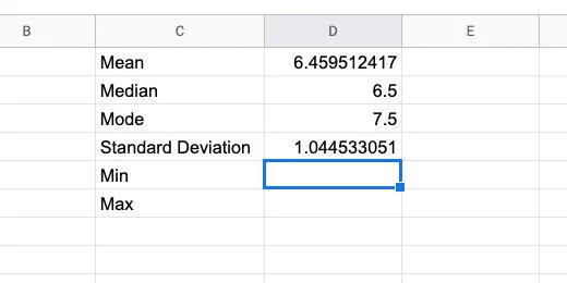
There are two more pieces of information we need. Type Min in cell C5. Type Max in cell C6.
Min and Max titles
Type =MIN(magnitudes) in cell D5. Type =MAX(magnitudes) in cell D6. These numbers represent the smallest and largest earthquake magnitude numbers in our data.
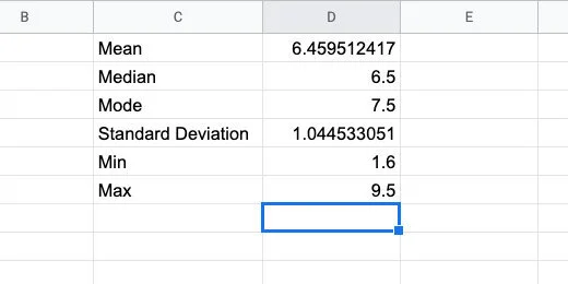
Minimum and maximum values
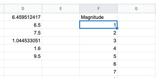
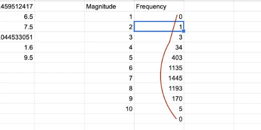
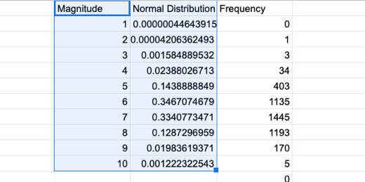
Skip column E. Type the heading Magnitude in cell F1. Type the numbers 1 through 10 down column F.
Magnitude data bin
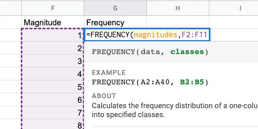
Type Frequency in cell G1. Frequency is the count of how many times a value appears. This is like finding the mode. The Frequency function will count the number of occurrences for each magnitude.
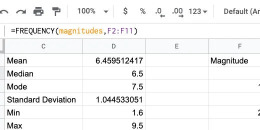
Type =FREQUENCY(magnitudes,F2:F11) in cell G2. This counts the number of times a number between two magnitudes. The function takes the values in the data range and matches them to the classes. The classes in this example are the range of earthquake magnitudes.
Frequency function
Frequency doesn’t count the exact number that matches the value in magnitude. This is how it works. For magnitude 1, there are no values from zero to 1. Between 1 and 2 there is one value. Between 2 and 3 there are three values. The largest frequency is between 6 and 7 with 1445 values.
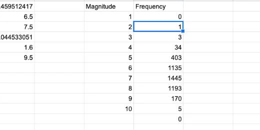
Frequency count for each magnitude in bin
The frequency numbers resemble the distribution curve.
Frequency count resembles distribution curve
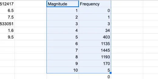
Let’s create a graph of this data to compare it with our normal distribution curve. Select the contents of both columns. Be careful not to select the zero at the bottom of the frequency column.
Selection of magnitude and frequency values
Click the Chart button.
Create chart button
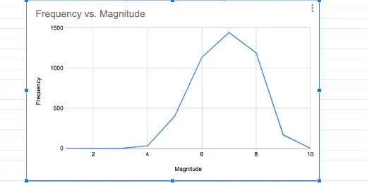
This is looking very much like a normal distribution.
Histogram as line chart
Change the chart type to a column.
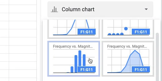
Select column chart option
This is known as a histogram.
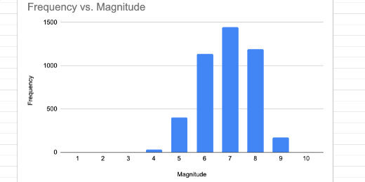
Histogram chart
We will return to this histogram later. For now, we will delete it. Click the actions menu on the chart. Select Delete chart.
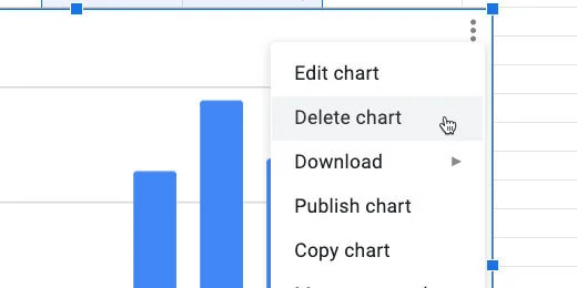
Delete chart
Normal Distribution
We are going to calculate the values for the normal distribution curve. The formula for calculating the normal distribution looks like the image below. We don’t have to go through all those calculations. Sheets have a function that does all the work.
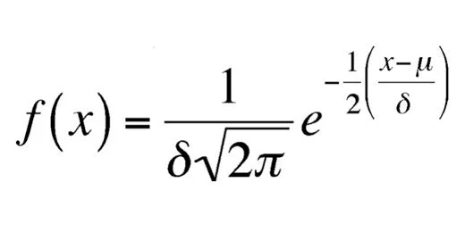
Normal distribution function
Click on cell G1. Right-click on the cell. Select Insert Column.
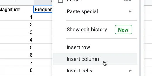
Insert a column
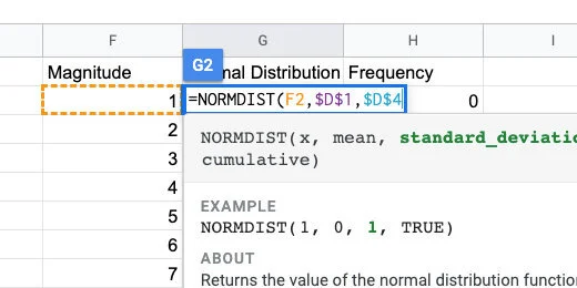
Title the new column Normal Distribution. Type =NORMDIST in cell G2 followed by an open parenthesis.
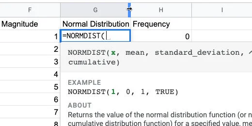
Normal distribution function and parameters
Type F2 after the opening parenthesis. This is the input for the normal distribution function. In our example, that is the magnitude value.
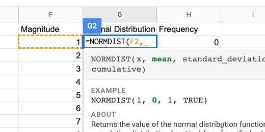
The first function parameter
The mean is in cell D1. We are going to copy this formula down the column when done. The reference to this cell needs to be locked in place. We are changing the cell reference to an absolute cell reference. All cell references are general references.
Type D1 and press the F4 function key on your keyboard. You might need to press the function button before pressing this key. It depends on how your keyboard is configured. The F4 function places dollar symbols before the letter and number.
If you can’t figure out the function key, type the dollar symbol before the letter and number. It needs to be $D$1.
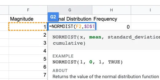
Mean parameter set as absolute cell reference
Type a comma followed by $D$4 for the standard deviation.
Standard deviation set as absolute cell reference
Type a comma followed by the word FALSE. We don’t need the distribution to be cumulative. Close the parenthesis and press the Return key.
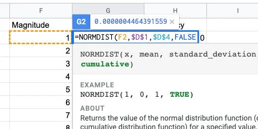
Normal distribution will not be cumulative
Clack on cell G2. Click the blue square and drag it down the column. Stop when you reach the last value for magnitude.
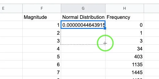
Copy the function down the column
We are ready to create a normal distribution chart.
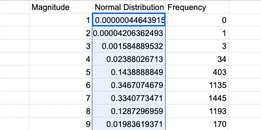
Normal distribution values
Select the contents of the Magnitude and normal distribution columns. Create a chart.
Selection for normal distribution chart
Select the smooth line chart option. We now have our normal distribution curve for the data. At this point, we are done. I would take it a little further.

Normal distribution curve
Compare normal distribution with histogram
Let’s compare the normal distribution with the frequency data. Click in the Data range field.
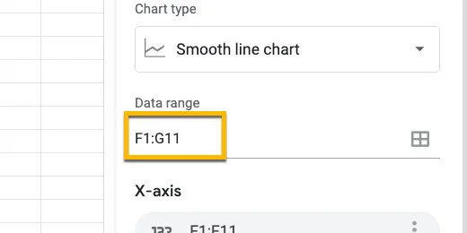
Chart data range
Erase G11 and replace it with H11.
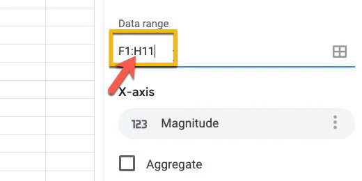
Update chart data range
Go over to the chart editor panel. Click the Add Series button.
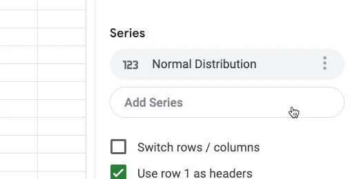
Add a series to the chart
Select Frequency
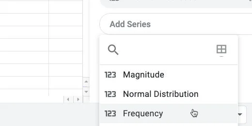
Select the frequency series
Click the chart type selector. Choose the Combo chart.
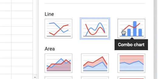
Change chart to combo chart type
Go to the Customize panel. Select the Series section.
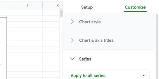
Series section in customize panel
Select the Normal Distribution series.
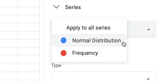
Select norma distribution series
Change the format from Column to Line.
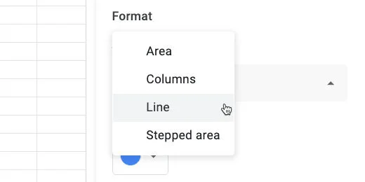
Set chart type to line
Select the Frequency series.
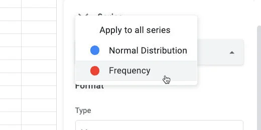
Change to frequency series
Change the chart type to columns.
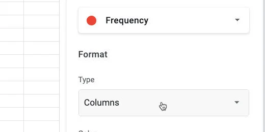
Change chart type to columns
Change the Axis position from Left to Right.
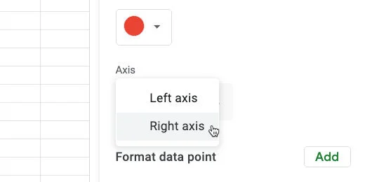
Change axis titles to the right
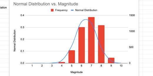
We see how the frequency distribution compares with the normal distribution. The frequency data is very close to the normal distribution. Some of the bars are outside the distribution curve. This is because we have a very small Bin sample.
Normal distribution chart and histogram
Enlarging the Bin sample
We are going to increase the Magnitude values to see how that affects the relationship with the charts.
Move the chart off to one side. Click on cell F3.
Return to magnitude values
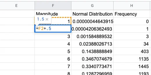
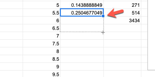
Let's add more information by adding half values. This will include 1.5,2.5,3.5 and so on. Type =F2+.5 in the cell. This gets the value from the previous cell and adds 5.
Increment each value by half
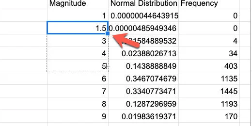
Use the blue square to copy the formula down the column. It will replace the values.
Copy the formula down the column
Keep copying the formula until the value reaches 10. I went down to row 20.
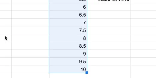
Magnitudes in increments of .5
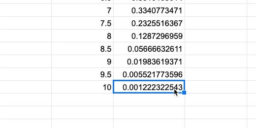
Go to the normal distribution column. Select the last cell with the formula. Click and drag the blue square to copy the function. Copy it down to match up with the last Magnitude value.
Copy the normal distribution function down the column
We need to update the Frequency values too.
Match the normal distribution to the magnitude values
For the frequency values, we need to update the frequency function. Click on cell H2. Update the function using the formula bar.
The frequency function in the formula bar
Update the F11 range to F20. Press the Return key.
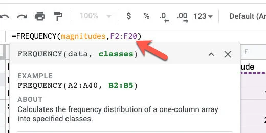
Update the range for the frequency function
We need to update the chart with our additions. Click the actions menu. select Edit chart.
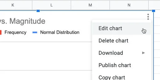
Edit the chart
Update the Data range from H11 to H20.
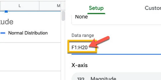
Update the range
More bars from our frequency are fitting within the normal distribution curve.
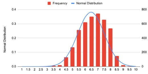
Chart with new values
I updated the values to get information for every quarter increase(.25). More frequency values are falling within the normal distribution curve.
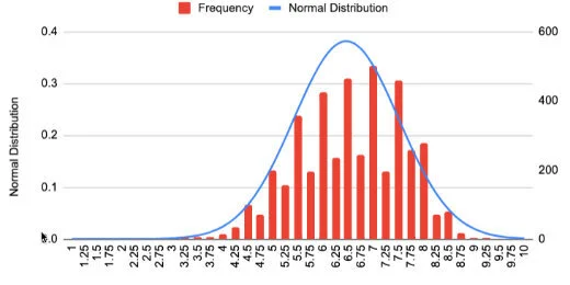
Chart comparison with .25 magnitude increments