
Technology lessons for educational technology integration in the classroom. Content for teachers and students.
Publishing Google Charts with Google Slides
Google Slides is a good way to publish graphs that are constantly updating. This works well when gathering data through polls and surveys. This is the type of data we are representing in the charts for this lesson. The data in this lesson comes from something we did to increase attendance at the campus.

Introduction
This is the fourth lesson in the four-part series on publishing Google Charts. This lesson focuses on the publication of charts using Google Slides.
Google Slides is a good way to publish graphs that are constantly updating. This works well when gathering data through polls and surveys. This is the type of data we are representing in the charts for this lesson. The data in this lesson comes from something we did to increase attendance at the campus.
The administrator promised a pizza party —for the holiday— to classrooms with the highest attendance. Each class kept a record of their daily attendance. We created a Google Form to collect the attendance for each day.
Each class form was simple. Every teacher had a personal form. The goal was to keep it simple. The teacher entered the number present and submitted it. We took care of gathering and formatting the data in the background.
The contest was part of a lesson. Everything is a teachable moment. Students learned about gathering data, and basic statistics. We focused on the average attendance value. This worked out in an interesting way when students wanted to come to school even if they were sick.
We worked out how one student doesn't affect the average as much as five or more. They learned how important it was for one student to stay home sick instead of infecting other students and increasing the number of possible absences. It's amazing what kids will do for a pizza party.
Resources
Use the link below to see a preview of the final product.
I have gathered all the data and formatted the charts in Google Sheet. Use the link below to get a copy of the working documents.
Data and chart overview
The Google Sheets document has the data and charts formatted for our project. The spreadsheet has one sheet dedicated to each grade level. The last sheet contains all the form data for each teacher’s class.
Each sheet has a table. The table contains the average for each teacher’s attendance. These averages are used to generate the charts.

The columns in each chart are color-coded to identify each teacher's class.

The attendance data updates every day during the contest. We can't have access to live data for the lesson so I did the next best thing. The Kinder sheet has a Date filter. This filter represents the dates for the attendance contest. Select a date and the data for that day and the previous days are averaged. Select August 21st, 2020.

The charts on each sheet update with the selected date range.

Preparing the slides
Switch to the Google Slides template. The template has one slide. This slide is based on a slide master created for this project.

Go to the menu and click Insert. Go to the Chart option and select From Sheets.
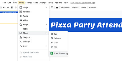
Find the Attendance Chart sheet. Click on the sheet icon and click the Select button.

Each chart in the sheet is detected and displayed. Click on the Kinder attendance chart.

Each chart is linked to the spreadsheet. This link updates the chart as the data in each sheet updates. We will see how this works later. Click the Import button.

Position the chart so it fills the slide. Don’t worry if the chart stretches.

Click the Insert slide selector.

The template has a master slide with the reformatted heading. Select this slide master.

Insert the next chart. Go to the menu and select Insert. Go to the chart option and select From Sheets. Select the attendance spreadsheet. Find the First-grade chart and insert it into the slide. Resize the chart to fit. Repeat this process with all the charts.

The data in my current chart for Kinder represents the first week’s attendance. This is true for all the other charts. This represents the selector choice I made a few steps ago.

Return to the Sheets tab. Use the date filter and select August 28, 2020.

The chart updates with the data from the dates.

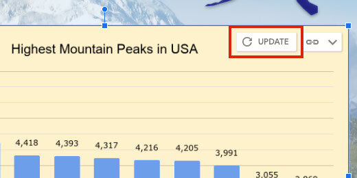
Return to the Google Slides tab. The chart in the kinder chart has an update button; click the button.

The chart updates and matches the chart in the Sheet.

The chart on each slide needs to be updated. Go to the First-grade chart and click the update button.

Updating each chart on each slide is tedious. There is a faster way to update all the charts at once. Go to the menu and click Tools; select the Linked objects option.

A panel opens on the right. It lists objects with links to external sources. Each link has an update button.

We can click each update button but there is a faster way to update all the charts. There is a button at the bottom of the panel to update all the linked objects; click the button.

There is a way to automatically update all the charts. That requires the creation of a Google Script. That takes us beyond the objective of this lesson.
Publishing
Everything is ready for publication. Go to the menu and click File; select publish to the web.

The link configuration box has several auto-advance options. The default is three seconds. Use the selector to choose how long each slide will display before advancing to the next. I like to leave it at three-seconds unless there is a lot of information to present.
Select the option to start the slideshow as soon as the player loads. Select the option to restart the slideshow after the last slide. Click the Publish button.

Click the Ok button to confirm the publication.

A special publication link is created. Copy the link.

Create a new tab and paste the link. Press the Return key to view the published slide show. The presentation begins moving from slide to slide as soon as the page loads.

Adjust the timing
The three-second default might be too fast. To adjust the timing we need to return to the publication settings. Choose a different time interval.

The link updates with the new setting. Copy the link. Return to the tab with the slide. Replace the link with the updated version.

Another way to update the setting is to go directly to the link. The end of the link has a number. This number represents the number of seconds for each slide. The number represents milliseconds. 5000 or 5 milliseconds in my example. Set this value to any value you want. Here are some examples: 5500 is five-and-a-half seconds, 7000 is seven seconds, and 60000 is one minute.

Use this link to publish the live charts.
Stop publishing
It is a good idea to stop publishing live charts when they are no longer needed. Return to the Google Slides tab. Click the Published content & settings option. Click the Stop publishing button when you are done with the project.

Publishing Google Charts with Google Drawings
Welcome to the third lesson in a four-part lesson for publishing Google Charts. This lesson focuses on the publication of Google Charts with Google Drawings.
Google Drawings has features that make publishing charts easy. Google Drawings allows us to be creative. Charts are often part of infographics. We are using a basic infographic to publish the chart in this lesson.

Introduction
Welcome to the third lesson in a four-part lesson for publishing Google Charts. This lesson focuses on the publication of Google Charts with Google Drawings.
In a previous lesson, we learned how to publish charts on their own. We published a Google Sheet to simulate a dashboard. We used a Google Doc to publish the chart and include detailed information.
Google Drawings has features that make publishing charts easy. Google Drawings allows us to be creative. Charts are often part of infographics. We are using a basic infographic to publish the chart in this lesson.
Use the link below to see a preview of the final product.
Use the links below to get a copy of the Chart and Drawing working documents.
The Chart
Take a look at the chart on the Google Sheet. The chart displays the top ten highest mountain peaks in the United States. The data for the chart comes from a Wikipedia article. The link to the articles is available in the Sheet. The data is in the Peaks sheet.
The Table uses a Query to filter for prominent peaks in the United States. The Google Sheet with the chart doesn’t need to be open. You can close it after reviewing the information.

The Drawing
The template has a background image of the Denali mountain. It has a title and text box with basic information about Denali. There is a place for the chart next to the text box.

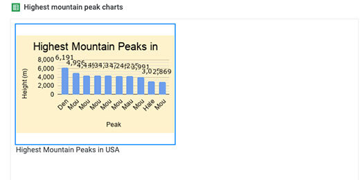
Go to the menu and click Insert. Go to the Chart option and select From Sheets.

Look for the spreadsheet titled Highest Mountain Peaks. The preview shows the table and chart in the first sheet. Select the spreadsheet.

The import box displays the only chart in our spreadsheet.
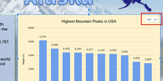
The chart is linked to the spreadsheet; this is important. Select the chart and click Import.

Resize the chart and place it next to the information box. The chart shows a link to the spreadsheet. We will come back to this later.
Click the Share button.

Click the option that reads Change to anyone with the link.

Click the Copy link button.

Open a new tab and paste the link into the address bar. The link ends with the word edit and some other information.

Replace edit and anything that comes after, with the word preview. Press the Return key to render the page.

Our drawing is nicely published for the world to view.

The data in the published drawing is live. Leave the tab open and return to the Drawing tab. Click the Done button to close the link box.

Click once on the chart. Click the Link button and select Open source.

The information in the table for the chart is from a Query. Click on the Heading titled Peak. Look at the query in the Formula bar.

Go into the Formula bar and change the Limit parameter from 10 to 5. The Limit parameter limits the number of results returned in the query. Press the Return key to update the query.

The table and chart update

Return to the Drawings tab. An update button appears next to the Link menu. Click the Update button.
Go to the published drawing tab. Refresh the page to show the changes.

Google Drawings is very useful for creating elaborate documents. An infographic is one document format that works well with charts and drawings.
The publish option
There is a publishing option for Drawings. This is similar to publish options in Sheets, Docs, and Slides. There is one important difference. The publish option does not provide a web version of the drawing. Let's take a look.
Click File and select Publish to the web.

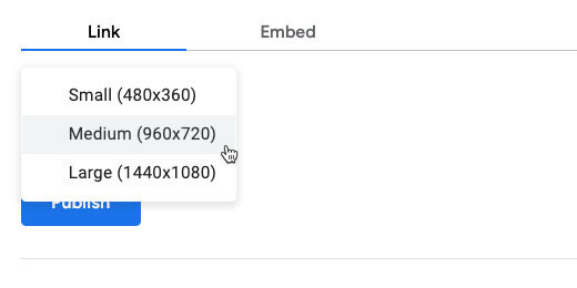
Publishing Google Drawings comes with an option to select the resolution of the published image. The medium resolution is recommended.
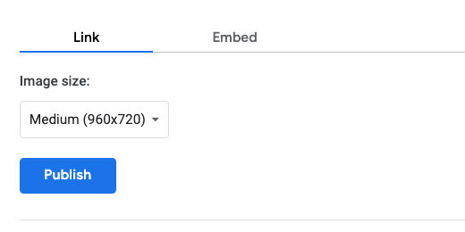
The other resolution options are small and large. Stick with medium and click the Publish button.
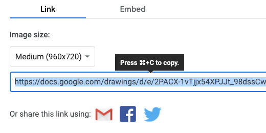
Confirm you want Google to publish the drawing.

A link is generated for the published document. Copy the link; create a new tab and paste the link.
Press the Return key. You most likely won’t see the chart displayed on the page. The drawing is converted to a PNG image and downloaded to your computer.
This option doesn’t serve us here for what we want to do. It is useful for other purposes. It is a good way to distribute and share images. It is also a good way to embed images in other Google products.
Publishing Google Charts with Google Docs
Welcome to the second part of a four-part lesson on publishing Google Charts. This lesson focuses on the publication of charts using Google Docs.
In the previous lesson, we learned how to publish charts with Google Sheets. We published a Chart by itself. We also published charts and tables in a dashboard format.

Introduction
Welcome to the second part of a four-part lesson on publishing Google Charts. This lesson focuses on the publication of charts using Google Docs.
In the previous lesson, we learned how to publish charts with Google Sheets. We published a Chart by itself. We also published charts and tables in a dashboard format.
Publishing charts in Docs provides a variety of tools not available in Sheets; this is useful when we want students to include Charts in reports.
Use the link below to see a preview of the final document.
Use the links below to get a copy of the working document for this lesson.
The link below contains the Google Doc to be published.
The link below contains the Google Sheet with the chart to be published.
Google Sheets working document
The document has information about Denali and Mount Blackburn. I copied the information from Wikipedia. The links to the resources are available in the citations.
Insert the chart
Place the cursor above the heading for Mountain Peaks.

Go to the menu and click Insert. Go to the Chart option and select From Sheets.

Find the Highest mountain peak spreadsheet; click on it once. Click the Select button.

A chart selection box opens. We only have one chart. Click on the chart and then the Import button.

There are two ways of publishing this document. I prefer one over the other. I think you will see why one is better than the other. Click File in the menu and select Publish to the web.

Click the Publish button. Get the link and paste it into a new tab. The published document looks good; however, all our nice formatting is gone. Let's take a look at another option.

Leave the published document tab open. Return to the document and close the publication configuration box.
Click the Share button.

Click the option to change the link so anyone who has the link can view the document.

Click the copy link button.

Open a new tab and paste the link. Look for the word edit at the end of the shared link.

Replace edit and anything after with the word —preview. Press the Return key.
This published version retains all the formatting. I prefer this way of publishing the Google Document.

This version comes with drawbacks. A shared version is different from a published version. The link on a shared version can be modified to allow anyone to make a copy of the document. They can replace the word preview with the word —copy. This is how you have been getting the working documents for the lessons.
Update the chart
Updating the chart information is not automatic. Go to the spreadsheet. Click on the Heading for Peak. Go to the Formula bar and change the limit from 10 to 5.


Go to the working document. Not the one published with the preview link. Click once on the chart. There is an update button in the top right corner. Click the button to update the published chart.

Go to the published document tab. Refresh the document page.

Text in a Google Doc is different. The text in the document is automatically updated.
Publishing charts with Google Sheets
This is part of a four-part series on publishing Google Charts. Published charts are live. Any changes made to the working chart are reflected in the published chart. Updates are not automatic for all forms of published charts. Updates have to be manually pushed to the published version.

Introduction
This is part of a four-part series on publishing Google Charts. Published charts are live. Any changes made to the working chart are reflected in the published chart. Updates are not automatic for all forms of published charts. Updates have to be manually pushed to the published version.
Google Sheets is a useful tool for the development of a variety of charts. Once those charts are created it may be necessary to share them with others. There are a variety of reasons for sharing the information and a variety of ways to share it. I am going to focus on examples related to education.
The first example focuses on the publication of data for a geography assignment. Like all assignments, this assignment is connected to other subjects. It is part of an overall student product students.
The second example comes from something I was part of for one year. The administrator at the campus wanted to increase student attendance. She offered a pizza party for the class or classes with the highest attendance. The parties would be part of the traditional holiday parties for December.
Product preview
Use the links below to see a preview of the final products.
The highest mountain peaks in North America:
Holiday party attendance:
Working documents
Use the links below to get a copy of the working document. The document includes the charts. The charts are already formatted for publication.
Just the chart
The spreadsheet has a chart and table on the first sheet. The first sheet is titled USA. The second sheet is titled peaks. That sheet contains the raw data.

Click once on the chart. Look for the action menu.

Click the action menu and select Publish chart.

A publication configuration box opens.

Click the share option selector. Choose the chart itself. The chart is titled Highest Mountain Peaks in USA.

Leave the other option set at Interactive. Click the Publish button.

Google Drive prompts for confirmation. Click the OK button.

A special publication link is generated and selected. Copy the link.

Create a new tab and paste the link into the address bar. Press the Return key to load the published chart.
The chart appears on the far left side of the browser. Nothing but the formatted chart appears on the page. Use the link and share it with anyone who needs to see the chart. The chart does not need special permission. Anyone who has the link can see it.
Charts created within an organization have additional options to share with the world. Use those options to share the map with the world. Otherwise, the chart can only be viewed by members of the organization.

Roll the mouse over one of the columns in the chart. The name of the mountain and height appear. This is the extent of the interactivity.

Interactivity is nice; it isn’t needed in this chart. We can choose to publish the chart as a non-interactive image. Click in the address bar and move to the end of the link. The last word in the link is interactive.

Replace the word interactive with "image". Press the Return key.

The image appears at the center of the page. Roll your mouse over a column and nothing will happen. Change the link name back to interactive if you want to use the interactive version.

The chart data is live. The chart updates on its own when we update the information related to the chart. For example, the chart would update if we chose to chart only the top five highest peaks. All we do is update the chart on the sheet. The update on the published version takes care of itself. Let’s take a look at how this works. Leave the tab open and return to the spreadsheet tab.
Stop and Republish
The sheet still has the publication options dialogue open. Click the Published content & settings option.

This is where we stop publishing the chart. The chart will always be viewable by anyone with the link as long as the publish option is enabled.
There are other ways to stop the published chart. These are not the ideal way to stop publishing the chart but you need to be aware of them. Deleting the chart from the sheet will stop the publication. Deleting the spreadsheet or Sheet will also stop the publication. Anyone visiting the site with a missing chart link will see an error message.
The republish option is automatically enabled. I recommend unchecking the option before making changes. This gives you time to make sure the information is ready for publication.

Remove the check from the box and close the configuration box.

Go to the table and click the Peak heading.

Look at the Formula bar. The table is generated with a Query function. The function has a limit parameter. The limit is currently set to 10. Only the first 10 records are displayed.

Replace the 10 with 5 and press the Return key.

The chart on the sheet updates with the changes.

Click the chart action menu; select Publish chart.

Place a check back on the option to automatically republish changes. Close the configuration box.

Switch back to the published chart tab. The chart has been updated with the changes. Click the browser refresh button if the chart does not show the change.

Close the published chart tab. We don’t need it for the remaining lessons.
Dashboard option
Sharing charts as we did is easy but the view is kind of plain. There is another way to share the chart and other content on the sheet. This is often referred to as publishing a dashboard.
This is a dashboard of a kind. Real dashboards created with Google Data Studio have interactive components. They include selectors and ways to update the information in charts.
Go to the menu and click File; choose to Publish to the web.

This is the same configuration option we just used.

Click the selector and choose USA. This is the Sheet itself.

Click the Publish button. Confirm you want to publish the document.

Copy the publish link. This link is different from the chart link we created earlier.

Create a new tab and paste the link into the address bar. The sheet with the table and chart open on the page. The name of the spreadsheet and sheet appears in the information bar. The table is missing half the mountain peaks. We changed the Query limit in the previous lesson.

Updating the dashboard
Return to the spreadsheet tab. Close the configuration box. Click on the Peak heading; go to the formula bar. Change the Limit value from 5 to 10. Press the Return key to update the table and chart.

Go to the spreadsheet dashboard tab. Click the browser refresh button.

updated published version of chart
I like this method of publishing charts. It allows me to choose the position and background color of the chart. I can also include other elements like the table.
Attendance dashboard
In the attendance dashboard, I applied the same process. The dashboard has several charts with additional formatting. Use the link above to see the published version of this dashboard.
Normal Distribution Curve with Google Sheets
This lesson demonstrates how to use Google Sheets to create a normal distribution, Bell curve, chart. We use data from NOAA. We create a normal distribution chart for all the recorded earthquakes. Along the way we learn to use several statistical functions.

Introduction
A normal distribution curve is one of the more common tools used to analyze information. It is used to represent real values that appear at random. Most of the values tend to fall within the standard deviation.
Use the link below to get a copy of the completed project.
I want to go over some of the fundamentals before creating a normal distribution. These fundamentals are important in the creation of the normal distribution curve.
The curve is created from data represented as numbers. The data represents a population. It can also be a sampling of the population. The population can be anything. It doesn’t necessarily mean population like a count of people. A population is things like the number of scores on an assessment or the number of accidents on state highways. The data are usually large.
The data don’t have to include every occurrence. A representative same is often used. Representative samples are often used on surveys. This is done because not everyone can be interviewed for a survey. The best method is to get a sample of people to take a survey. This sample represents the population from one or more categories. Deciding on the sample data is difficult. We don’t have to do that here.
All collected data have some common characteristics. All data has a Mean, Median, and Mode. The Mean is the average of the numbers or data collected. The average falls in the middle of the numbers. The average is calculated by adding the numbers and dividing the total by the number count. Here is a simple example. We have five numbers. They are 1,2,3,4 and 5. The numbers total 15 when we add them. We divide 15 by the number count which is 5. The average or Mean is 3. We see that the number 3 is in the middle of 1,2,3,4 and 5.
Here is another example. A class of five students took a test. Their scores are 60,65,75,80,90 and 95. The total, when the scores are added is 465. Dividing 465 by 6, the number count gives an average of 77.5. The average doesn't have to be one of the values. The average of 77.5 does fall in the middle of the grades. Somewhere between 75 and 80.
The Median is the value that is exactly in the middle. This is different from the average. We don’t have to do any math to determine the Median. We do have to place the numbers in order from least to greatest.
Here is an example. We have exam scores of 60,70,75,80,85,85 and 90. The Median value is 80. Here is another way to figure it out. There are 7 scores. Add 1 to the number and divide by 2, 7+1 dividend by 2 is 4. The median number is the fourth number in the list.
The Mode is the number that appears most often. We have to place the numbers in order. Here is an example. We have weekly temperatures of 77,79,79,79,80,80 and 85. The Mode is 79 because it is the number that appears most in the list of values.
The range is another important concept. The range identifies the largest value and the smallest value. The Range is the difference between these numbers. The Range in the temperature example is 85 to 77, 77-85=8. The range in these values is 8.
The last concept is the Standard Deviation. The standard deviation is the distance of each value from the Mean. There are a few math steps required to determine the standard deviation. The math isn’t complex.
The first step is to subtract the mean from each value. The answer to each is squared. Add up all the squared values and divide by the count. Finally, we take the square root.
This provides the standard deviation. That is several steps. We don’t have to do all the math. Google sheets will determine the Standard Deviation with a function.
Gathering and formatting the data
The data for our distribution chart come from NOAA. I have used this data before. I like it because it is free and there is a lot of it. I also use it because students like to learn about earthquakes and volcanoes.
Use this lesson as part of a larger project. The link to the data is available below. It is the same data from previous lessons.
NOAA Earthquake database:
https://www.ngdc.noaa.gov/nndc/struts/form?t=101650&s=1&d=1
Google Spreadsheet data:
Query the data
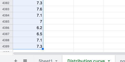
The data we want is in the last column. This column represents the earthquake magnitudes. We will import this column of information into a separate sheet. The data we want is in column H.
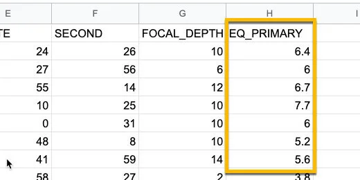
NOAA magnitude data
Click the Plus button next to the sheet name. Rename the new sheet Distribution curve.
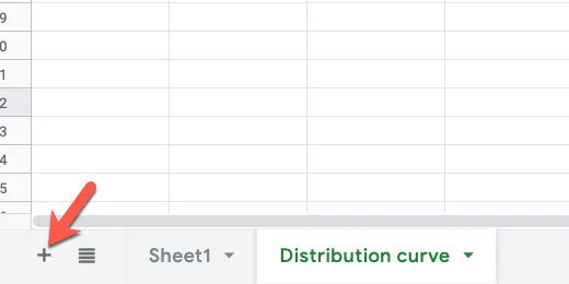
Add a new sheet
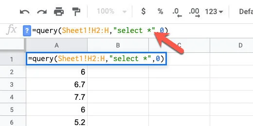
Click on cell A1. Type =query(Sheet1!H2:H,”select *”,0).
This is a query function. It is used to import data from another sheet. This query imports data from Sheet1. The data we chose to import starts in cell H2. It goes all the way down to the end.
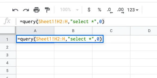
Query the data
Filter away empty values
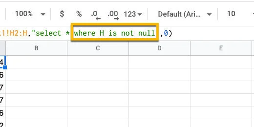
I want to remove cells with empty values before creating the Named Range. Make sure cell A1 is selected. Click once after the asterisk. Use the formula bar.
Append to the query
Add WHERE H is not null after the asterisk. This imports information in cells that are not empty. The not null part is referring to the not empty cells.
Filter away empty data
Sorting the data
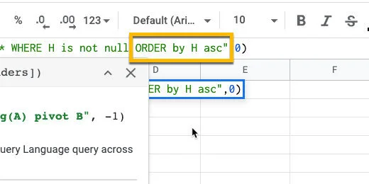
Sorting the data is helpful when looking at the frequency distribution. Type ORDER by H asc after the word null. The content is arranged in ascending order.
Sort the data in alphabetical order
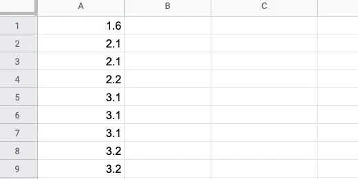
The sorted data shows there are multiple occurrences of magnitudes. This will appear again when we use the Frequency function.
Repetition of magnitudes
Named Range
We are going to use this data several times. To make things easier, we are going to save the data in a Named Range. A Named Range allows us to call the same data with a word.
Click once on cell A1. We are going to select all the data to put into a data range. The easiest way to do this is to use a keyboard shortcut. Press and hold the Shift and Control keys. Keep holding these and press the down arrow once and let go.
Selected cells for Named Range
Click Data in the menu and select Named Ranges.
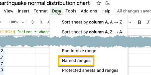
Named Range option
A Named Ranges panel opens on the right. Name the range ‘magnitudes’. Click the done button.
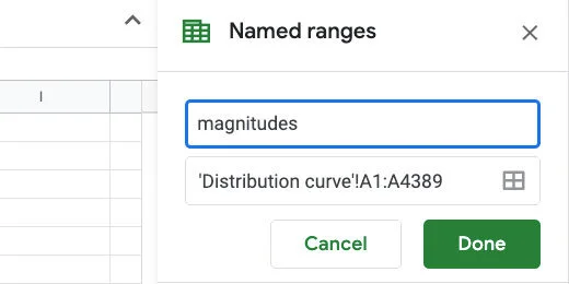
Named Range name set to magnitudes
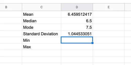
Scroll back to the top of the sheet. Skip column B. In column C enter the labels for Mean, Median, Mode, and Standard Deviation.
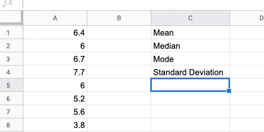
Titles for statistical data
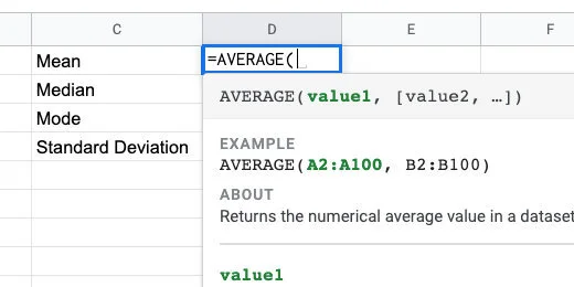
Click in cell D1. Type =AVERAGE followed by an open parenthesis. Google Sheets does not have a function called MEAN. The average is the same as the Mean.
We supply the data range within the parenthesis. The data range is the beginning cell and the ending cell for the data. This is where we use the Named Range.
The AVERAGE function
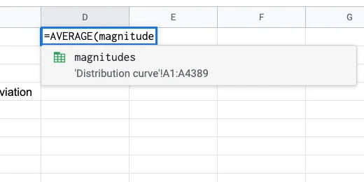
Type magnitudes followed by closing parenthesis. The Named Range appears as a suggestion as we type the name.
Magnitudes Named Range for AVERAGE parameter
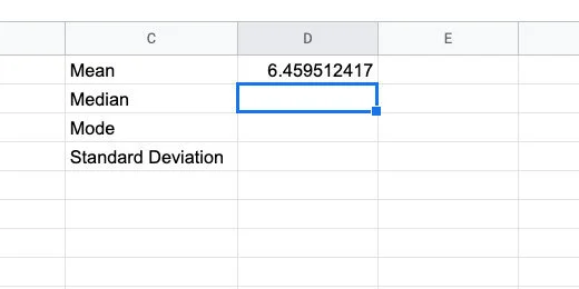
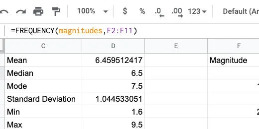
Press the Return key to run the function. The average magnitude for all the recorded earthquakes in our data list is 6.459512417.
Calculated average
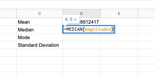
In cell D2, type =MEDIAN followed by an open parenthesis.

Median function
Type the Named Range followed by closing parenthesis.
Median function with named range parameter
Type =Mode(magnitudes) in cell D3.
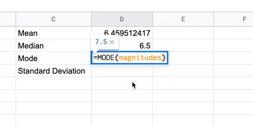
Mode function
Type =STDE in cell D4. There are several options for the Standard Deviation function. We want the standard deviation for our entire population. The function ends with the letter P.
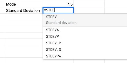
Standard Deviation function
There are two functions that end with the letter P. Use the STDEV.P function and supply the magnitudes Named Range in the parenthesis.
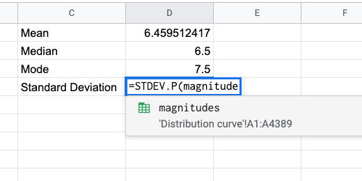
Standard Deviation for the population
These are the values you should see.
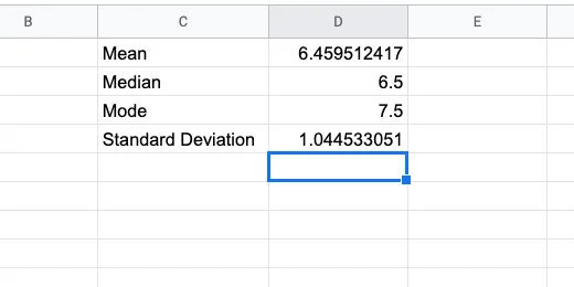
Calculated statistical values
There are two more pieces of information we need. Type Min in cell C5. Type Max in cell C6.
Min and Max titles
Type =MIN(magnitudes) in cell D5. Type =MAX(magnitudes) in cell D6. These numbers represent the smallest and largest earthquake magnitude numbers in our data.
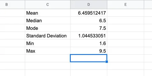
Minimum and maximum values
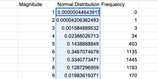
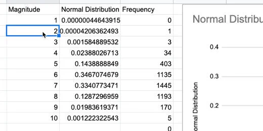
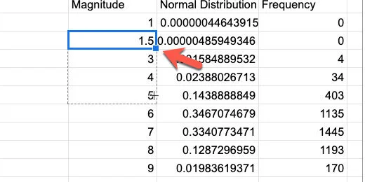
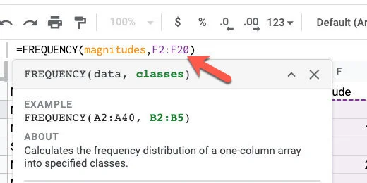
Skip column E. Type the heading Magnitude in cell F1. Type the numbers 1 through 10 down column F.
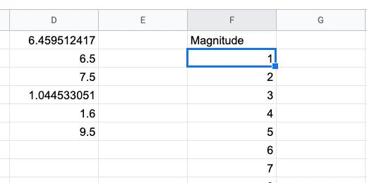
Magnitude data bin
Type Frequency in cell G1. Frequency is the count of how many times a value appears. This is like finding the mode. The Frequency function will count the number of occurrences for each magnitude.
Type =FREQUENCY(magnitudes,F2:F11) in cell G2. This counts the number of times a number between two magnitudes. The function takes the values in the data range and matches them to the classes. The classes in this example are the range of earthquake magnitudes.
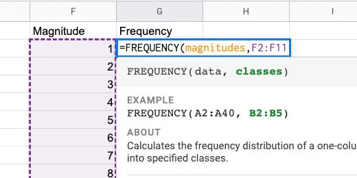
Frequency function
Frequency doesn’t count the exact number that matches the value in magnitude. This is how it works. For magnitude 1, there are no values from zero to 1. Between 1 and 2 there is one value. Between 2 and 3 there are three values. The largest frequency is between 6 and 7 with 1445 values.
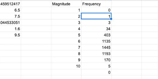
Frequency count for each magnitude in bin
The frequency numbers resemble the distribution curve.
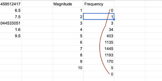
Frequency count resembles distribution curve
Let’s create a graph of this data to compare it with our normal distribution curve. Select the contents of both columns. Be careful not to select the zero at the bottom of the frequency column.
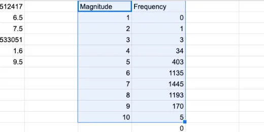
Selection of magnitude and frequency values
Click the Chart button.
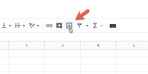
Create chart button
This is looking very much like a normal distribution.
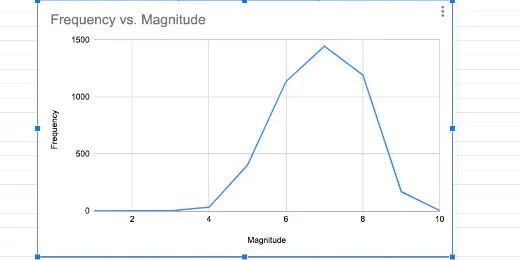
Histogram as line chart
Change the chart type to a column.
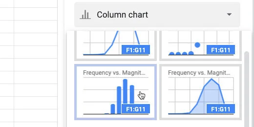
Select column chart option
This is known as a histogram.
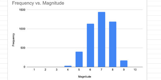
Histogram chart
We will return to this histogram later. For now, we will delete it. Click the actions menu on the chart. Select Delete chart.
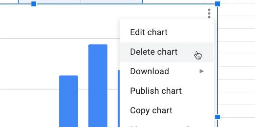
Delete chart
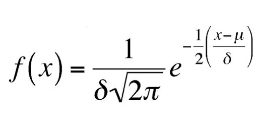
Normal Distribution
We are going to calculate the values for the normal distribution curve. The formula for calculating the normal distribution looks like the image below. We don’t have to go through all those calculations. Sheets have a function that does all the work.
Normal distribution function
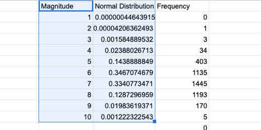
Click on cell G1. Right-click on the cell. Select Insert Column.
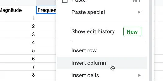
Insert a column
Title the new column Normal Distribution. Type =NORMDIST in cell G2 followed by an open parenthesis.
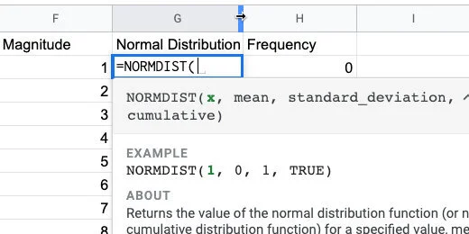
Normal distribution function and parameters
Type F2 after the opening parenthesis. This is the input for the normal distribution function. In our example, that is the magnitude value.
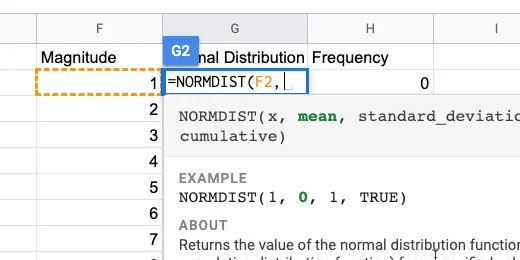
The first function parameter
The mean is in cell D1. We are going to copy this formula down the column when done. The reference to this cell needs to be locked in place. We are changing the cell reference to an absolute cell reference. All cell references are general references.
Type D1 and press the F4 function key on your keyboard. You might need to press the function button before pressing this key. It depends on how your keyboard is configured. The F4 function places dollar symbols before the letter and number.
If you can’t figure out the function key, type the dollar symbol before the letter and number. It needs to be $D$1.
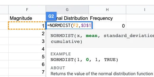
Mean parameter set as absolute cell reference
Type a comma followed by $D$4 for the standard deviation.
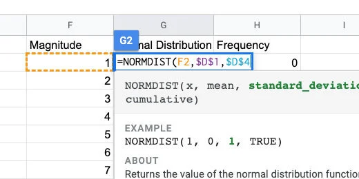
Standard deviation set as absolute cell reference
Type a comma followed by the word FALSE. We don’t need the distribution to be cumulative. Close the parenthesis and press the Return key.
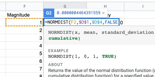
Normal distribution will not be cumulative
Clack on cell G2. Click the blue square and drag it down the column. Stop when you reach the last value for magnitude.
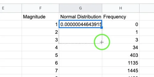
Copy the function down the column
We are ready to create a normal distribution chart.
Normal distribution values
Select the contents of the Magnitude and normal distribution columns. Create a chart.
Selection for normal distribution chart
Select the smooth line chart option. We now have our normal distribution curve for the data. At this point, we are done. I would take it a little further.

Normal distribution curve
Compare normal distribution with histogram
Let’s compare the normal distribution with the frequency data. Click in the Data range field.
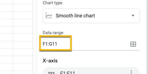
Chart data range
Erase G11 and replace it with H11.
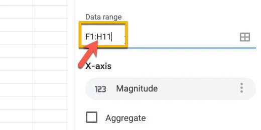
Update chart data range
Go over to the chart editor panel. Click the Add Series button.
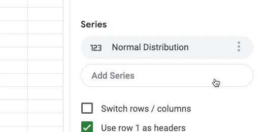
Add a series to the chart
Select Frequency
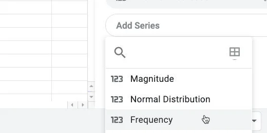
Select the frequency series
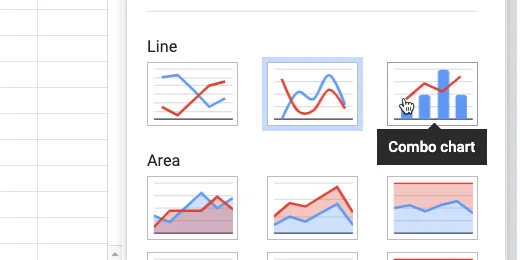
Click the chart type selector. Choose the Combo chart.
Change chart to combo chart type
Go to the Customize panel. Select the Series section.
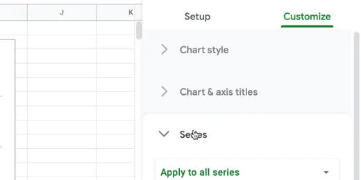
Series section in customize panel
Select the Normal Distribution series.
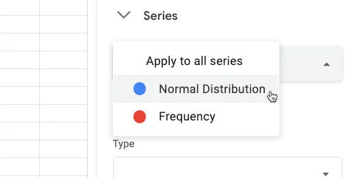
Select norma distribution series
Change the format from Column to Line.
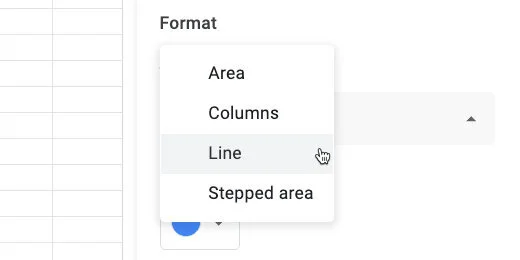
Set chart type to line
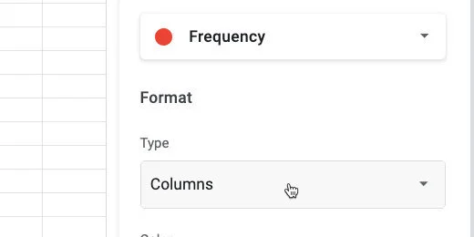
Select the Frequency series.
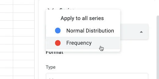
Change to frequency series
Change the chart type to columns.
Change chart type to columns
Change the Axis position from Left to Right.
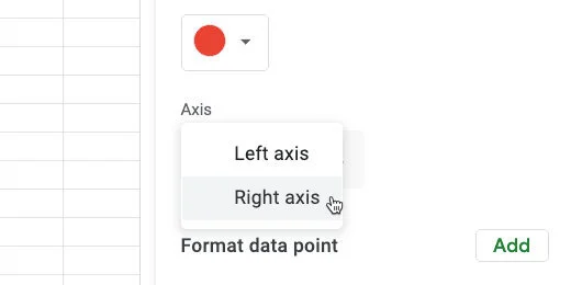
Change axis titles to the right
We see how the frequency distribution compares with the normal distribution. The frequency data is very close to the normal distribution. Some of the bars are outside the distribution curve. This is because we have a very small Bin sample.
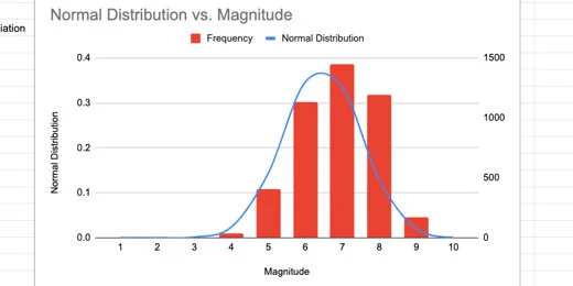
Normal distribution chart and histogram
Enlarging the Bin sample
We are going to increase the Magnitude values to see how that affects the relationship with the charts.
Move the chart off to one side. Click on cell F3.
Return to magnitude values
Let's add more information by adding half values. This will include 1.5,2.5,3.5 and so on. Type =F2+.5 in the cell. This gets the value from the previous cell and adds 5.
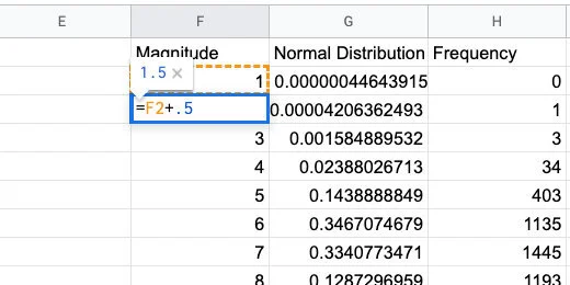
Increment each value by half
Use the blue square to copy the formula down the column. It will replace the values.
Copy the formula down the column
Keep copying the formula until the value reaches 10. I went down to row 20.
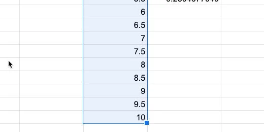
Magnitudes in increments of .5
Go to the normal distribution column. Select the last cell with the formula. Click and drag the blue square to copy the function. Copy it down to match up with the last Magnitude value.
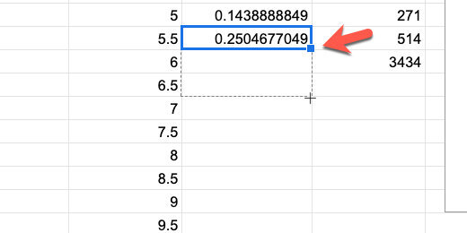
Copy the normal distribution function down the column
We need to update the Frequency values too.
Match the normal distribution to the magnitude values
For the frequency values, we need to update the frequency function. Click on cell H2. Update the function using the formula bar.
The frequency function in the formula bar
Update the F11 range to F20. Press the Return key.
Update the range for the frequency function
We need to update the chart with our additions. Click the actions menu. select Edit chart.
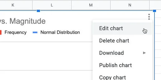
Edit the chart
Update the Data range from H11 to H20.
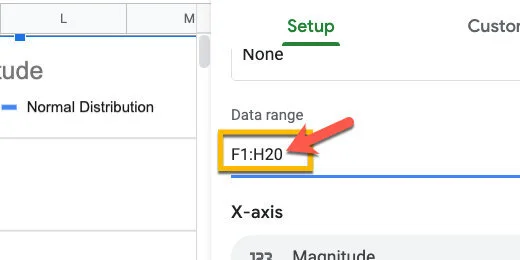
Update the range
More bars from our frequency are fitting within the normal distribution curve.
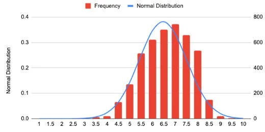
Chart with new values
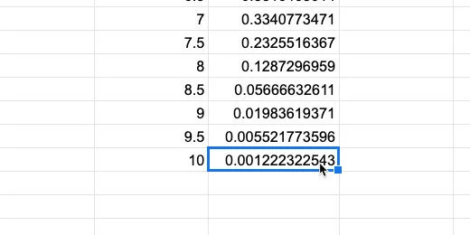
I updated the values to get information for every quarter increase(.25). More frequency values are falling within the normal distribution curve.
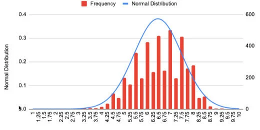
Chart comparison with .25 magnitude increments
Comparison Line Charts
In this lesson, we are going to create a chart that plots the data for two time periods. These periods range from 1998 to 2008 and 2009 to 2019. The chart is useful when making comparisons. We will be able to see twenty years of data and compare decades of earthquakes.

Comparison line charts with Google Sheets
Introduction
In a previous post, we learned to create a basic line chart. We used information from NOAA on recorded earthquakes. The graph charted the number of earthquakes that took place over a ten year period.
In this lesson, we are going to create a chart that plots the data for two time periods. These periods range from 1998 to 2008 and 2009 to 2019. We will be able to see twenty years of data and compare decades of earthquakes.
Comparison Line chart
The data for this lesson is available from NOAA. It is also available as a filtered version from my link. This is the data we will use to create the chart. You don't need to go to my first lesson on the line chart to follow along. I will go over everything from the beginning. Use the link to get a copy of the data.
NOAA Earthquake database:
https://www.ngdc.noaa.gov/nndc/struts/form?t=101650&s=1&d=1
Google Spreadsheet data:
Gathering the data
Create another sheet for the line chart. Click the add sheet button. The button looks like a plus sign. It is next to the sheet name.

Double click the sheet name. Change the name to "comparison line chart".

We are going to import the data we need for the chart. I know this is an extra step but it teaches you a few more skills. I love teachable moments. Click once on cell A1.
We are using a function called QUERY. This function imports data from other sheets. Functions and equations begin with an equal sign. Type an equal sign followed by the word QUERY.

The function needs parameters. These parameters are placed inside of the parenthesis. Type an opening parenthesis. Don't add a space between the word QUERY and the parenthesis.
Google Sheets provides useful information about the parameters. The first thing we need to do is point to the data we need to import.

The data is in the adjacent sheet. To point to this sheet we type the name of the sheet. Type Sheet1 followed by an exclamation mark. The exclamation mark is used to identify the name as the name of a sheet. The exclamation also serves as a separator between the sheet name and the data range.

We need the column that contains all the years for earthquakes. That is column A. The information begins with the first row and goes down for hundreds of rows. Type A1 and a colon. The colon is used to separate the first cell in the range from the last cell in the range. The last cell is hundreds of rows down. Instead of using the number for the last row, we can simply type the letter A after the colon. This instructs Sheets to get the data from cell A1 and go down the column to the last row with data.

We are done selecting the data. Type a comma to separate the parameter from the next. In the next parameter, we need to identify the information we want to import. Normally we would limit the import to specific data. I want to import everything and then filter it using different tools.
Type opening quotation marks followed by the word select and an asterisk. The asterisk is known as a wild card symbol. In this case, it is referring to everything. We are selecting everything in the column. Type closing quotation marks followed by a comma.

The third parameter identifies if the data includes headers. The header is the title at the top of the column. Type a number 1 to inform the function that the first cell has a title. Type closing parenthesis. Press the Enter key.

We are going to count the earthquake events every year. Skip a column and go over to cell C1. Type 1998 to 2008.

Go to cell C2. We are going to write the individual years. Begin with 1998 and enter a year in each cell down the column.

Go to cell D1 and type Quakes.

In the cells next to each year, we will count the number of quakes. Sheets will do this with another function. Type the equal sign followed by COUNTIF.

The COUNTIF function is used to count the number of occurrences. It will count something if it matches the criteria. The function needs two parameters. We need to tell it where the stuff to count is located. We need to tell it what to count. Type an opening parenthesis.

We need to pass in the range for the first parameter. The data we want to count is in column A. A Range needs a starting and ending value. Type A2:A for the Range. The Range begins at A2 because we don’t need to count the title. The ending Range is open so it includes the last row with data. Type a comma to separate the first parameter.

We want to search for the year. The year is in the adjacent column. In the parameter, we will point to this column. Type C2 and a closing parenthesis. Press the Return key.

We see that in 1998 there were 32 earthquakes.

We need to repeat this for the remaining years. We don’t have to manually enter all the functions. Google Sheets will help us. Click back onto cell D2. Click the little square in the lower right corner and drag it down. Stop when you reach the last year.

The number of earthquakes from 1998 to 2008 is ready. We are going to use the same process for the years 2009 to 2019.

Go to cell F1 and enter the title for 2009 to 2019. Enter the years down the column. Place the Quake title in cell G2.

In cell G2 type the function =COUNTIF(A2:A,F2). Copy the function to the corresponding cells.

Constructing the chart
We will begin with a simple line chart. Select the data set for the years 2009 to 2019.

Click the insert chart button.

Google should create a line chart.

The chart setup section shows the series that is being plotted. The series name is based on the title in the column. Click the Add series button.

The data for the years 1998 to 2008 is in column D. The data range is D1 to D12. Enter D1:D12 for the series Range. Click the OK button.

The data for both series is plotted. It’s difficult to understand the chart without more information. We will begin by changing the series names. Click in cell G1 and change the title to “2009 to 2019”. Change the title in D1 to “1998 to 2008”. Change the titles in cells C1 and F1 to Years.

The chart updates with the changes. That makes a little more sense.
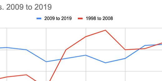
The titles along the horizontal axis show the labels for 2009 to 2019. The line for this data should stand out against the comparison line.

We are going to switch to another line chart format that treats each line as a separate graph. Click the chart selector. Choose the combo chart.

One of our lines is converted to a bar chart. No problem, we will change it back.

Switch to the Customize tab. Go to the series section. Select the series that is converted to a bar chart.

Change the format from Columns to Line.

Switch over to the 1998 to 2008 series.

Change the line color to a light blue. Change the line type to dash.

Switch to the 2009 to 2019 series. Change the line color to a dark blue.

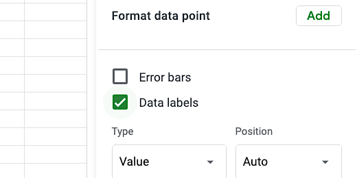
Scroll down a little and click the Data labels option.
The chart is starting to come together.

Go to the Chart style section. Enable compare mode. Compare mode provides additional information when we hover over a data value.

Close the chart editor. Hover the mouse arrow over one of the data points. The comparison information is useful.

Edit the chart title. Change it to read Earthquake Comparison By Decade. The comparison chart is done.
Google Sheets Line Charts
A lesson I created a while ago on bar charts has gained lots of interest. I thought it would be a good idea to create a lesson for line charts. I like to bundle concepts in my lessons. So we are going to query and organize data before creating the line chart. The creation of line charts is easy. Gathering and organizing data is hard. The data for this lesson is from the National Oceanographic and Atmospheric Administration, NOAA. NOAA has interactive data for earthquakes, volcanoes, and weather. I have a link below to the site.

Introduction
A lesson I created a while ago on bar charts has gained lots of interest. I thought it would be a good idea to create a lesson for line charts.
I like to bundle concepts in my lessons. So we are going to query and organize data before creating the line chart. The creation of line charts is easy. Gathering and organizing data is hard. I find my students benefit from interacting with the data before the charting process. It gives them a better understanding of what the data represents.
The data for this lesson is from the National Oceanographic and Atmospheric Administration, NOAA. NOAA has interactive data for earthquakes, volcanoes, and weather. I have a link below to the site.
The data is available online through an interactive database. The data is also available for download. I downloaded the data for use in the chart. A link to the data is available on a Google Spreadsheet. The link is available below.
The sheet for this lesson does not contain all the data in the database. We only need part of the data for the lesson.
Use the link to get a copy of the data.
NOAA Earthquake database:
https://www.ngdc.noaa.gov/nndc/struts/form?t=101650&s=1&d=1
Google Spreadsheet data:
Gathering the data
Data is gathered in a variety of ways and there is often lots of it. This data needs to be filtered. NOAA has data going back hundreds of years. We only need a fraction of that data for this chart.
I like to work on a separate sheet from the original data. It is always a good idea to leave the sheet with the original data alone.
The earthquake datasheet contains date and time information for each earthquake. It also contains information for the depth and magnitude of each quake.

Create a new sheet by clicking the plus button. The button is at the bottom of the spreadsheet to the left of the current sheet.

The new sheet is added to the right of the existing sheet.

Double click the sheet name. The name will be highlighted. Change the name to Line Chart.

Each rectangle in the spreadsheet is called a cell. Cells are arranged in columns and rows. Each cell is referenced by the intersection of each column and row. The first cell is cell A1. Click once on cell A1.

This line chart to graph the occurrence of earthquakes over the last ten years. This is from 2009 to 2019. We only need the year of each earthquake.
We are going to query the data from the first sheet. A query is a function in spreadsheets. A function is a set of instructions. In the query, we need to provide some instructions. We need to provide the location of the data and the data we need. Functions begin with an equal sign. Type and equal sign in cell A1. Type the word query after the equal sign.
Google sheets are helpful. Information about the function appears.

The function needs to know where to get the information. The information is called a parameter. Parameters are placed within parenthesis. Type an open parenthesis after the word query.
Google sheets is providing more help. It is identifying the parameters we need in the function. It is also providing an example.

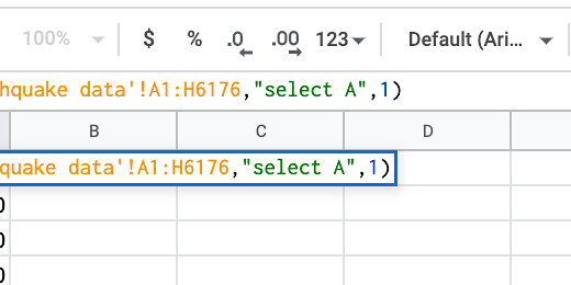
The data we want is in the sheet Earthquake data. Type a single quote and type the name of the sheet. The name must be exact. The name of the sheet begins with a capital letter. We need to include a capital letter. Type a closing single quote after the sheet name.

Type an exclamation mark. The exclamation mark identifies the name as a sheet.

The data range is from column A to column H. The data extends for over 6,000 rows. A range is a starting cell and an ending cell. Type A1:H6176 after the exclamation mark. Type a comma. This finishes the selection of data that will be in our query.

We need to identify the information we want from the Earthquake datasheet. The date is in the first column. Type opening double-quotes. Type select followed by A. Type closing double quotation marks and a comma.

Type the number 1 followed by closing parenthesis. The number informs the query that the first row has headings. Press the Return key on your keyboard to run the query.
To create the line chart we need to count the number of times an earthquake was recorded each year. To do that, we are going to use another function.

Skip three columns and click on cell D1. We need headings for the data. Type Year in cell D1. Go over to cell E1 and type Earthquakes.

Go to cell D2 and type 2019. Type 2018 and 2017 in the two cells below that. We don’t have to type all the remaining years. Spreadsheets have a useful tool to help create repeating values.

Select the dates. A blue border surrounds the selected cells. In the lower right corner of the selection box is a tiny square.

Move the arrow over the square until the arrow changes to a plus. Click and drag the square down to row D12.

The spreadsheet will fill in the values down to 2009.

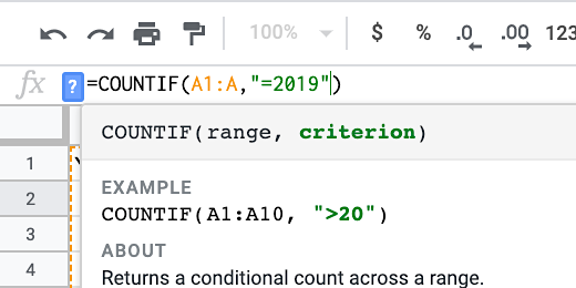
Click on cell E2. This cell will hold the number of times an earthquake was recorded in 2019. Type an equal sign followed by the function name COUNTIF. Type an opening parenthesis.
The function needs two parameters. It needs the range to look for values to count. Then it needs the criterion or things to count.

The data is in column A. Type A1:A for the range. Type a comma.

The criteria need an operator. There are several operators. We need an operator like equal to, greater than, or less than. We want an operator that looks for a specific year. We want to count all values that are equal to 2019. Type opening double-quotes. Type the equal sign followed by 2019 and closing quotation marks. Close the function with a closing parenthesis. Press the Return key.

There were 61 earthquakes in 2019.

This function needs to be copied to the other cells in the row. I want to rewrite the function to make it easier. Click back on cell E2.
The formula bar is above the column headings. The formula bar is used to edit formula cell contents. Place the cursor after the closing parenthesis.
The point of using computers and software is to make things easier. We don’t want to manually enter the date. We want the spreadsheet to do it for us. Erase the parenthesis and everything in the parenthesis. The year is in cell D2. Type D2. Press the Return key. We get the same count.

Select cell E2. Click the blue square in the corner and drag it down to row E12. This copies the function to each cell. The cell used to identify the count is updated as the function is copied to the cells. This is because of something called relative cell reference. The value looks at the contents of the cell to the left. It keeps doing this as the function is copied to each cell.

Now we have the data needed for the line chart.
Line Chart
We need to select the data to be used in the line chart. Select the cells from D1 to E12.

Go to the button bar and click the insert chart button.

Google Sheets the best chart for the data selected. We have our line chart. The Chart editor opens on the right. Use it to customize the line chart.
