Publishing Google Charts with Google Slides

Introduction
This is the fourth lesson in the four-part series on publishing Google Charts. This lesson focuses on the publication of charts using Google Slides.
Google Slides is a good way to publish graphs that are constantly updating. This works well when gathering data through polls and surveys. This is the type of data we are representing in the charts for this lesson. The data in this lesson comes from something we did to increase attendance at the campus.
The administrator promised a pizza party —for the holiday— to classrooms with the highest attendance. Each class kept a record of their daily attendance. We created a Google Form to collect the attendance for each day.
Each class form was simple. Every teacher had a personal form. The goal was to keep it simple. The teacher entered the number present and submitted it. We took care of gathering and formatting the data in the background.
The contest was part of a lesson. Everything is a teachable moment. Students learned about gathering data, and basic statistics. We focused on the average attendance value. This worked out in an interesting way when students wanted to come to school even if they were sick.
We worked out how one student doesn't affect the average as much as five or more. They learned how important it was for one student to stay home sick instead of infecting other students and increasing the number of possible absences. It's amazing what kids will do for a pizza party.
Resources
Use the link below to see a preview of the final product.
I have gathered all the data and formatted the charts in Google Sheet. Use the link below to get a copy of the working documents.
Data and chart overview
The Google Sheets document has the data and charts formatted for our project. The spreadsheet has one sheet dedicated to each grade level. The last sheet contains all the form data for each teacher’s class.
Each sheet has a table. The table contains the average for each teacher’s attendance. These averages are used to generate the charts.

The columns in each chart are color-coded to identify each teacher's class.

The attendance data updates every day during the contest. We can't have access to live data for the lesson so I did the next best thing. The Kinder sheet has a Date filter. This filter represents the dates for the attendance contest. Select a date and the data for that day and the previous days are averaged. Select August 21st, 2020.

The charts on each sheet update with the selected date range.

Preparing the slides
Switch to the Google Slides template. The template has one slide. This slide is based on a slide master created for this project.

Go to the menu and click Insert. Go to the Chart option and select From Sheets.
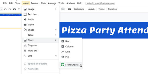
Find the Attendance Chart sheet. Click on the sheet icon and click the Select button.

Each chart in the sheet is detected and displayed. Click on the Kinder attendance chart.

Each chart is linked to the spreadsheet. This link updates the chart as the data in each sheet updates. We will see how this works later. Click the Import button.

Position the chart so it fills the slide. Don’t worry if the chart stretches.

Click the Insert slide selector.

The template has a master slide with the reformatted heading. Select this slide master.

Insert the next chart. Go to the menu and select Insert. Go to the chart option and select From Sheets. Select the attendance spreadsheet. Find the First-grade chart and insert it into the slide. Resize the chart to fit. Repeat this process with all the charts.

The data in my current chart for Kinder represents the first week’s attendance. This is true for all the other charts. This represents the selector choice I made a few steps ago.

Return to the Sheets tab. Use the date filter and select August 28, 2020.

The chart updates with the data from the dates.

Return to the Google Slides tab. The chart in the kinder chart has an update button; click the button.

The chart updates and matches the chart in the Sheet.

The chart on each slide needs to be updated. Go to the First-grade chart and click the update button.

Updating each chart on each slide is tedious. There is a faster way to update all the charts at once. Go to the menu and click Tools; select the Linked objects option.

A panel opens on the right. It lists objects with links to external sources. Each link has an update button.

We can click each update button but there is a faster way to update all the charts. There is a button at the bottom of the panel to update all the linked objects; click the button.

There is a way to automatically update all the charts. That requires the creation of a Google Script. That takes us beyond the objective of this lesson.
Publishing
Everything is ready for publication. Go to the menu and click File; select publish to the web.

The link configuration box has several auto-advance options. The default is three seconds. Use the selector to choose how long each slide will display before advancing to the next. I like to leave it at three-seconds unless there is a lot of information to present.
Select the option to start the slideshow as soon as the player loads. Select the option to restart the slideshow after the last slide. Click the Publish button.

Click the Ok button to confirm the publication.

A special publication link is created. Copy the link.

Create a new tab and paste the link. Press the Return key to view the published slide show. The presentation begins moving from slide to slide as soon as the page loads.

Adjust the timing
The three-second default might be too fast. To adjust the timing we need to return to the publication settings. Choose a different time interval.

The link updates with the new setting. Copy the link. Return to the tab with the slide. Replace the link with the updated version.

Another way to update the setting is to go directly to the link. The end of the link has a number. This number represents the number of seconds for each slide. The number represents milliseconds. 5000 or 5 milliseconds in my example. Set this value to any value you want. Here are some examples: 5500 is five-and-a-half seconds, 7000 is seven seconds, and 60000 is one minute.

Use this link to publish the live charts.
Stop publishing
It is a good idea to stop publishing live charts when they are no longer needed. Return to the Google Slides tab. Click the Published content & settings option. Click the Stop publishing button when you are done with the project.
