Comparison Line Charts

Comparison line charts with Google Sheets
Introduction
In a previous post, we learned to create a basic line chart. We used information from NOAA on recorded earthquakes. The graph charted the number of earthquakes that took place over a ten year period.
In this lesson, we are going to create a chart that plots the data for two time periods. These periods range from 1998 to 2008 and 2009 to 2019. We will be able to see twenty years of data and compare decades of earthquakes.
Comparison Line chart
The data for this lesson is available from NOAA. It is also available as a filtered version from my link. This is the data we will use to create the chart. You don't need to go to my first lesson on the line chart to follow along. I will go over everything from the beginning. Use the link to get a copy of the data.
NOAA Earthquake database:
https://www.ngdc.noaa.gov/nndc/struts/form?t=101650&s=1&d=1
Google Spreadsheet data:
Gathering the data
Create another sheet for the line chart. Click the add sheet button. The button looks like a plus sign. It is next to the sheet name.

Double click the sheet name. Change the name to "comparison line chart".

We are going to import the data we need for the chart. I know this is an extra step but it teaches you a few more skills. I love teachable moments. Click once on cell A1.
We are using a function called QUERY. This function imports data from other sheets. Functions and equations begin with an equal sign. Type an equal sign followed by the word QUERY.

The function needs parameters. These parameters are placed inside of the parenthesis. Type an opening parenthesis. Don't add a space between the word QUERY and the parenthesis.
Google Sheets provides useful information about the parameters. The first thing we need to do is point to the data we need to import.

The data is in the adjacent sheet. To point to this sheet we type the name of the sheet. Type Sheet1 followed by an exclamation mark. The exclamation mark is used to identify the name as the name of a sheet. The exclamation also serves as a separator between the sheet name and the data range.

We need the column that contains all the years for earthquakes. That is column A. The information begins with the first row and goes down for hundreds of rows. Type A1 and a colon. The colon is used to separate the first cell in the range from the last cell in the range. The last cell is hundreds of rows down. Instead of using the number for the last row, we can simply type the letter A after the colon. This instructs Sheets to get the data from cell A1 and go down the column to the last row with data.

We are done selecting the data. Type a comma to separate the parameter from the next. In the next parameter, we need to identify the information we want to import. Normally we would limit the import to specific data. I want to import everything and then filter it using different tools.
Type opening quotation marks followed by the word select and an asterisk. The asterisk is known as a wild card symbol. In this case, it is referring to everything. We are selecting everything in the column. Type closing quotation marks followed by a comma.

The third parameter identifies if the data includes headers. The header is the title at the top of the column. Type a number 1 to inform the function that the first cell has a title. Type closing parenthesis. Press the Enter key.

We are going to count the earthquake events every year. Skip a column and go over to cell C1. Type 1998 to 2008.

Go to cell C2. We are going to write the individual years. Begin with 1998 and enter a year in each cell down the column.

Go to cell D1 and type Quakes.

In the cells next to each year, we will count the number of quakes. Sheets will do this with another function. Type the equal sign followed by COUNTIF.

The COUNTIF function is used to count the number of occurrences. It will count something if it matches the criteria. The function needs two parameters. We need to tell it where the stuff to count is located. We need to tell it what to count. Type an opening parenthesis.

We need to pass in the range for the first parameter. The data we want to count is in column A. A Range needs a starting and ending value. Type A2:A for the Range. The Range begins at A2 because we don’t need to count the title. The ending Range is open so it includes the last row with data. Type a comma to separate the first parameter.

We want to search for the year. The year is in the adjacent column. In the parameter, we will point to this column. Type C2 and a closing parenthesis. Press the Return key.

We see that in 1998 there were 32 earthquakes.

We need to repeat this for the remaining years. We don’t have to manually enter all the functions. Google Sheets will help us. Click back onto cell D2. Click the little square in the lower right corner and drag it down. Stop when you reach the last year.

The number of earthquakes from 1998 to 2008 is ready. We are going to use the same process for the years 2009 to 2019.

Go to cell F1 and enter the title for 2009 to 2019. Enter the years down the column. Place the Quake title in cell G2.

In cell G2 type the function =COUNTIF(A2:A,F2). Copy the function to the corresponding cells.

Constructing the chart
We will begin with a simple line chart. Select the data set for the years 2009 to 2019.

Click the insert chart button.

Google should create a line chart.

The chart setup section shows the series that is being plotted. The series name is based on the title in the column. Click the Add series button.

The data for the years 1998 to 2008 is in column D. The data range is D1 to D12. Enter D1:D12 for the series Range. Click the OK button.

The data for both series is plotted. It’s difficult to understand the chart without more information. We will begin by changing the series names. Click in cell G1 and change the title to “2009 to 2019”. Change the title in D1 to “1998 to 2008”. Change the titles in cells C1 and F1 to Years.

The chart updates with the changes. That makes a little more sense.
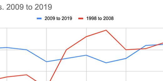
The titles along the horizontal axis show the labels for 2009 to 2019. The line for this data should stand out against the comparison line.

We are going to switch to another line chart format that treats each line as a separate graph. Click the chart selector. Choose the combo chart.

One of our lines is converted to a bar chart. No problem, we will change it back.

Switch to the Customize tab. Go to the series section. Select the series that is converted to a bar chart.

Change the format from Columns to Line.

Switch over to the 1998 to 2008 series.

Change the line color to a light blue. Change the line type to dash.

Switch to the 2009 to 2019 series. Change the line color to a dark blue.

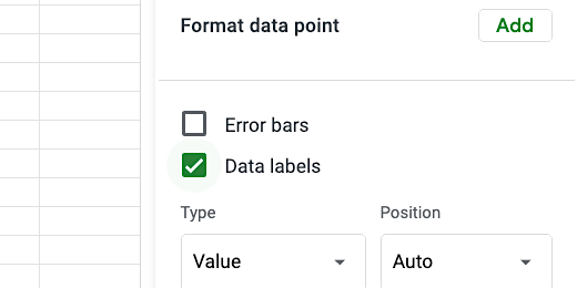
Scroll down a little and click the Data labels option.
The chart is starting to come together.

Go to the Chart style section. Enable compare mode. Compare mode provides additional information when we hover over a data value.

Close the chart editor. Hover the mouse arrow over one of the data points. The comparison information is useful.

Edit the chart title. Change it to read Earthquake Comparison By Decade. The comparison chart is done.