
Technology lessons for educational technology integration in the classroom. Content for teachers and students.
Google Sheets Bar charts with multiple groups
Bar graphs are great when working with multiple groups of data. They are helpful when looking for patterns. Groups of data provide opportunities to look at data from different perspectives.

Google Sheets bar charts
Bar graphs are great when working with multiple groups of data. They are helpful when looking for patterns. Groups of data provide opportunities to look at data from different perspectives.
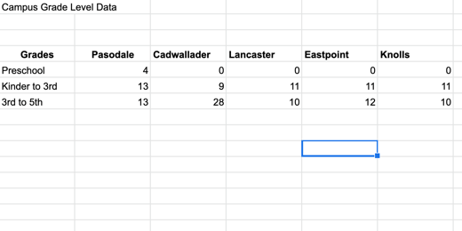
The data for this chart is shared with you here. Click this link to get a copy and follow along. The second tab in the sample worksheet includes data from multiple campuses.
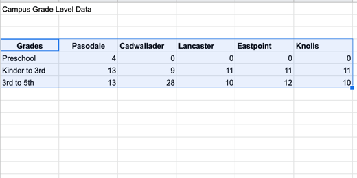
Select the headings and data then click the Insert chart button.
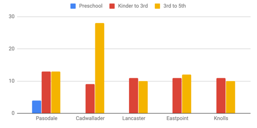
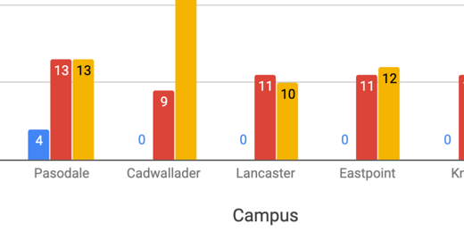
This bar chart includes more information. This chart includes a legend. The legend in this chart runs across the top. The data in the chart is grouped by campus. The bars for the data appear in the order that came from the table.
Google tried to help format the titles but they need some work. The horizontal title is missing and we need to change the title from Grades to something else. Change the title from Grades to Campus. Go to the Chart editor panel and change the font size to 16 points.

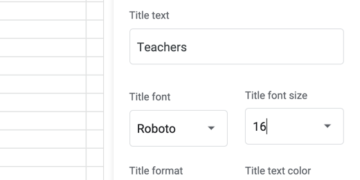
Click on the axis and titles selector. Choose the Vertical Axis title.

The vertical axis title is empty. Click once in the title field and type Teachers.

Change the font size to 16 points.
Change the title to “Teachers by Campus” and change the font size to 16 points. Change the text alignment to center align.

Showing the values on each bar would be helpful. Go to the Series section.

Scroll down a little and place a checkmark in the Data labels option.

The data labels work well with all the values except Preschool. Only one campus has preschool teachers. It throws off the values for the other campuses.
We can format each data series. Click on the series selector.

Select the Preschool series.

Go to the text color option. Change the value from Auto to white.

Changing the font color to white forces the color to change across all campuses. The value of zero is still there but we can’t see it because it matches the background color.

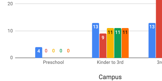
Data can be viewed from different perspectives. The data in our current graph is displaying values for each campus. We can also modify the view so we are looking at the values for each grade level. Switch to the Setup section in the Chart editor.

Scroll down and remove the checkmark from switch rows or columns.

The values are now grouped by grade levels. Switching the data grouping changed the formatting. Switching between data groupings causes this issue. The better option is to create two separate charts of the same data. Place a checkmark back on the switch rows or columns box.

Click once on the chart and click the actions menu. Select Copy chart. The chart is placed in the computer’s memory. Click Edit in the menu and select Paste.

The copy is pasted above the original. Click once on the pasted copy and go to the setup section. Change the switch row or columns box.

This takes us back to the version that needs formatting.

There are some bars without values. Let’s take care of them first. Go to the series section in the customize panel.

Place a checkmark in the Data labels box.
We need to fix the values in Preschool. We can fix this in one of two ways. Let’s take a look at the easiest way first.
Click the Text color selector and choose white.
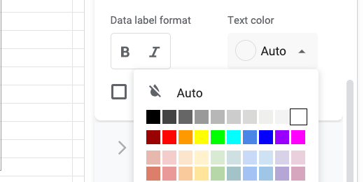
This works well when the bars are bright colors and the background is white. There is another option that allows us to target our customization. Place the text color back to Auto.

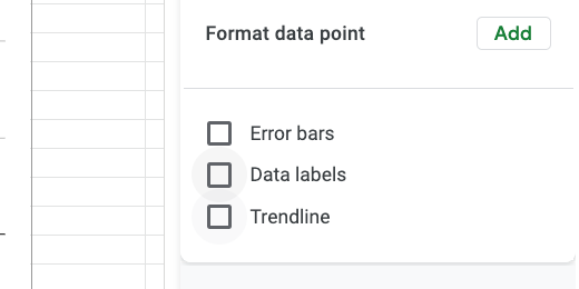
Find the Format data point option and click the Add button.

A data point selector dialogue opens.

Select a campus and the preschool that has a zero value. Click the OK button. Select white from the data color option.

Click the Add button again. Choose the next campus that has zero for the Preschool value. Change the data point color to white.
This option includes several steps but it does offer the flexibility to provide greater customization of text colors. Change the title of the slide to Teachers by Grade Level.
Bar Graphs in Google Sheets
Bar graphs are used to compare groups of information. Bar graphs compare groups of data at one point in time or across time. In this lesson, we will create a basic bar chart using Google Sheets.

Bar Graphs
Bar graphs are used to compare groups of information. Bar graphs compare groups of data at one point in time or across time. In this lesson we will create a basic bar chart using Google Sheets.
The dat for our graph compares the number of teachers in each grade level per campus. This graph will be a snapshot in a survey. It will be used for comparison with future surveys.
The data for this chart is shared with you here. Click this link to get a copy and follow along. You can skip over the next few instructions if you are using the link to the copied data.
Create a new Google Sheet. There are a couple of ways to do this. Click the Apps launcher and select Sheets. Another way is to open Google drive at https://drive.google.com and click the New button. Select Google Sheets from the list of applications.
Create a new Google Sheet
There are are a couple more ways. Go to the Sheets portal. The portal is at https://sheets.google.com. Click the create blank sheet button. One more way is to type https://sheets.google.com/create in the address bar.

Create a blank Google Sheet
If you are using the link to the example data then you will be presented with a copy option. Click Make a copy to save a copy to your Google Drive account.

Make a copy of the chart data
Our graph doesn’t have much in the way of data. The point here is to understand the fundamentals and then apply them to other data later.

Chart table data
To create a chart we need to select data for the chart. The selection should include headings. The headings for our data include Grades and Teachers. Click and drag to select the eight cells.

Select data for chart
There are a couple of ways to access the chart tools. We can click Insert in the menu and select Chart. I prefer to use the chart tool button in the button bar.

Select chart button in button bar
Google Sheets Charts will try to guess the type of graph you want to create with the data. The data we selected has one column of numbers. One column of numbers usually represent a circle graph. This is why we have a circle graph representing our data.
A circle graph is not the same as a bar graph. Circle graphs are used to represent the values from one group as a whole. Circle graphs are not typically used for multiple groups.

Basic pie chart
The Chart Editor panel opens on the right side of the sheet. The chart type selected is shown as a Pie chart. Click the Chart type selector.

Chart setup and chart selector
Google Sheets will take a second look at your data and recommend a bar chart. Click the column chart option.

Suggested charts from Google
The graph is a better representation of our data. The bar graph is very nice. Google Sheets has done a lot of work for us. It has created a colorful graph with a title and labels. We’ll take it from here and put our own spin on the graph.

Bar chart
Click once on the chart. Hash lines appear in the title area. They also appear in the axis sections. These hash lines mean we can edit the information.
I will use the words chart and graph to represent the same concept. Some prefer to use the term chart. Others prefer the term graph. I hope this isn’t confusing.

Hash marks around chart
Click the chart title. The hash lines will disappear and the title will be highlighted. Change the title to read Teachers per Grade Level.

Update chart title
The panel on the right changes based on what we have selected. The available options are displayed to help format the title text.

Chart title text
All the options are selected for us. Change any of them by clicking the selector.

Chart title font options
Click the Title format alignment option and choose Center Align.

Center justify the title
Click the Bold button.

Select the bold text option
There is a title to the left of the chart and below the chart. These are referred to as the x and y-axis labels. Click Teachers on the y-axis.
Google refers to the x and y-axis as vertical and horizontal. I use the terms x-axis and y-axis in class to reinforce math concepts.

Data headings
The formatting panel updates so we have the tools needed to format the title.

Vertical axis title
Click on the Title font size selector. Change the font size to 18 points. Fonts are measured in points.

Font size selector
Click the color selector and choose dark green 1.

Font color selector
Repeat the process for the title at the bottom.

Updated axis titles
Click once on the bar graph itself. Resize handles should appear around the graph.

Corner resize handle
Click on the bar for Preschool. It will turn a darker shade when selected.

Selected bar in chart
Change the bar color using the color picker. I chose a dark purple color for mine. Choose the color you prefer.

Change bar color using color picker
All the bar colors change to match. All the bar colors are the same because they are part of the same group.

Chart with new color selection
In the same series panel, we have an option to display the data labels. Place a checkmark on this option.

Data labels option
The values for each bar appear near the top of each.

Data labels in chart
Change the font size to 16 points and change the font decoration to bold.

Data label font and text options
Scroll to the top of the chart editor and select Chart style.
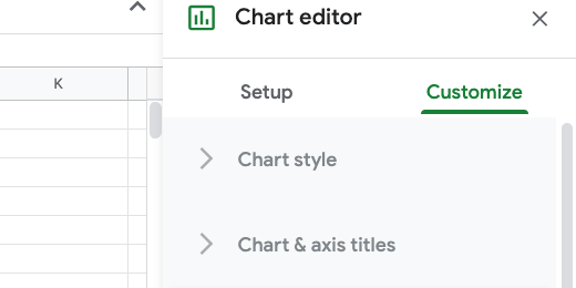
Chart editor customize section
Place a checkmark in the 3D option. This gives our chart a nice 3D look.
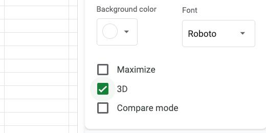
Chart 3D option
Those are the fundamentals.