Google Sheets Bar charts with multiple groups

Google Sheets bar charts
Bar graphs are great when working with multiple groups of data. They are helpful when looking for patterns. Groups of data provide opportunities to look at data from different perspectives.
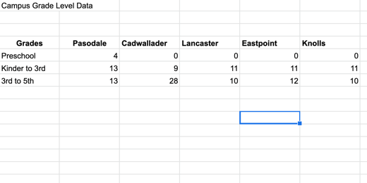
The data for this chart is shared with you here. Click this link to get a copy and follow along. The second tab in the sample worksheet includes data from multiple campuses.
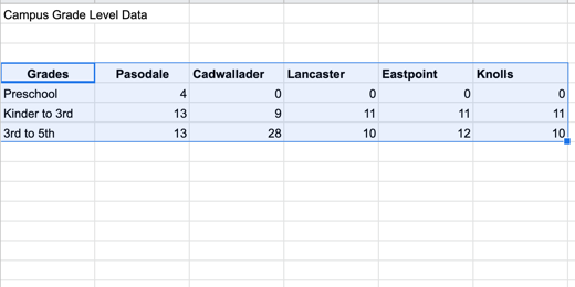
Select the headings and data then click the Insert chart button.
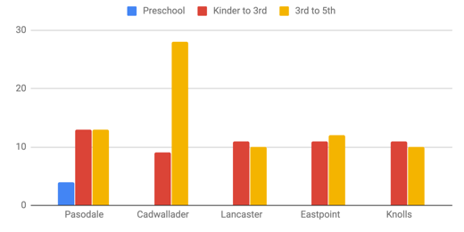
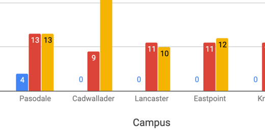
This bar chart includes more information. This chart includes a legend. The legend in this chart runs across the top. The data in the chart is grouped by campus. The bars for the data appear in the order that came from the table.
Google tried to help format the titles but they need some work. The horizontal title is missing and we need to change the title from Grades to something else. Change the title from Grades to Campus. Go to the Chart editor panel and change the font size to 16 points.

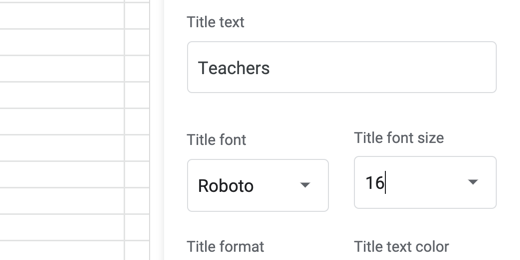
Click on the axis and titles selector. Choose the Vertical Axis title.

The vertical axis title is empty. Click once in the title field and type Teachers.

Change the font size to 16 points.
Change the title to “Teachers by Campus” and change the font size to 16 points. Change the text alignment to center align.

Showing the values on each bar would be helpful. Go to the Series section.

Scroll down a little and place a checkmark in the Data labels option.

The data labels work well with all the values except Preschool. Only one campus has preschool teachers. It throws off the values for the other campuses.
We can format each data series. Click on the series selector.

Select the Preschool series.

Go to the text color option. Change the value from Auto to white.

Changing the font color to white forces the color to change across all campuses. The value of zero is still there but we can’t see it because it matches the background color.

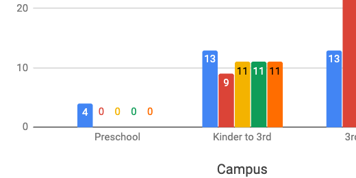
Data can be viewed from different perspectives. The data in our current graph is displaying values for each campus. We can also modify the view so we are looking at the values for each grade level. Switch to the Setup section in the Chart editor.

Scroll down and remove the checkmark from switch rows or columns.

The values are now grouped by grade levels. Switching the data grouping changed the formatting. Switching between data groupings causes this issue. The better option is to create two separate charts of the same data. Place a checkmark back on the switch rows or columns box.

Click once on the chart and click the actions menu. Select Copy chart. The chart is placed in the computer’s memory. Click Edit in the menu and select Paste.

The copy is pasted above the original. Click once on the pasted copy and go to the setup section. Change the switch row or columns box.

This takes us back to the version that needs formatting.

There are some bars without values. Let’s take care of them first. Go to the series section in the customize panel.

Place a checkmark in the Data labels box.
We need to fix the values in Preschool. We can fix this in one of two ways. Let’s take a look at the easiest way first.
Click the Text color selector and choose white.
This works well when the bars are bright colors and the background is white. There is another option that allows us to target our customization. Place the text color back to Auto.

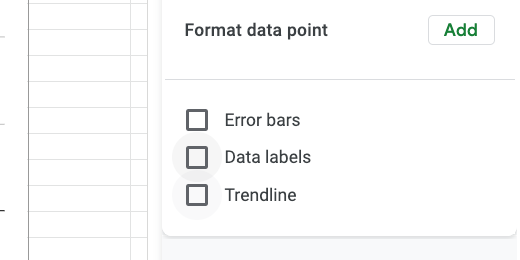
Find the Format data point option and click the Add button.

A data point selector dialogue opens.

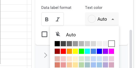
Select a campus and the preschool that has a zero value. Click the OK button. Select white from the data color option.

Click the Add button again. Choose the next campus that has zero for the Preschool value. Change the data point color to white.
This option includes several steps but it does offer the flexibility to provide greater customization of text colors. Change the title of the slide to Teachers by Grade Level.